
Good UX is essential for any application to succeed. As designers or low-code developers, it’s our responsibility to create a user experience that helps users achieve more with the application we’re building. So, how can we deliver a positive experience quickly and easily? The solution lies in prescribed design.
Prescribed design is a set of high-performing UX designs and templates that Pega’s design team has already created and is always working to improve. A prescribed design system, such as the Pega Cosmos design system, spells out an application’s navigation, workflow, and information architecture according to solutions that we know work for enterprise applications. Why? We developed all the prescribed workflows and decisions in Cosmos with the goal of helping users get work done faster.
But prescribed design also helps us create better applications using tried-and-true pages, templates, and workflows that support user productivity, quickly and easily. This means that not only will you (1) prototype faster by spending less time deciding how to display design information (while still creating thoughtful UX), but (2) you’ll spend more effort thinking about the bigger, more important decisions that affect the lives of our users.
Our design system for enterprise, Cosmos, embraces prescribed design. Let’s review a few examples of prescribed concepts within Cosmos and discuss why it results in stronger user experiences for the people working with your application.
The Case Page template shows only the most critical information
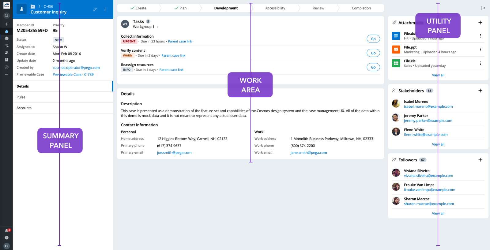
This template lays out the interface a user sees when working on a case. The Case Page template follows a defined layout: the Summary Panel sits on the left of the screen, the Utility Panel on the right side, and the Work Area in the center.
This layout creates efficient workflows out-of-the-box and is an efficient way to prototype one of the most important pages in your application. But how, exactly, does it work?
Case Page templates display exactly the information a user needs, right when they need it. Here’s how:
- The Summary Panel houses the most important information related to a case, such as the case ID and core data, and is readily available on the left of the screen.
- The Utility Panel houses other information, such as documents, and is also readily available to a user as they work through a case.
- The Work Area, being in the center of the UI, is supported by the Summary and Utility Panels, making it easier for users to refer to information in the panels and then input data into the work area, without switching pages.
By always keeping core information and data right in front of the user, they can ingest it at-a-glance and know exactly what they need to do to get work done.
The structured Case Lifecycle makes workflows productive and scalable

The Case Lifecycle consists of a set of stages, processes, and steps that will ultimately help an end user complete their work. Historically, Pega has always embraced workflows such as create and review harness, flow actions (that represent the pieces of a work process), and how work assignments appear. But now, we’ve reorganized those workflows to be as effective, productive, and scalable as possible. This means that users work with a more consistent, recognizable, and modular UI that will help them get work done.
Case creation through modals lets users focus on the task at hand
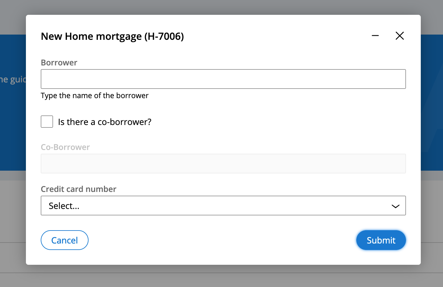
With Cosmos, a new case is created through a modal dialog. There are several reasons why we embrace this design for creating new cases.
First, case creation is one of the most critical parts of the Pega experience. When creating a new case, a modal appears over the current screen, allowing users to direct their full attention to entering the essential information needed. At the same time, users can minimize modals to view other content if needed, so they can review or copy other application information into their current workflow. This also reduces the headache of constantly switching screens to access information.
During the case creation process, modals also prevent users from accidentally moving away from what they are currently working on. For example, a modal may be authored in a way that would allow the user to select whether to go to the newly created case or stay on the existing one. This way, modals allow users to avoid becoming stuck in a workflow they’re not yet ready to complete.
Creating cases using modals removes the pain of content switching and getting into unwanted workflows. In Cosmos, this experience is implemented automatically, thanks to prescribed design.
Pulse, the collaboration tool in Cosmos, keeps comments and posts all in one place, for fast and contextual viewing
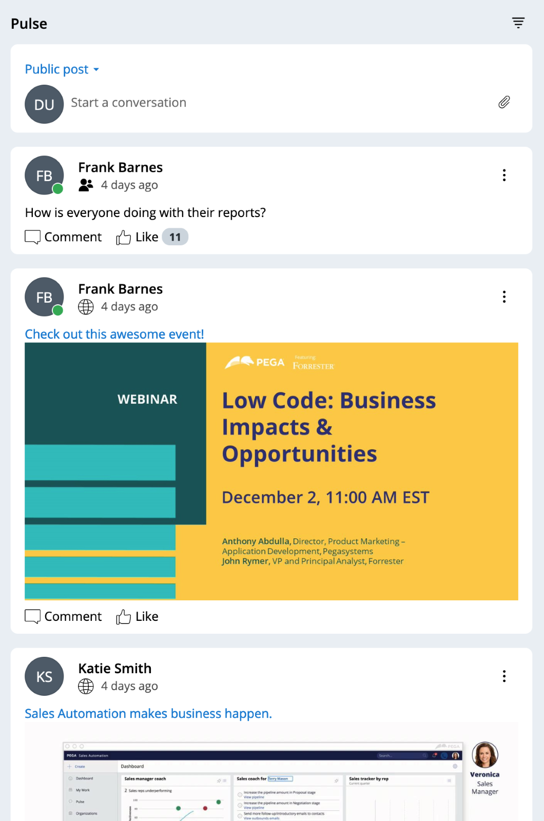
Pulse is a Cosmos component that acts as a comment feed on the case, allowing any user to collaborate with other people through comments. Pulse naturally optimizes work performance, so you don’t need any customization options. But how exactly does Pulse maximize productivity through collaboration?
Pulse keeps all comment activity and posts all in one place in a way that allows users to access the information fast, but also see the context and history behind the attachments. Moreover, Pulse surfaces the latest activity to the top of the feed, moving conversations forward until all tasks are completed.
The main Navigation Panel makes it easier to complete core actions
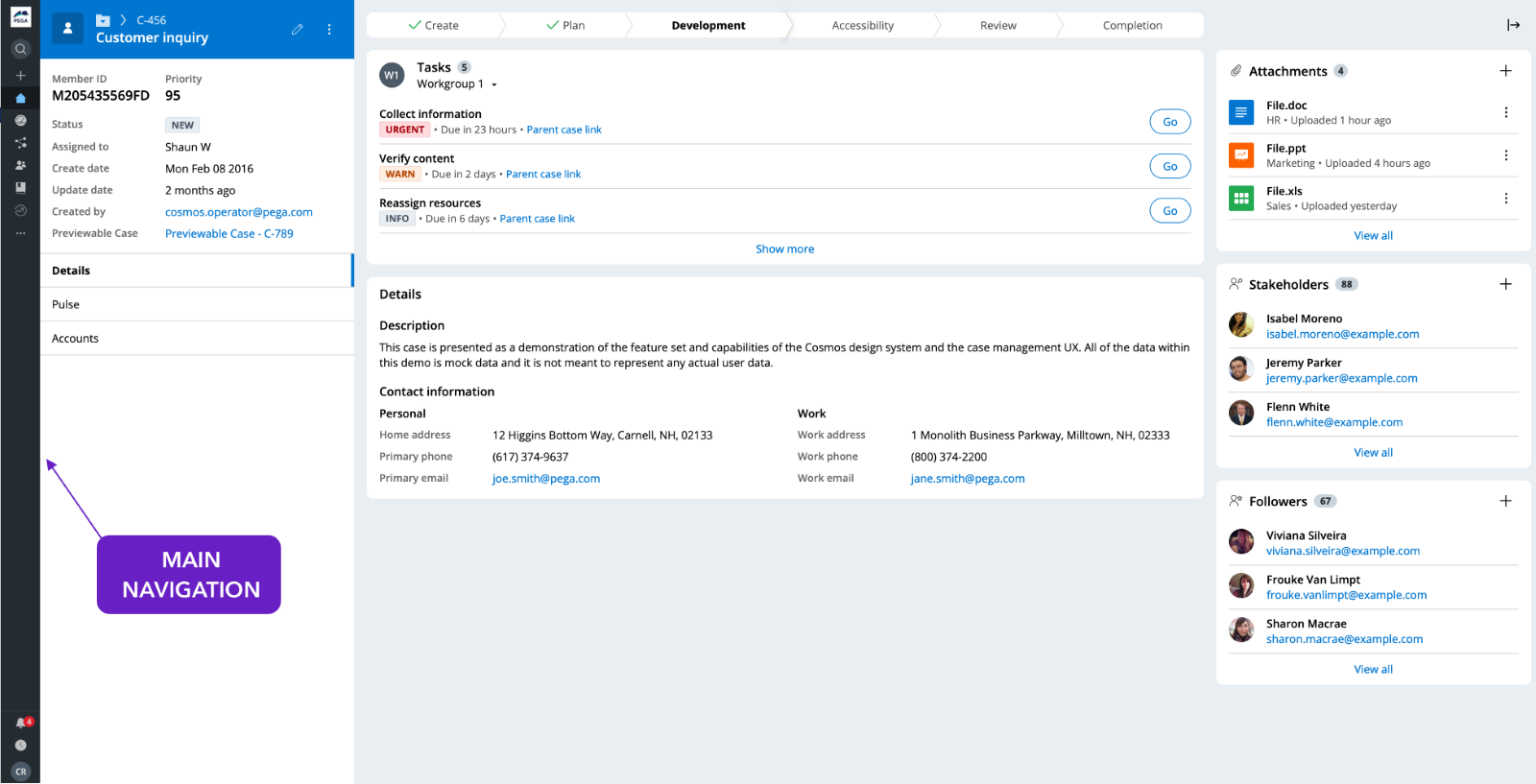
The main Navigation Panel helps users quickly navigate the core parts of the application. All primary navigation links are contained within a single global navigation component instead of the traditional application header.
What makes this good UX? All core navigation links are contained in one place (in one component!), making it easier for users to find and complete actions. Since the navigation also appears to the side of the screen, vertical space is freed up to allow room for other, relevant information to be displayed.
What prescribed design means for you
Prescribed is not the same as “inflexible”: designers and low-code developers decide how and where to place information, what data to show when, and how data will be used in the application. The flow of work to be done and an application's branding is also up to the designer working in the system. The concepts we’ve shown are simply some examples of how embracing prescribed design can make work easier for your users.
But what other benefits can YOU, as the designer or low-code developer, get from following the prescribed approach?
Design faster
With a selection of pre-configured components to choose and build from, designers can build prototypes quickly and easily. There’s no need to stress over minute details, like the size or placement of a button, or the placement of navigation elements or key components, because Cosmos’ prescribed design templates help you get there. Saving time on decisions like these add up over time.
Focus on high-value design decisions
What do you do with all this extra time? Focus on more important decisions that will provide greater value to end users. For example, who are users and what are their end goals? What data do users really need to get work done? When should that data appear in their workflow? What’s the best workflow for the users’ objectives? Spending extra time answering these questions will help you design the best application for your users.
As designers and low-code developers, our goal is to use Cosmos to organize ideas, optimize flows, and ultimately help users get work done faster, easier, and better. You understand the business logic and the needs of your users. Prescribed templates and design solutions within Cosmos will help you create workflows that keep users happy, but also yield results for your business.
Recommended resources:
-
Subscribe to get updates to the Cosmos Sketch library.
Don’t forget
JOIN THE CONVERSATION on Collaboration Center
FOLLOW @PegaDeveloper on Twitter
SUBSCRIBE to the Pega Developer Podcast on Spotify or via RSS