How to discover the peak hour of recent system usage
Summary
In a Version 5.2 system, a background process takes an hourly snapshot of all requestors present, saving information about each as an instance of the Log-License-Usage-Hourly class.
Suggested Approach
Using a simple area chart to summarize these statistics, you can identify the hour during the past day or few days during which the snapshot recorded the highest number of requestors. The chart may help you understand more about patterns of usage and demand.
For example, on the system containing this report, the peak hour occurred on February 6 at 15:59 GMT time, when 53 requestor sessions were active.

When interpreting this chart, you should understand certain limitations of the data, as described below.
How to construct the chart
To chart the requestors by hour:
1. Create and test a summary view rule with Log-License-Usage-Hourly as the Applies To class. The second and third key parts are arbitrary.
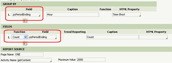
2. The property pzPeriodEnding identifies the exact date and time of each hourly snapshot. On the Content tab, enter the property pzPeriodEnding in the Group By array. In the Fields array, choose the Count function to count instances.
2. Save the Summary View form. Click the Run toolbar button (![]() ) to view the results as a tabular report.
) to view the results as a tabular report.
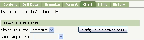
3. Open the Chart tab. Select the Use a chart for the view? check box, Select Interactive as the Chart Output Type. Click the Configure Interactive Charts button.
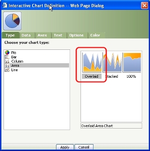
4. The Interactive Chart Definition dialog appears. On the Type tab, select Area in the left panel and Overlaid in the right panel.
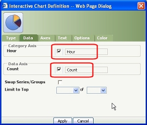
5. On the Data tab, the Category Axis and Data Axis lists each contain only a single row. Select both check boxes.
6. The Text, Option, and Color tabs of the Interactive Chart Definition dialog are optional. Click Apply to close the dialog. Save the Summary View form.
7. To test the interactive chart, click the Run toolbar button (![]() ). Adjust the slider control
). Adjust the slider control ![]() to narrow the time interval.
to narrow the time interval.
Notes and Limitations
The results includes all four types of requestors (agents, browser-based, portlet, and services), but only those requestors that are present at the moment each hour when the system takes the snapshot. For example, if a user signs on at 10:15 A.M. and signs off at 10:58 A.M., that user's requestor session isn't included an the hourly count taken at 10:59. Many service requestors require only fractions of a second to execute and so are not included, unless requestor pooling is in use.
In a multinode cluster, statistics on separate nodes are recorded at different points in the hour. To restrict the report to a single value of the pzNodeName property, add a row to the Criteria array (on the Content tab).
Typically when a single-node system is up, at least three agent requestors are running, so the chart contains data points for each hour of the day. However, no data points appear for down periods; that is, the chart contains fewer than 24 data points for days when the system is down.