How to add a Grid layout to a section
Summary
In Version 6.1 there are two ways to add a grid to a section, and to use it to add, display, and update repeating data.
Grids, along with trees and tree grids, have dynamic repeating sections that show as many rows as are needed to display the selected data.
Don't confuse the V6.1 Grid layout described here with the V5.5 DataGrid HTML property. For new development, the Grid layout is preferred. For the V5.5. DataGrid approach, see How to add a Grid layout to a section.
Suggested Approach
As of V6.1 SP2, you can use a report definition rule as a grid layout data source. See Using a report definition rule as a grid layout data source.
T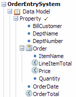 he video demonstrates the two ways to add a grid to a section: adding a layout and specifying its type, or dragging onto the section a Page List property for the grid to display. A description in text follows the video.
In this example, the user's application processes purchase orders. The order details object, Order, is a Page List property with each page containing four Single Value properties. Each instance of Order captures how many of one product the current customer wants, and calculates the line item total by multiplying the unit price and the quantity ordered.
The user does not need to know before starting how many items the customer wants, as the grid is able to expand dynamically to provide as many rows as are needed for the current purchase order.
Adding the Grid layout:
1. Start with the layout
- Select or create a section.
- Click the down-arrow at the right end of the Layout group (
 ) and select Layout (
 ).
). - Click and drag the layout onto the section. When the pointer changes shape to indicate that you can drop the layout, release the mouse button.
- On the Layout Optionsform:
- Click the Repeating radio button.
- Select
Gridas the repeat type. - Click OK.
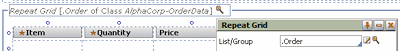
- Open the properties panel for the Repeat Grid section of the layout. In the List/Group field, select the Page List you want to display:
- Delete any default layout you do not need and save the section.
2. Start with the data
- Select or create a section to hold the layout.
- In the Application Explorer, select the Page List the layout will display, and drag it to the section.
- Drop the page list onto the section, above the default layout. In the pop-up dialog that appears, select
Gridas the layout type. - You do not need to assign the Page List to the grid, as that has happened automatically.
- Delete any default layout you do not need and save the section.
Adding controls and buttons
Controls
 As with any data display, you may need to add a control like a dropdown menu or a checkbox to make a useful representation of the data. Drag the controls you need to the cells in the repeating row where they are needed, and make sure they are set to display the correct data item.
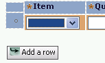
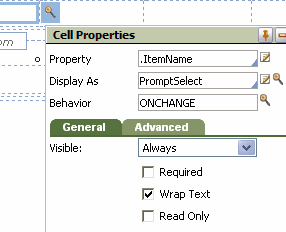
In the image at the right, a PromptSelect control is being used to display a list of product names from which the user can choose. The Behavior field is set to ONCHANGE: when the user selects a product, a Client Event refreshes this section of the screen (but not the whole screen, so the user does not experience an annoying flicker) so the cell in the "price" column can display the correct item price.
The next image shows the form at runtime: the user has selected items and quantities for the first two rows, and is about to do so for the third row. The section has refreshed so that the correct prices are showing for the selected items and quantities.

Buttons
As of V6.1 SP2, buttons use the auto-generated pxButton control rule. See Using the pxButton control rule.
Buttons you add to the top or bottom action areas can initiate a wide range of activities when clicked; a typical one is adding a blank row to the grid so more data can be added.
Buttons you add to the repeating area of the grid control are known as express action buttons. They generally provide a quick way to perform some action on the work object that the row they are in represents: "Quick Approve", "Send for Audit", "Add Note", or some custom activity you create.
To add a button to the top or bottom action area:
- Select a button control and drag it to one of the cells in either action area.
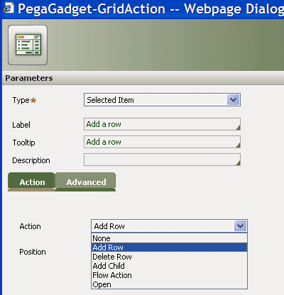
- Open the button's properties panel. Note that the Use Section field is set to pzGridAction. Select the magnifying glass beside the field to open pzGridAction's parameters panel.
- Set the Type to Selected Item, give the button a meaningful label and tooltip, and select the action that takes place when the user clicks the button:
To add an express action button:
- Drag a button to an empty cell in the repeating-row area of the grid.
- Open the button's properties panel. If you want the button to appear only in the currently-selected row, check the Show when active checkbox in the General tab. If this option is unchecked, the button will appear in every data row in the grid.
- Note that the Use Section field is set to pzGridAction. Select the magnifying glass beside the field to open pzGridAction's parameters panel.
- Set the Type to Selected Item, give the button a meaningful label and tooltip, and select the action that takes place when the user clicks the button.
To add an icon to an action-area or express-action button:
On the Advanced tab of either button type you can specify an icon for the button. If you set this, the button does not need a label; however, make sure it has a meaningful tooltip to help users understand its function.
- Select
 > User Interface > Galleries > Image Gallery and browse the available images. When you find a good image for the button, select it and copy its Path from the Selected Image display:
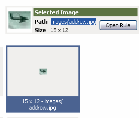
- In the section you are working on, select the button, open its properties panel, and select the magnifying glass to open the properties panel for pxGridAction. In the Advanced tab paste the image path into the Icon Class field.
- Save the section rule.
- At runtime, the button appears with its icon: