How to include a TreeGrid control in a flow action
Summary
A powerful control introduced in V5.5, the standard HTML Property rule TreeGrid lets application users view, build, or update a multi-level tree structure based on embedded Page List property values.
In the business example presented in this article, the tree reflects the (approximate) structure of the United States. The first level of the tree consists of United States regions (such as the Midwest region, defined by the Census Bureau as 12 states including Illinois, Indiana, Ohio and others).
The other levels are states, cities, and ZIP codes. At runtime, application users can add, update, or delete new nodes at each level.
The Discussion of TreeGrid parameters and settings in Step 3 includes descriptions of TreeGrid capabilities not used in this example.
Suggested Approach
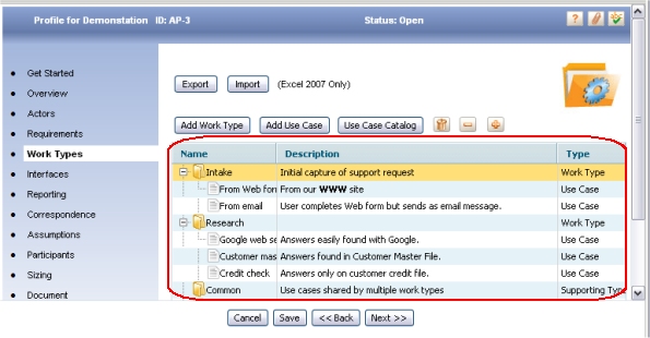
This screen image illustrates a fully-expanded tree control in the Emerald Survey example described below.
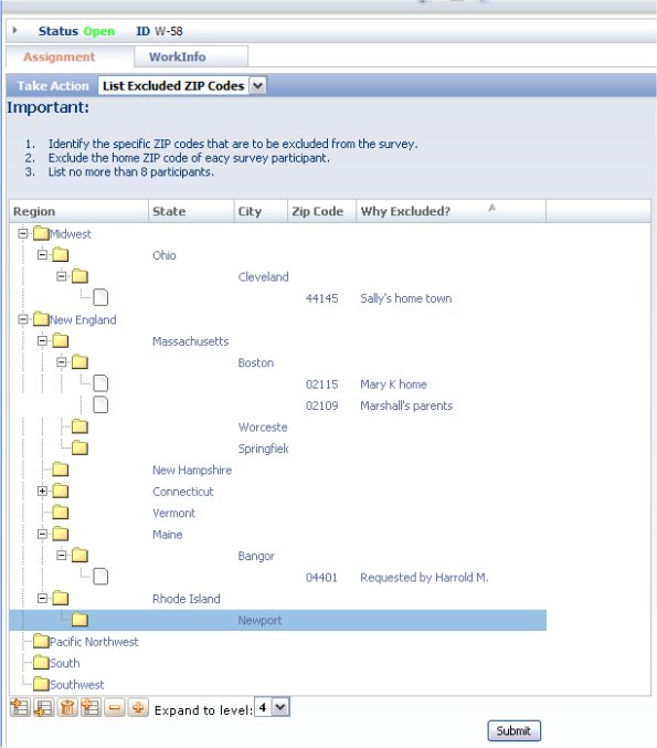
The "root" or base of the tree is at the left. Levels identify regions, states and cities within a state. The fourth-level nodes of the tree, at the right, identify a single U.S. Portal Service ZIP code (for an area within that city) and a comment. ZIP Code 02109 and 02115 in Boston, as well as 04401 and 44155 are identified for this work object, W-58.
Controls at the bottom of the form allow the user to add or delete nodes, and collapse or expand the tree or portions of the tree.

In this example, the user can change the label text in any node by double-clicking the text and typing.
When the user submits the flow action, the application saves the current state of the entire tree as property values in the work object.
Business setting
A division of the Emerald organization conducts postal mail surveys under contract for various business customers. Emerald recruits a team of temporary hired staff to help with mailings and processing of returned surveys.
Survey households are selected from a large marketing database using criteria that meet customer requirements. However, as a routine part of planning each survey, Emerald allows the customer to identify a small number of specific ZIP codes (or cities or states) that are not to receive any surveys. The customer may identify these because their business is already an active presence or advertiser in that area, or because the ZIP code is the home of one of the survey team, or for unstated reasons. (Survey team members and customer staff are not allowed to be survey participants.)
In the Emerald survey application, the Restrictions flow action (labeled "List Excluded ZIP Codes) allows users to view, or update, the excluded states, cities, and zip-codes.
Step 1: Create a Page List-based data model
The TreeGrid control supports a data structure consisting only of Page List and Single Value properties. Each level of the tree corresponds to pages in a Page List property.
Values shown on each node of the tree are from Single Value properties at that level. A tree may contain many levels. Pages at different levels may belong to distinct classes or to a shared class.
For example, the Emerald survey work object contains a Page List property named AllRegions,
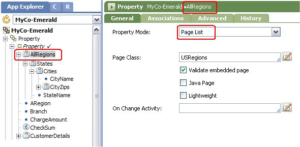
Each page of the AllRegions property is of class USRegions. The USRegions class contains a Page List property named States.
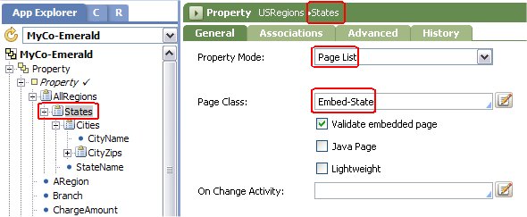
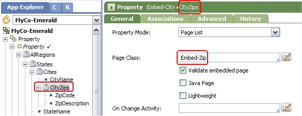
Similarly, each page of the States property is of class Embed-State. The Embed-State class contains a Page List property named CityZips (and a Single Value property, StateName).
Each page of the CityZips property is of class Embed-Zip. The Embed-Zip class contains two Single Value properties, ZipCode and ZipDescription.
Individual pages within a Page List structure are identified by a numeric subscript starting at 1. So the property reference to the 02115 ZIP code in the first screen shot above is:
pyWorkPage.AllRegions(2).States(1).Cities(1).CityZips(1).ZipCode
- The New England region is AllRegions(2).
- Massachusetts is the first state in the region, or AllRegions(2).States(1)
- Boston is the first city in the state, or AllRegions(2).States(1).Cities(1).
Step 2: Create a section rule
The flow action in this example references a section rule named Restrictions. The top layout contains a single free-form cell with a paragraph of user instructions.
Below the layout containing the paragraph, add a second layout containing a single freeform cell.
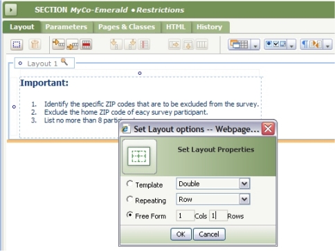
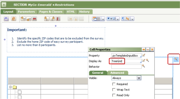
Select an InputBox control (as a placeholder) from the Basics control group and drag it into the single cell of the new layout. Open the Cell Properties panel and change the Display As field to TreeGrid.
Step 3: Enter parameters
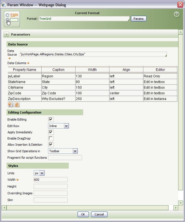
As with other advanced controls, much of the behavior and appearance of the TreeGrid control is determined by parameters. Click the magnifying glass icon at the right of the Display As field to enter parameters.
Parameter | Description |
|---|---|
| Data Source | Identify the top-level page and the Page List properties that together identify the deepest level of the tree structure. Separate each level with a period character, surround the value with double quote characters, and omit subscripts and parentheses. Example:
"pyWorkPage.AllRegions.States.Cities.CityZips" If the value starts with a period, the primary page is assumed as the higher-level page, so this is equivalent to:
".AllRegions.States.Cities.CityZips" |
| Data Columns | Complete this grid control to Identify the Single Value properties that are visible from each level of the tree display.
Select From Property Definition for the Editor field to use the HTML Property rule identified in the General tab of the property rule. You may also type in the name of an HTML property rule in the Editor field. (You can use all HTML property rules that do not require parameters; if you use property rules that require parameters, you must accept the default parameter values.) |
Editing Configuration | |
| Enable Editing | Select to allow runtime changes to the tree structure. If not selected, user interactions are limited to expanding and collapsing existing nodes. If selected, additional parameter fields appear on this form. |
| Edit Row | Select one of the following:
The In Section and In Popup choices can present a section rule form that allows users to input or revise multiple fields from the selected level and from higher levels, whether or not these properties appear in the Data Columns grid. |
| Section for editing | If you selected In Section or In Popup for the Edit Row parameter, identify here the Stream Name key part of a section rule. The Applies To key part must match (or be an ancestor class of) the Page Class of the Page List property at that level. Note that you can use distinct sections for each level, if the Stream Name key parts of the section rules are all the same as the value you enter here. |
| Apply Immediately | Select to cause asynchronous clipboard updates (using AJAX) as each user interaction completes, rather than only when the form is submitted. See Notes below. If the Edit Row value is In Section or In Popup, this box must be checked. |
| Enable DragDrop | Select to allow users to drag nodes (including the subtree attached to the node) to other positions at the same level in the tree. If users drop the row at the same level as the dragged one, it is inserted above the row at which it is dropped (at the same level). Dropping a row one level higher places the dropped row at the bottom of that level. Dropping at any other level is disallowed. Such reordering changes the order of pages at that level, but does not change any property values within the pages. |
| Allow Insertion & Deletion | Select to allow the user to add and delete nodes. |
| Show Grid Operations in | Select Toolbar, Right-Click Menu, Both, or None to control the presentation of options to expand, collapse, add rows, and so on. If you select Right-Click Menu or Both, identify in the Name and Action columns the menu text and a JavaScript function, for each option that is to appear on the right-click menu. Complete the next field. |
| Fragment for Script Functions | Optional. Identify an HTML fragment rule that defines custom JavaScript functions referenced in the right-click menu. (Not used in this example). |
Styles | |
| Units | Select px for pixels or % for percent, to identify the units of the Width and Height fields.
At runtime, scroll bars appear if needed. |
| Width | Enter a width in pixels or percent. |
| Height | Optional. Enter a height in pixels or percent. If this field is blank, the system adjusts the height at runtime, attempting to display the entire tree as expanded or collapsed. |
| Overriding Images | Optional. You can override the small image used at each level by identifying the second and third key part of a binary file rule containing the image. Specify the replacement for the default top level image (folder.gif) first, followed by a comma, then the replacement for the second--level image (leaf.tif), and so on, between double quotes. For example: "mytop.gif, mysecond.gif, mythird.gif" Not used in this example. |
| Skin | Optional. Enter one of the following styles: .gray, xp, mt, modern, light, or clear. These differ in fonts, borders, and background colors. To see the definitions of each style, examine the standard text file rule webwb.dhtmlx.css, a final rule. |
After you complete all parameters:
- Click OK to close the Parameters window.
- Apply the Cell Properties panel.
- Save the Flow Action form.
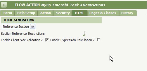
Step 4: Create a Flow Action
Create a flow action named Restrictions to reference the Restrictions section.
- Do not complete the Form tab.
- On the HTML tab, reference the section.
- On the Action tab, complete the Before this Action Run Activity field if necessary to initialize the top-level Page List property — AllRegions in this example.
- Also on the Action tab, complete the Validate and After this Action Run Activity field as appropriate to validate and process the submitted input.
Step 5: Test
- Update a flow rule to allow the flow action as a local or connector flow at one or more assignments in the flow.
- Execute the flow.
- Select the flow action. Interact with the tree structure, exercising all options.
- Select Tools > Clipboard to review the contents of the clipboard after each update.
Notes
- In this example, the essential data need is for the list of excluded ZIP codes, rather than a tree structure relating the ZIP codes to cities, states or regions. For storing only the ZIP codes, a Value List property could be used. However, the tree structure is natural and easy to understand.
- No validation of user input values such as state names or ZIP code values occurs while the user interacts with the tree structure. Because pages in a Page List are identified by a numeric index (subscript) rather than a unique text value, there is nothing in this example to prevent the user from adding duplicate states (or cities or ZIP codes), or placing a state in the wrong region, and so on. Any such cross-node or holistic tree validation must occur after the flow action is submitted.
- As with other AJAX-based controls, if you select the Apply Immediately option on the HTML Parameters window, at runtime the TreeGrid control updates the clipboard after each node edit is complete, before the user submits the entire flow action (or other form). If the user is allowed to abandon (cancel) the flow action, your application must provide a way to restore the previous state of the tree. To erase an entire tree structure, create an activity that's linked to the Cancel button. To delete the to Page List property and create an empty tree, use a Property-Remove method.
Additional TreeGrid Example
- To interact with another TreeGrid example, select File > New > Application Profile and interact with the Application Profile tool to add use cases (in step 5, Work Types).
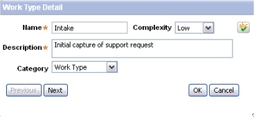
To enter or revise top-level notes (work types) or second-level nodes (use cases), this TreeGrid uses two pop-up sections both named WorkTypeUseCaseSection, one in the Embed-Accel-UseCase class and one in the Embed-Accel-WorkTypes class. At runtime, the pop-up section can capture (and validate) much more information than appears in the tree display. For example:
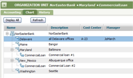
- The standard harness rule Data-Admin-.OrgChart uses a TreeGrid control to support the interactive organization chart display found on the Organization, Organization Division, and Organization Unit forms. Note that all text in this display is "read-only"; to change the label of a division or organization unit, the user double-clicks to open that data instance. This example uses pop-up sections. (Special activities and JavaScript functions support this harness rule.)
 Section rules — Completing the Layout tab.