How to use the Branding wizard to create a new application skin
Summary
The Branding wizard (called Application Skin wizard in V5) enables you to quickly develop and put into production a user interface that reflects corporate or departmental standards. The wizard lets you uniformly apply color schemes, logo images, fonts, and other design attributes to layout and form elements such as headers, tabs, and controls. These elements appear in user portals, work forms, and reports.
The wizard can be used with both composite portals and traditional portals. In many cases, the wizard eliminates the need to individually modify the stylistic elements within the section rules of your application.
Because the wizard can be re-run at any time (either updating the same rules, or updating a copy), gradual refinement and experimentation are easy to accomplish.
This article describes an example of how you use a few of the wizard's features to brand a new skin for a composite portal.
This article describes V6.1 features. For 6.3, see How to use the Skin rule to style your application user interface. For V5.5 , see How to use the Application Skin wizard to create a new skin. For V5.4, see How to use the Application Skin wizard.
Suggested Approach
In this example, Acme Corporation wishes to develop a manager portal for its Order Entry System application based upon the standard Manager composite portal rule.
The goal is to modify the skin so that some of the branding-related elements in the manager portal, work forms, and reports conform to the company standard. You will use the Branding wizard to make those changes.
Before you start, make an inventory of the elements that you are modifying. Compile a list of the colors, fonts, and other information you will apply.
In this example, you will change:
- The main and accent colors from the default gray scale to light blue and beige (CSS hexadecimal values #B5C5E4 and #E6D7B8, respectively).
- The color of the portal background to light gray (#ECF1F5).
- The color of the left and center panel backgrounds to white (#FFFFFF). Their borders will also be light gray.
- The colors of the active (selected) and the inactive (unselected) tabs.
Create new portal and skin rules
In this example, you will create a new portal rule and run the Branding wizard to create a new skin.
- Copy the standard portal rule named Manager into your application by clicking Save As (
 ) and naming the new rule OESManager. Do not change the values in the Role, Type and Skin fields. Keep the rule form open.
- Open the Branding wizard from the Pega button
 > User Interface > Tools > Branding Wizard.
 - On the first step, Name and Location, select create a new skin from the I would like to: pull-down list.
- Enter the skin rule name in the Name field. In this example, the new skin is named OrderEntrySkin.
- Select the RuleSet and version in the appropriate fields. Clear the Apply to Work User and Work Manager portals checkbox. Here is how the completed form looks:

Hint: As you work in the wizard, click the Help icon ( ) for detailed information about each form.
 - Click Finish to create the new skin rule and generate six text file rules (defining the Cascading Style Sheets) associated with the skin rule as displayed in the Completion panel.
At this point, you have created a skin rule called OrderEntrySkin. In later steps, you will edit this skin to reflect Acme's own colors and styles.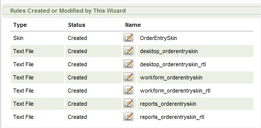
- Click Close in the Completion panel to exit the wizard.
- Return to your portal rule, replace the default skin value with the new skin name (OrderEntrySkin), and save the rule.

- Open your access group. On the Settings tab, add the new portal rule in the Secondary Portal Layouts section and save the form.

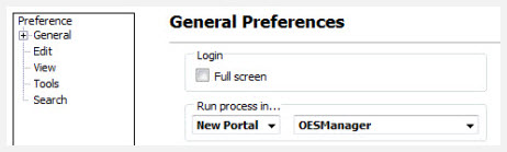
- Select Preferences from your profile pull-down menu (next to your name on the header bar) . On the General preferences screen, select New Portal in the Run process in... field and OESManager in the pull-down menu. This enables you, while developing, to preview the run-time effect of your skin rule on the applications work object forms, portal, and reports. Click Save to save your updated preferences.
Use Quick Create to make global branding changes
- Log off and on again to enable your access to the new portal. To see the new portal, select the Run button
 > Open Portal.
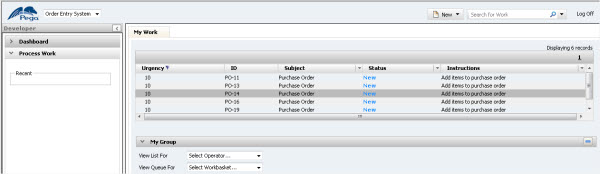
 - Select OESManager in the list to open the portal. Here is how the user portal appears using your unmodified copy of the standard application skin rule:
Here is a work object form: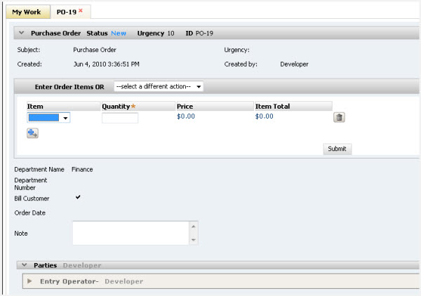
You can close the portal or leave it open as you test your Branding wizard modifications. After you save the skin, press F5 to refresh the window and display your changes.
- Open the Branding wizard. In the Name and Location form, select modify an existing skin and select the skin rule you created.

- Click Quick Create in the navigation panel. Select quick create from the Initialization Method pull-down menu. This form enables you to apply fonts and colors to most user interface elements in a single step. In many cases, the Quick Create settings are adequate for a basic branding deployment. You can customize specific UI elements later by using other controls in the wizard. By default, the main and accent colors are gradient grayscale.

- Leave the Background Gradient checkbox selected and click the Main box. This opens the Color Chooser.
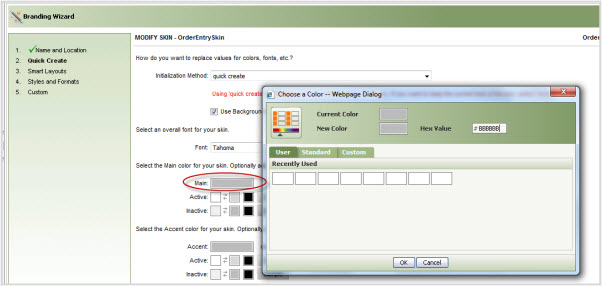
- Enter the new hex color code (#B5C5E4) in the Hex Value box. The color appears in the New Color box. Click OK.
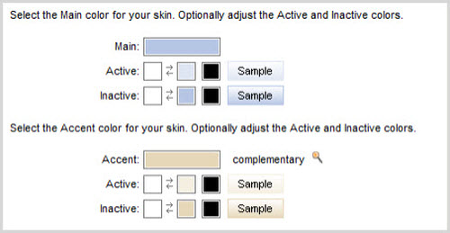
The color displays in the Main box on the Quick Create form. A complementary color (in this case #E6D7B8) is applied to the Accent box. Variations of these colors also display in the Active and Inactive boxes for use with elements that have selected or unselected states such as tabs, accordions, and menu bars. The main and accent colors are applied to the middle boxes in the Inactive color row; a lighter-density version of the colors appear in the Active row. The first box color (white) is blended in to produce the gradient. The third box in each row denotes the text color (black).
- Click Preview to see your modification applied to sample composite elements.

- Close the Preview and click Save. This regenerates the CSS text file rules with your updates. Do not exit the wizard.
- To see the user portal with user styles, select the Run button.> Open Portal > OESManager or refresh the browser (if the portal is open).

- Operate the various controls on the portal to see how the skin settings are applied. Note the difference in color between selected and unselected elements which can include menu bars, tabs, accordions, and more.
- Open a work item to see the color applied to the work form.
Modify the Quick Create settings
You may want to override the settings applied by Quick Create to specific elements. In this example, you will change:
- The portal area's background color
- The left and center panel border and background colors
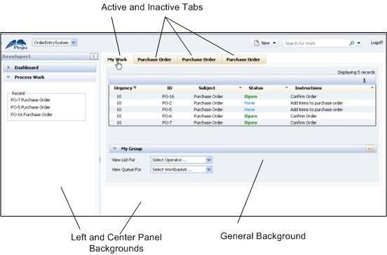
- The colors of active and inactive tabs (as shown in the example below):
Modify the portal and panel background colors
- Return to the Branding wizard, and click Styles and Formats in the navigation panel.
- Select General in the Category field. In the Background Type field, select solid. Enter #ECF1F5 in the Color field as shown here:

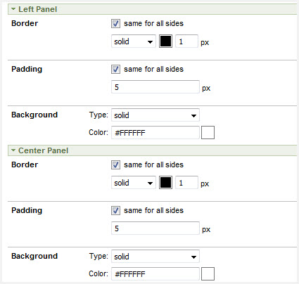
- In the Category field, select Layouts. Expand the Left Panel and Center Panel sections on the form.
- Select solid in all Border and Background field settings.
- Using the Color Chooser, apply the background color (entered in the Background section) to both Border settings. Select white (#FFFFFF) for both panel backgrounds.
Modify the tab settings
- From the category Layouts, select Tab from the Element field.
- In the Standard Tabs section under the Active and Inactive columns, reverse the main (blue) colors with the accent (beige) colors used in the Border and Background color fields as shown here:

- Click Save. Open the portal and review the results.