Improvements and enhancements in UI Kit 7 version 09-01-01
The latest version of UI Kit includes several improvements and upgrades that provide a foundation for standardizing on common pieces of user interface functionality. The UI-Kit-7 (09-01-01) ruleset provides designers and developers with the base for a standard, modern, and consistent user experience and gives applications a clean, user-friendly look and feel.
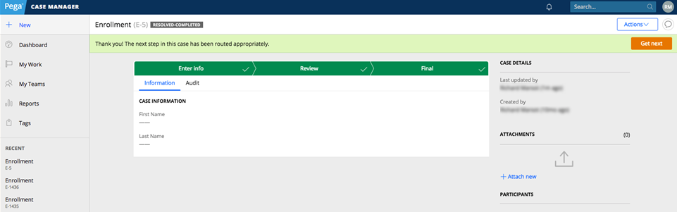
- Tree and tabbed screen flows have an updated look and feel.
- Case Status has moved from Case Details to the header and uses the new Badges that are supported in the skin.
- The Tools widget has been moved from the right column to the menu.
- Case stage chevrons are now displayed across the entire width of the screen.
Alternate desktop portal
The new alternate desktop portal for the Case Manager, Case Worker, and Pega Express portals includes the navigation menu and New button in the header. The navigation menu is displayed as a horizontal menu in the header, and the main layout uses the full width of the screen. A responsive mode displays the left navigation menu when there is not enough space to display the entire portal.
The alternate desktop portal
The alternate desktop is best used for portals that have fewer than four navigation menus. If a portal has more than four menus, use the default left navigation portal. To use the alternate desktop portal, open Channels and interfaces, select the Case Worker or Case Manager application view, and select the alternate desktop from the menu.
Mobile updates
The UI-Kit-7 (09-01-01) ruleset improves the mobile experience with new harnesses for case manager and case worker that include worklist sorting. Mobile screen flows show the current item and hides sub-cases and action buttons resize themselves depending on the number of buttons shown. A new mobile menu slides up from the bottom of the screen and the New menu displays across the full width of the screen with a slide-up transition.
- Work area harnesses have a sticky header and footer.
- The case action buttons have moved to the footer in a simplified perform harness.
- The View case button opens the review harness.
- Tools are now found in the Actions menu in three sections: Case-related, Social, and Admin.
- The mobile offline indicator is more prominent.
- The login page is mobile specific.
Badge support
Badges provide application users with a visual indicator of the work status. The Badges mixin in the skin rule now supports badges in Pega® Platform applications. The Badge text formatted text skin format uses the Badges mixin. Within this formatted text format, you can specify one of six badge types. You can edit the badge color in the skin instead of in the CSS of your application. The pyEndUser skin contains the styles for the badge. The text of the badge uses the Badges typography mixin. The color for each badge is contained in the Backgrounds mixin.

The badges available in the pyEndUser skin.
You can add badges to a section or to a layout by adding a Formatted text rule. On the property panel Presentation tab, select Badge text as the control format. In the Advanced Presentation Options, select the helper class for the badge color that you want.