Improvements and enhancements in UI-Kit-8
The release of UI-Kit-8 includes several improvements and upgrades that provide a foundation for standardizing on common pieces of UI functionality. UI-Kit-8 is now included in the list of built-on applications when you create an application by using the New Application wizard.
UI-Kit-8 included as a built-on application
UI-Kit and UI-Kit-Express are no longer added to the application ruleset list by the New Application wizard. Instead, UI-Kit-8 and UI-Kit-Express are added to the list of built-on applications in the application rule. When you upgrade your application to the latest version of UIKit, include UIKit in the list of built-on applications by opening the application and clicking Add Application in the Built on applications section. In the list of applications, add UIKit. You can also upgrade a Pega Express application in the same way by adding UI-Kit-Express to the list of built-on applications.
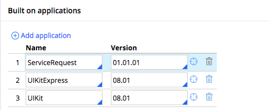
UI-Kit-8 included as a built-on application
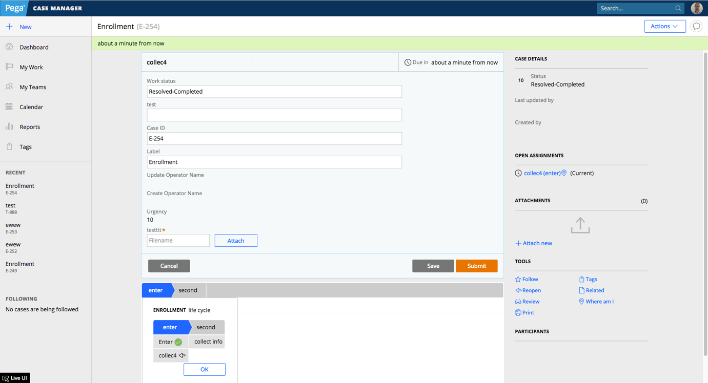
New case and Pulse icons relocated
The New case icon has been moved to the left menu panel, and case stages have been moved to below the action area. The Pulse icon is now displayed at the top-right of the screen to allow keyboard accessibility. Case details have moved from below the work area to a panel on the right side of the screen. A new case view widget is available in the Review harness.
The new Workarea harness type.
Workarea harness type
UI-Kit-8 includes the new Workarea harness type that supports a fixed header that stays in place while the user scrolls. The Workarea harness supports the following screen layout properties that are controlled in the General tab of the screen layout properties:
- Header and content
- Header, content, and footer
- Content and footer
- Content only
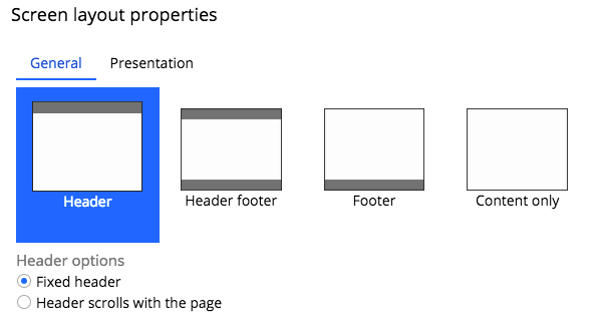
Screen layout properties showing header and footer options