Top Ten Usability Guardrails
Summary
The user interface is the most broadly visible aspect of your application. In these times, many if not all users of your application have extensive experience with web-based forms and applications, and so they have well-developed expectations and habits. The user interface you design and build affects users' productivity, acceptance, accuracy, and satisfaction, and so is a critical factor in implementation success.
Pegasystems professional staff have developed, tested, and reviewed dozens of Process Commander applications in a variety of industries and organizational settings. This article summarizes ten good practices when building Process Commander applications. Like other "guardrails", these standards are not absolute; some exceptions are appropriate in specific situations.
- Be consistent
- Pay attention to alignment and whitespace
- Don't ignore the user
- Minimize data entry
- Customize thoughtfully
- Avoid visual clutter
- Watch out for excessive clicking
- Balance content and navigation
- Less is more
- Test your design's usability!
1. Be consistent
Make the styles, color palettes, images, icons and fonts, consistent throughout your application.
- Avoid background colors for captions and read-only fields.
- Select a header style and use it consistently.
- Put your buttons in consistent places on every screen.
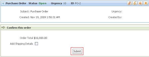
In the form below, the Submit button is on the far right:

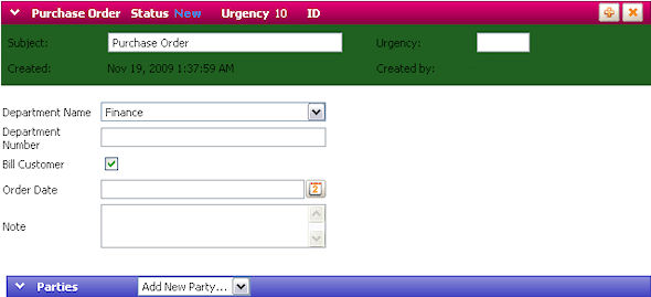
In the next screen, the Submit button is centered, causing delay or confusion. To maintain consistency, keep buttons in the same location on every screen.
- Use consistent wording in labels and messages.
- Use simple color schemes.
The screen below uses acceptable color schemes.

The screen below uses a color scheme that makes it hard to read.
Do not use Inline Styles.
- Use Inline styles for individual cells only be used for singular, unique instances
- If a style is to be used elsewhere, update your Application Skin to include that style and leverage it where needed. This allows you to make changes globally.
2. Pay attention to alignment and whitespace
Line up all fields:
- All text boxes and select boxes should be the same width, to eliminate the jagged look. Left and right alignment is required.
Minimize unnecessary whitespace between cells and rows, but avoid making your screen look compacted.
Alignment of fields:
- Left-justify caption texts
- Mark any required fields with a
 star on the right side of the caption (This is an automatic feature of the Application Skin wizard).
 - Align labels with fields – both vertically and horizontally
- Align fields across multiple
 sections and
  layouts.
The alignment of the screen below to the left is acceptable. However, the input fields are too close together. The screen on the right provides more vertical space between fields and is easier to read.
Proper use of whitespace
- Make good use of screen space. Eliminate horizontal scrolling, and reduce vertical scrolling as much as possible, as users move through your forms, while leaving sufficient white space so the forms are easy to read. Use layouts to position two sections side by side, so that the user can see more of the form at one time. For complex presentations, consider using tabbed layouts to simplify display and navigation.
Although a layout like this one requires no vertical scrolling...
...it may be too wide for some screen displays and require horizontal scrolling. Reduce the gap between the two sections to resolve this issue.
3. Don't ignore the user
Involve the users in the design process. They will feel invested in the application.
- Use feedback to understand the tasks and goals and create your design.
- Show the user prototypes and incorporate their suggestions to improve the application.
Understand limitations
- Use business rules and task knowledge to balance and validate the feedback you obtain from users. User feedback is sometimes based on emotion instead of tasks.
- People are naturally adverse to change. Show them how their jobs can be improved with your Process Commander application.
4. Minimize data entry
Don't ask users to enter data that the system already knows and could provide beforehand (punctuation in numbers, dates, and so on). This reduces time spent on a task.
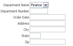
- Use automatic lookup features that fill in fields automatically based on user input.
For example, after the user enters a zip code, the city and state can be automatically filled in.
Think about how users input data (usually through either a keyboard or mouse). Make sure the data entry process is streamlined so the user is not constantly toggling between the two input methods.
Don't mark fields as required unless they are truly necessary.
Prevent data entry errors as early as possible, even before a user submits the form.
- The screen below does not indicate that any fields are required, None are marked with a
- star.

- However, after clicking
Submit
- , the user learns that
Quantity
- is a required field. The user did not know this and is now must spend more time on the task.

5. Customize thoughtfully
There are correct ways to customize without breaking the design guardrails.
- For example, use HTML Property rules that accept parameters. In the example below, many options exist if you want to customize the appearance of the Order Date field. Click the
 magnifying glass next to the field and pick the appropriate item next to Display As.
Create an auto-generated, model-driven user interface.
Design with the user in mind, by analyzing the tradeoffs between usability and staying with Auto Generated UI elements.
Business and user requirements should be the driver, not opinion.
6. Avoid visual clutter
Don't try to fit everything on one form. Ii will take a user more time to complete one long complicated screen than two simple screens.
The example screen has clutter in the form of redundant headers, fields too far aligned to the right – which requires horizontal scrolling, and far too much whitespace.
Design for modularity. Design small pieces of the screen so that they can be easily changed and reused.
Understand the target screen resolution size you are developing for. Your own PC's resolution may be different; this affects the layout and functionality of the screen.
Avoid horizontal scrolling. No one wants to scroll from right to left to see more information.
In the screen below, the user must scroll to the right to see the Shipping Information, this creates unnecessary work.
7. Watch out for excessive clicking
Minimize the number of steps and other navigation that a user has to perform to complete a task.
- The primary goal is task completion, not reducing clicks.
- Eliminate unnecessary confirmation screens, mandatory fields and open sections.
Set the keyboard focus to the first field when the form is displayed.
Notice the focus in the screen below is on the first field – Address Line 1.

Ensure that when the user does need to click or navigate somewhere, that it is clear where they are going and what they are expected to do.
8. Balance content and navigation
Decide on one primary navigation method. Use it to drive all user interaction with the application.
- Avoid mixing tree navigation, tab navigation and dropdown navigation for the same task.
Employ navigation systems that provide appropriate methods based on content and available tasks.
- Do not try covering every possible eventuality – you will produce a complex, multilayered application that is difficult to use.
9. Less is More
Avoid excessive use of title bars and headers..
- Headers must be necessary, purposeful, and provide value. Most of the headers in the example screen below are redundant.

Don't use UI features simply because they are available.
- When choosing UI components, make sure they support intent-driven processes and enhance the ability of a user to complete a task.
10. Test your design's usability!
Build usability testing into your project plan.
Set quantitative usability goals early and design to meet those goals.
- Valid Usability Goals include:
- Reducing number of steps to complete a task
- Reducing the elapsed time to complete a task
- Increasing automation
- This practice reduces the vagueness of just trying to make the application easy to use, instead you now have specific goals for the design.
- Use performance reports to identify steps in a process that take a long time to complete.
Usability testing early lets you fix the issues before they become a problem.