
 Harness, Section,
and Flow Action forms
Harness, Section,
and Flow Action forms
Adding a section
|
|
A section rule can appear within another section, within a harness rule, or within a cell of a layout. (You cannot edit a section that is within a cell directly; open the section rule.)
Sections define reusable rectangular sub-areas of a harness, section, or flow action. For example, the standard section Work-.CoreSummary is included in both the Work-.New and Work-.Perform harness rules. This achieves modularity, ensures a uniform appearance, and reduces the number of rules you need to maintain and update when you later need to revise work object forms.
 Before you save a Harness, Section, or Flow Action
form, review and adjust the layout. If a section is
expanded when you save the form, it appears initially expanded
at runtime; if a section is collapsed when you save the form,
it appears initially collapsed at runtime.
Before you save a Harness, Section, or Flow Action
form, review and adjust the layout. If a section is
expanded when you save the form, it appears initially expanded
at runtime; if a section is collapsed when you save the form,
it appears initially collapsed at runtime.
You can embed sections within sections within sections.
The maximum recommended depth is four levels.
 Drag and drop the Section
control
Drag and drop the Section
control
Click the down-arrow ( ) at the right end of the Layout control group
(
) at the right end of the Layout control group
( ) and select the Section control
(
) and select the Section control
( ). Drag the control. When the pointer changes
shape to indicate that you can drop the control, release the
mouse button. Click the magnifying glass
). Drag the control. When the pointer changes
shape to indicate that you can drop the control, release the
mouse button. Click the magnifying glass to display the
Containers panel.
to display the
Containers panel.
Drop the section in a cell. Complete the Section Include panel.
You can add a new section to an existing section rule in either of two ways: nested or peer. A peer section appears below the current section rule, and may present properties from a different page (of a different class) than the Applies To class in the key of the current section.
To include an additional section as a nested section:
 )
into a cell. The cell border becomes yellow.
)
into a cell. The cell border becomes yellow. )
and complete the Section Include panel.
)
and complete the Section Include panel.To include an additional section as a peer to the current section:
 to present the SmartFrames
wireframe preview.
to present the SmartFrames
wireframe preview.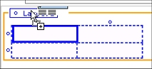 Drag and drop the section control
()
onto the Layout box at the top of a section. The entire
layout border becomes yellow.
Drag and drop the section control
()
onto the Layout box at the top of a section. The entire
layout border becomes yellow. Case A: Section is in a table cell
— Cell Properties panel
If the section is in a table cell, complete all three tabs
of the Cell Properties panel. If the panel is pinned
( ), the wireframe presentation on the
rule form changes immediately to reflect of your inputs. If
the panel is not pinned (
), the wireframe presentation on the
rule form changes immediately to reflect of your inputs. If
the panel is not pinned ( ), click
Apply to apply your inputs.
), click
Apply to apply your inputs.
Field |
Description |
| Use Section |
|
| Refresh When |
Optional. Enter a simple Java expression evaluated upon JavaScript events as part of a client event to cause this section to refresh from the server when the expression evaluates to true. For example, enter .Color =="Blue" in this field to make this section refresh when the property Color changes to the text value Blue. See Implementing dynamic form actions and the Client Event Editor. |
Field |
Description |
| Width |
Optional. Enter a positive number for the width in pixels of this cell. (At runtime, normal browser processing for rendering tables determines the actual displayed width.) This field appears only when the Unit field in the Layout panel or
Repeat panel (for the layout containing this cell) is
set to
|
| Height |
Optional. Enter a positive number for the height in pixels of this cell. (At runtime, normal browser processing for rendering tables determines the actual displayed height.) This field appears only when the Unit field in the Layout panel or
Repeat panel (for the layout containing this cell) is
set to
|
| Visible |
Select |
| When |
|
| Run on Client |
This field appears only if you select Select to indicate that the When field contains a simple property comparison test that will be evaluated on the user workstation in response to a client event. See Implementing dynamic form actions and the Client Event Editor. Clear to indicate that the When field contains a when condition rule name or an expression to be evaluated once upon initial display of the form. |
| Read Only |
Select to cause the section to be presented in read-only styles, even when the form is in read-write mode, always or conditionally. |
| When |
This field appears only when you select the Read Only check box. |
Field |
Description |
| Read-Write Style |
Click the pencil icon ( |
| Read-Only Style |
Click the pencil icon ( |
| Inline Style |
To apply inline styling to this cell only, type a CSS style definition in this field, or click the magnifying glass to access a Style Editor window. Styles you enter in this field supplement and override style elements defined in style sheets, according to standard CSS rules. Inline styles are recorded in the generated HTML for the form; they do not alter the CSS definitions. Using the Style EditorYou can select the font, color, font size, borders, margins, and other attributes of this cell using selection lists. The Style Editor maintains a preview of the resulting presentation. If you alter the style definition directly, click Apply to update the preview. Click OK to record the style defined with the Style Editor in the panel. |
If the section you entered is not within a cell, complete the
Section Include panel.
Field |
Description |
| Include Section |
You can review or change the section you identified earlier. |
| Visible When |
Optional. To control visibility of the section, enter or select one of the following:
|
| Refresh When |
Optional. To force refresh of this section based on a test , enter a simple Java expression evaluated upon JavaScript events involving a property comparison or multiple property comparisons using the || and && operators and parentheses. |
| Using Page |
Identify the name of the page that is the basis for fields (properties) within this section. Leave this field blank if the page is the one matching the Applies To key part of the rule. |
| View Privilege |
|
| Update Privilege |
|
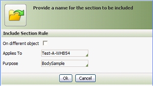
 Select or confirm the Purpose
key part of the section rule. Click the pencil icon
Select or confirm the Purpose
key part of the section rule. Click the pencil icon
 )
) ), then drag the border.
  ), then drag the border.
  If a user holds the privilege in the
View Privilege field but does not hold
the privilege identified in this field, the section
appears in read-only format. In this case, default
values for fields are not shown.
If a user holds the privilege in the
View Privilege field but does not hold
the privilege identified in this field, the section
appears in read-only format. In this case, default
values for fields are not shown.