
 Harness, Section, and Flow Action forms
Adding a layout

|
|
Every section and every flow action contains at least one layout (or other form of repeating layout). A layout defines a rectangular area on the form corresponding to the HTML <TABLE > element. Proj-649 5.4
You can add layouts above or below the current layouts.
 1. Adding and
deleting layouts
1. Adding and
deleting layouts
Click the down-arrow ( ) at the right end
of the Layout control group (
) at the right end
of the Layout control group ( ) and select
the layout control (
) and select
the layout control ( ). Alternatively, click the
Layout control group itself to pop-out the Layout control group
window. Drag the control on to the work area. When the pointer changes
shape to indicate that you can drop the layout, release the mouse
button.
). Alternatively, click the
Layout control group itself to pop-out the Layout control group
window. Drag the control on to the work area. When the pointer changes
shape to indicate that you can drop the layout, release the mouse
button.
Alternatively, you can select an existing layout and click the
Insert Row Above ( ) or Insert Row Below (
 ) button to add a new one above or below the selected
one.
) button to add a new one above or below the selected
one.
To delete a layout, select the layout and click the Delete Row
button ( ), not the Delete Cell button.
2. Complete the
Layout Options form
Select a radio button and complete this form to control the appearance of the grid. Then click OK.
Field |
Description |
| Template |
Select to create a SmartLayout
grid containing fixed-width, fixed-height column pairs. Each
column pair is designed to hold one label and one field,
typically for a Select a template:
|
| Repeating |
Select to create a layout that can present values from a
|
| Freeform |
Select to create a freeform layout providing you with full control over the width and height of each cell. Use this option in special situations where a the restrictions of a SmartLayout are not appropriate. For example, use freeform when a cell of the layout must contain a large control such as an embedded section, list view, List-to-List control, or Work Area control. Enter two positive integers to control the initial number of rows and columns in the grid. |
 You can convert a SmartLayout to a
freeform layout at any time. However, use care, because the reverse is
not possible. You can't directly convert a freeform layout to a
SmartLayout.
You can convert a SmartLayout to a
freeform layout at any time. However, use care, because the reverse is
not possible. You can't directly convert a freeform layout to a
SmartLayout.
 The SmartLayout capability is introduced in
V5.5. If you have a harness, section, or flow action rule created in a
release before V5.5, you can update the rule to use SmartLayouts,
which provide more consistent spacing and use of styles. See How to convert a
section or flow action rule to SmartLayouts.
The SmartLayout capability is introduced in
V5.5. If you have a harness, section, or flow action rule created in a
release before V5.5, you can update the rule to use SmartLayouts,
which provide more consistent spacing and use of styles. See How to convert a
section or flow action rule to SmartLayouts.
3. Complete the
Layout panel — Top fields
Click the magnifying glass icon ( ) to open the Layout panel.
Complete the top fields, General, and Advanced tabs. GRP-229
Field |
Description |
||||||||||||||||||||||||
| Format |
Choose a format to control what appears above the layout (known as a header or subheader), and aspects of the body. This choice primarily affects styles and appearance.
Information in or below a subheader (including Using the Branding wizard, you can review or revise the styles (colors, fonts, padding and margins) associated with each header or subheader format.
|
||||||||||||||||||||||||
| Title |
Enter text to appear in the header or subheader. This text may include directives or JSP tags, such as <p:r > or <pega:lookup >.
This field is not visible if the Format
field contains |
||||||||||||||||||||||||
| HTML |
If the Format field contains
|
||||||||||||||||||||||||
| Template |
If this is a SmartLayout, you can change the template selected previously. If you change the Template to
|
||||||||||||||||||||||||
| Visible When |
Optional. To control visibility of this header, enter or select one of the following:
To make a dynamic condition, enter a simple Java comparison of a property and a value, or a combination of such comparisons using parentheses and the && and || operators, such as: (.Width >= "20") && (.Length >= "40) This causes dynamic execution of the condition each time the value of a property mentioned in the condition changes. (Mark the fields containing such properties as a Client Event.) |
4. Complete the
Layout panel — General tab
Complete the General tab.
Field |
Description |
||||||||||
| Header Type |
Select one of the following header styles. This field does
not appear if the Format value is
|
||||||||||
| Expand When |
If blank, the state of the layout (expanded or collapsed) when you save the Harness, Section, or Flow Action form becomes the state upon initial runtime presentation. |
||||||||||
| Style Prefix |
For example, type A in this field to use styles named .A_standardheader* rather than the normal .standardheader* styles. Define the prefixed styles in your workform_zzzzz.css text file (created by the Branding wizard) or in another text file that you identify on the Scripts and Styles tab of the Harness form. |
||||||||||
| Defer Load? |
This field appears for |
||||||||||
| New Tab Group |
For Header Type of |
||||||||||
| New Layout |
For Header Type of |
5. Complete the
Layout panel — Advanced tab
Complete the Advanced tab.
Field |
Description |
| Body Visible When |
Optional. To control visibility of the body of the layout, enter or select one of the following:
|
| Width |
|
| ID | Optional. Enter an alphanumeric ID for this layout, for use in JavaScript functions. |
| Header Image |
Optional. Click the magnifying glass icon( |
| Allow changes to Template |
Select to convert this SmartLayout to a quasi-freeform layout, allowing you to add or remove columns.
If all restrictions are removed, you can change the height of individual rows, or the width of individual columns. |
Use the Column Properties panel to change the type of a column, to change the width of a freeform column, or to apply an inline style to all cells in the column.
 To view or
change column properties, click a column header and then click the
magnifying glass icon ( ).
To view or
change column properties, click a column header and then click the
magnifying glass icon ( ).
Click the magnifying glass icon ( ) at the top of a SmartLayouts column to open
the Column Properties panel. The contents of this
panel differs depending on whether the column is part of a Smart
Layout.
Field |
Description |
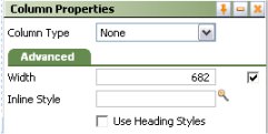
| Column Type |
Select a Column Type. For SmartLayouts,
drag and drop operations work best when adjacent cells have
the |
| Advanced tab | |
| Width |
Set the column width in pixels. This field does not appear for columns that are part of a SmartLayout. |
| (no label) |
Clear the Use at Runtime checkbox to allow the browser at runtime to determine the width of this column based on the size of the column contents and the size of other columns. The width may vary from use to use depending on the contents of this cell and other cells. (When cleared, the generated HTML for this column includes a <TD> element with no WIDTH= attribute.) The Width value is used as you view the rule form, but not at runtime. For example, clear this checkbox if the cell is to contain a section rule that may be wide in some situations and narrow in others. Select the Use at Runtime checkbox to force the Width value to be used by the browser at runtime, even when data values in this column or in other columns would otherwise cause the browser to present a wider or narrower column. If checked, data values may sometimes wrap or appear truncated. This field does not appear for columns that are part of a true SmartLayout. |
| Inline Style |
Optionally, enter CSS code for an inline style for a cells
in the column. For guided assistance in composing a style
definition, click the magnifying glass icon ( |
| Use Heading Styles |
Select to change the cell HTML element from <TD> to <TH>, with a resulting style change. |
Each column in a SmartLayout has one of four types:
Field — Cells in this column have field
stylesLabel — Cells in this column have label
styles.Spacer — Cells in this column are
empty.None — No restrictions on cell
contents.When you use a SmartLayout template, field styles and labels initially appear in adjacent paired cells, making it easy to drag and drop properties with the associated label.
Cells in a SmartLayout Label
column ( ) have label styles applied by
default, but you are not limited to placing labels in the cell. Such
cells can hold a field (a property value), a section, or various other
controls. Similarly, cells in a SmartLayout Field column
(
) have label styles applied by
default, but you are not limited to placing labels in the cell. Such
cells can hold a field (a property value), a section, or various other
controls. Similarly, cells in a SmartLayout Field column
( ) have field styles applied, but can
hold a label, a field, a section, or other controls. You can override
many of the style attributes.
) have field styles applied, but can
hold a label, a field, a section, or other controls. You can override
many of the style attributes.
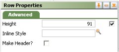 Use the Row
Properties panel change the type of a row, or to apply an
inline style to all cells in the row.
Use the Row
Properties panel change the type of a row, or to apply an
inline style to all cells in the row.
To view or change row properties, click the circle at the left end
of the row. Then click the magnifying glass icon ( ) at the right end
of the row. The contents of this panel differs depending on whether
the row is part of a SmartLayout.
Field |
Description |
| Advanced | |
| Height |
Optional. Enter a positive number for the height in pixels of this cell. (At runtime, normal browser processing for rendering tables determines the actual displayed height.) This field appears only when no columns in the Layout not
controlled by SmartLayout column restrictions (that is, all
columns have the
|
| (no label) |
Clear the Use at Runtime checkbox to allow the browser at runtime to determine the height of this row based on the size of the row contents and the size of other rows. The height may vary from use to use depending on the contents of this cell and other cells. (When cleared, the generated HTML for this column includes a <TD> element with no HEIGHT= attribute.) The Height value is used as you update the rule, but not at runtime. For example, clear this checkbox if the cell is to contain a section rule that may be tall in some situations and short in others. Select the Use at Runtime checkbox to force the Height value to be used by the browser at runtime, even when data values in this column or in other cells would otherwise cause the browser to present a taller or shorter column. This field does not appear for rows that are part of a true SmartLayout. |
| Inline Styles |
Optionally, enter CSS code for an inline style for a cell
in the column. For guided assistance in composing a style
definition, click the magnifying glass icon ( |
| Make Header? |
Select this option to have the heading styles apply to each cell in the column. |
Creating and
deleting rows and columns
Use the cell controls to add rows and columns, delete rows or columns, or merge cells.
In most cases, select an object in the layout before clicking an icon. Certain operations may be unavailable depending on your selection and the layout characteristics.
Control |
Description |
|
Delete the contents of a single cell (not a row or column) |
|
|
Insert a new row before (above) the selected row |
|
|
Insert a new row after (below) the selected row |
|
|
Delete the selected row or layout |
|
Merge right — Combine the selected cell and the cell to the right. |
|
Merge down — Combine the selected cell and the cell below it. Proj-649 5.4 |
|
Unmerge All — Undo the previous merges. GAGNP 5/07 |
The Insert column before ( ), Insert column after(
 ), and Delete column (
 ) operations are not available for Smart
Layout columns. They are available in Freeform layouts.
) operations are not available for Smart
Layout columns. They are available in Freeform layouts.
 By design, you
cannot change the height or width of SmartLayout
template-based cells through rule form updates. However,
Process Commander records the template cell height and widths
in styles for the <TD> HTML element. If at runtime a
cell contains an object that is explicitly larger than these
values, browsers do expand the table cell to attempt to
display the entire object, overriding the fixed size
restriction. The resulting display may vary somewhat by
browser version.
By design, you
cannot change the height or width of SmartLayout
template-based cells through rule form updates. However,
Process Commander records the template cell height and widths
in styles for the <TD> HTML element. If at runtime a
cell contains an object that is explicitly larger than these
values, browsers do expand the table cell to attempt to
display the entire object, overriding the fixed size
restriction. The resulting display may vary somewhat by
browser version. A when condition rule. Click the pencil icon
 )
) The display may truncate
(partially obscure) a data value if the value is wider
than width defined by the pixel value. GROVS
8/24/06
The display may truncate
(partially obscure) a data value if the value is wider
than width defined by the pixel value. GROVS
8/24/06 As a
best practice, use SmartLayouts to achieve uniform height of
cells throughout your application's forms. You can set
the row height of SmartLayout templates using the
Branding wizard.
As a
best practice, use SmartLayouts to achieve uniform height of
cells throughout your application's forms. You can set
the row height of SmartLayout templates using the
Branding wizard. ), then drag the border.
PROJ-281
), then drag the border.
PROJ-281