|
Apply fonts and colors to most UI elements in a single step.
Complete the Initialization Method field. Choose:
none — To build a skin by supplying all
elements. No initialization is performed and all options on the panel
disappear. Click Next>> to advance to
the next wizard step.quick create — To build a skin by supplying a
font name, an image for the portal title bar logo, and the main and
accent colors.
![]() If you are in modify or copy skin mode (Name
and Location — Step 1) and select
If you are in modify or copy skin mode (Name
and Location — Step 1) and select quick
create, updates to settings on this panel overwrite colors and
fonts you may have customized in later steps. If you want to keep the
current look of the skin, select none.
Pick font
Select a font for your skin. This font is applied generally to all text elements.
Pick colorsv6.1 proj-242 grp-2027
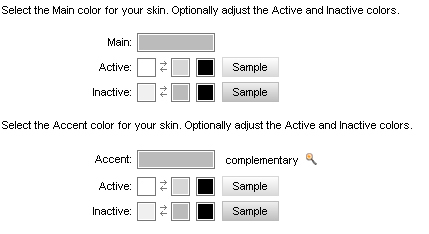
Use the color selection area to automatically apply colors to many of the backgrounds and borders used by interface components.

To modify the default colors:
Use the Preview button to see which elements are affected.
If you are using gradients, three boxes are displayed. Use the first and second boxes to blend colors for a horizontal two-tone effect. The third box is for text. The left box is the upper color, the right for the lower. For example, yellow and red are blended as shown here:You can swap colors (upper and lower) by clicking the arrows (
) between the boxes.
If you are using flat colors (the Use Background Gradients (IE Only) checkbox was cleared), there is no color box for blending a gradient. In this example, the background is brown and the text is yellow:
Click Preview to open in a new window a rendering of the UI elements as configured so far. To view the rendering on a traditional Pega portal, click Preview Traditional Portal in the preview window.
Click Next>> to advance to Smart Layouts, Step 3.
Click <<Back to return to the previous step.
Click Save to save your updates to the skin rule.
Click Cancel to discard your updates and exit the wizard.
Click Finish to save your updates and exit
the wizard. This action opens a panel containing an array of rules
comprising the skin and its associated portal and text rules. Click the
edit button (![]() ) to open a rule. Click Reopen Skin to return to the first step, or click
Cancel to exit the wizard.
) to open a rule. Click Reopen Skin to return to the first step, or click
Cancel to exit the wizard.