|
Define basic characteristics for work object forms defined through harness, section, and flow action rules in your application, including the font and background colors.
The settings in this category can be refined with increasing levels of granularity in the other categories. For example, the settings in the General section are applied, where appropriate, to the Panel Set element in the Layouts category. If you set the general background color to yellow and leave the panel backgrounds transparent, yellow is applied to all. However, if you apply another color (green, for example) in the Top panel, green is applied.
none if you do not want to modify the background (no fill).
Otherwise, do the following:
solid,
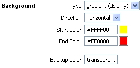
image, or gradient (IE only) background,
appropriate fields are displayed for the type.solid, you can use the pop-up color picker by clicking
the box to the right of the field.gradient (IE only), you can use the
Direction field to blend the colors horizontally or vertically. For
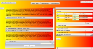
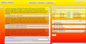
example, if you use the horizontal setting with these colors:


image, do the following:images/AlphaCorpLogo.gif file name in the
Location field. To search for an image, click the
magnifying glass button (webwb directory).None if you want
to use a single image; set to Horizontal if you want a
single row of images across the background. The starting image is
positioned according to the horizontal and vertical position controls.
Here are some examples:In this example, the position of the single logo (no tile) is top left:
In this example, the tile array is based upon the first logo at the top left position:
In this example, the array of icons is based upon the first logo in both center positions:
Enter the typeface configuration used for links
Enter the typeface configuration used for labels.
Click Preview to open in a new window a rendering of the UI elements as configured so far. To view the rendering on the traditional Pega portal, click the Preview Traditional Portal button in the preview window.
Click Next>> to advance to the next wizard step and specify additional characteristics.
Click <<Back to return to the previous step.
Click Save to save your updates to the skin rule.
Click Cancel to discard your updates and exit the wizard.
Click Finish to save your updates and exit
the wizard. This action opens a panel containing an array of rules
comprising the skin and its associated portal and text rules. Click the
edit button (![]() ) to open a rule.
) to open a rule.
Click Reopen Skin to return to the first step, or click Cancel to exit the wizard.