
 Harness, section, and flow action forms
Completing the Layout tab — Adding a Menu Bar

|
|
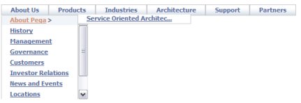
 In a composite portal, a menu bar
can allow the user to switch among spaces. In a flow action or sections
within a work object form, a menu bar can execute activities or call
JavaScript functions.
In a composite portal, a menu bar
can allow the user to switch among spaces. In a flow action or sections
within a work object form, a menu bar can execute activities or call
JavaScript functions.
The structure of a menu bar is defined by a navigation rule. Because the navigation rule undergoes stream processing and can reference clipboard property values, the runtime menu choices available may differ based on user and context. 5.5 GRP-237 K Chen
Follow these steps to include a menu bar in a composite portal. This facility depends on rules of various types:
 1. Define the
menu structure with a Navigation rule
1. Define the
menu structure with a Navigation rule
2. Drag and drop
the Menu control into a section
Create a section rule to hold the menu.
A new section contains an initial layout, in SmartLayout format.
From the Layout tab, select and add a
second layout, of type Free Form with one row and one
column, below the SmartLayout. Delete the SmartLayout.
Drag to adjust the width and height of the cell to hold the expanded menu display. Using default styles, each menu row (or tab) requires about 30 pixels of height. You can fine-tune the cell size later.
Click the down-arrow ( ) at the right end
of the Advanced control group (
) at the right end
of the Advanced control group ( ) and select the menu bar control
(
) and select the menu bar control
( ). Drag the control.
When the pointer changes shape to indicate that you can drop the
layout, release the mouse button.
). Drag the control.
When the pointer changes shape to indicate that you can drop the
layout, release the mouse button.
3. Complete the
Cell Properties panel — Top fields
Parameters to the standard Control rule MenuBar control the menu display.
Field |
Description |
||||||||||||||||||||||||||
| Property |
Retain the placeholder property pyTemplateMenuBar. (This property is not used.) |
||||||||||||||||||||||||||
| Control |
Retain the default Control rule
MenuBar. Click the magnifying glass icon (
|
||||||||||||||||||||||||||
| Behavior |
Leave blank. Not used. |
4. Complete the
Cell Properties panel — General tab
The General tab controls when the menu is visible. In most cases, accept the default values; the menu is always visible.
Field |
Description |
| Visible |
Select to determine when the menu appears. Select:
|
| Condition |
A menu that is not visible is also disabled and cannot be accessed. |
| Required |
Not used for menu bars. |
| Wrap Text |
Not used for menu bars. |
| Read-Only |
Not used for menu bars. |
5. Complete the
Cell Properties panel — Advanced tab
Style information on the Advanced tab is not meaningful for menu bars.
Field |
Description |
| Default Value |
Leave blank. |
| Width |
This field appears only when the cell is not controlled by SmartLayout column restrictions. Enter a positive number for the width in pixels of this cell. (At runtime, normal browser processing for rendering tables determines the actual displayed width.) You can also adjust the width this column directly:
|
| Height |
Optional. This field appears only when all columns in the Layout are not controlled by SmartLayout column restrictions. Enter a positive number for the height in pixels of this cell. (At runtime, normal browser processing for rendering tables determines the actual displayed height.) You can also adjust the height of a row directly:
|
| Read-Write Style |
Not used. |
| Read-Only Style |
Not used. |
| Inline Style |
Not used. |
| Use Heading Styles |
Not used. |
 ) to enter parameters for the
menu. Complete the following parameters:
) to enter parameters for the
menu. Complete the following parameters: If you selected
  ), then drag the border.
PROJ-281
), then drag the border.
PROJ-281 ), then drag the border.
PROJ-281
), then drag the border.
PROJ-281