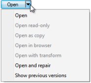
 Split button
 A split button control has two parts.
The button part (on the left) allows a user to select a default option, or choose a different option. The arrow part (on the right) presents a drop down list of alternatives.
Use the standard control rule SplitButton to present a property as a split button.
- Set the
Captionparameter to one value, the label for the button part. - Set the
SplitButtonparameter to true.
This control is useful for properties with a Local List or other form a table, when one choice is dominant within a group of a dozen or fewer choices, and the text values are short.
By default, clicking the button or selecting from the drop-down does not submit the form. You may configure client event processing to occur upon click.
 For an example of a similar control rule that submits a form following the user selection with a split button, see the similar control rule FindWorkGadget.

|
About Control rules |

|
Atlas — Standard control rules with parameters |
 Definitions — S