
 Harness and Section forms
Adding a DataGrid control

|
|
 The DataGrid control is deprecated. Update an existing DataGrid to a Grid control. For guidelines on upgrading, see Upgrading deprecated and outdated controls on the PDN.
Use a DataGrid control to allow users to view or edit values of a Page List or Value List property, as an alternative to the Column Repeat or Tabbed Repeat control.
Basics
The DataGrid control provides application users with an attractive, compact table or matrix for reviewing, editing, and sorting tabular data. Depending on configuration details, the control allows substantial editing to occur within a browser window, with bulk updates occurring only when the form is submitted. (Alternatively, using AJAX calls, server updates can occur a row at a time.)
Based on the standard control DataGrid and the <pega:dataGrid > JSP tag, this control provides three modes:
Runtime interaction
 Several user actions are available at runtime, depending on DataGrid parameters:
 to append a new row to the grid.
 to insert a new row above the selected row.
 to delete a selected row or rows.
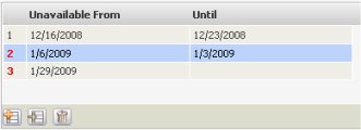
SHIFT+click or CTRL+click to select multiple rows.For an example of the Cell Edit mode, review the Scheduled Absence area on the Work Settings tab of any Operator ID form. The contents of this tab of the Operator ID form are defined in the standard section named Data-Admin-Operator-ID.WorkSettings.
Step 1. Plan
Identify the Page List or Value List property to be presented as a DataGrid. For a Page List, determine the Page Class of the property and the embedded Single Value properties that are to appear as columns in the grid.
The DataGrid control updates property values; it does not add a property to the clipboard. Evolve your application so that the Value List or Page List property is present on the clipboard — even if it has no rows — when the DataGrid is presented to the user.
Step 2: Define a section to allow editing of one row
If the property is a Page List and you plan to allow editing of an element through a section display, create a section to allow user input and editing. Set the Applies To key part of this section to the Page Class of the property.
Step 3. Add a placeholder into the cell
Access the Layout tab of the harness or section that is to contain the control, or the Form tab of the Flow Action form. Click the down arrow ( ) in the Basic control group (
 ) and drag a Text box control
  and drop it in the destination cell.
Step 4: Complete the Cell Properties panel
Complete the Cell Properties panel for the text box control. Complete the Property field with the Page List or Page Group property you identified in Step 1.
Set the Control field to DataGrid.
Complete the General tab and Advanced tab parts of the Cell Properties panel to meet application needs. See Adding a Text Input control — General tab and Adding a Text Input Control - Advanced tab a Text Input control — Advanced tab.
Ensure that the width and height of the panel are sufficiently large to support the initial display of the DataGrid.
Step 5: Supply control parameters
Click  at the right of the Display As field. Enter parameter values for the DataGrid control:
Field |
Description |
||||||||||||||
| Data Grid Columns Property Type |
Select |
||||||||||||||
| Page List Property Name or Value List Property Name |
|
||||||||||||||
| Applies To |
|
||||||||||||||
| Width |
Optional. Enter a width in pixels for the DataGrid display. If left blank, the system determines the width based on current contents of the control. |
||||||||||||||
| Height |
Enter a height in pixels for the DataGrid display. |
||||||||||||||
| Ordered DataGrid |
Select to allow the user at runtime to insert, delete, and move rows using drag and drop, copy, and paste operations. The index value (an integer starting at 1) appears in a read-only column. Leave cleared to allow the user at runtime to sort rows by any column, by clicking the column header. In either case, the order of rows when the form is submitted and saved becomes the order of values in the |
||||||||||||||
| Enable Editing |
Select |
||||||||||||||
| Custom Section for Row Editing |
|
||||||||||||||
| Append/Insert buttons visibility |
Select:
|
||||||||||||||
| Condition |
|
||||||||||||||
| Delete buttons visibility |
Select:
|
||||||||||||||
| Condition |
 If you selected If you selected Other Condition for the previous field, identify here a when condition rule that determines whether the delete buttons are visible. |
||||||||||||||
| Row Selection |
Select Users can use CTRL-click to select multiple, non-contiguous rows, or SHIFT-click to select all rows between the current row and the row most recently selected (whether above or below the current row). These actions are similar to those used with other familiar Windows controls. |
||||||||||||||
| Immediate Update of Data Source |
If the Enable Editing value is
If not selected, user edits are sent to the PRPC server only when the user form (or flow action form) is submitted. This checkbox is visible only when the Enable Editing value is |
||||||||||||||
| Data Columns |
Use this DataGrid control to identify and describe the columns of the DataGrid control you are building. Complete at least one row. Order is significant in this array; at runtime, the top row of this array becomes the leftmost column of the DataGrid.
|
Step 6: Save and Test
 Use with caution. Your application may need to provide a way for users to explicitly "undo" such rows. The clipboard retains these updates unless your application removes them. The next Commit operation causes the changes to be saved into the database.