 Harness and Section forms - Adding a Grid layout

|

|
A Grid layout presents data in aligned columns and rows, as a spreadsheet. Grids are highly performant and can display expansive data sets using progressive paging. There are numerous options for configuring read-only and editable grids.
Using grid layouts, users can view (and in certain cases edit) values of a Data Page, Page List or Page Group property, or a report definition, in a spreadsheet format. The layout can display a custom skin; is cross-browser compatible; is sortable by column; fields can be configured to be editable and localizable.
When a grid is bound to a data page or report definition that accepts parameters and the parameter value uses a property reference, the grid automatically refreshes whenever the property value changes.
Note: If the source for the grid is a report definition, and the Header display field on the Report Definition Report Viewer tab is set to "Hide column headings", the column headings do not appear in the grid.
If you are building a Mobile application, see Supported user interface features for mobile applications.
 and select
  .
.  in the Grid Repeat Layout to open the Properties panel.
You can also set properties for columns, rows, and action areas.
You can also add a grid layout by dragging the Page List, Page Group, Data Page, or Report Definition that you want to use as the data source from the Application Explorer into the section. You can reference a Page List embedded in any of level of pages; for example Page.Page.PageList.
![]() The UI Gallery contains working examples of grid layouts. To view and interact with examples and review configurations, select
The UI Gallery contains working examples of grid layouts. To view and interact with examples and review configurations, select  > User Interface > UI Gallery. Explore the examples in the Tables & Grids category.
You configure many elements in a grid layout using properties panels. To display the panels, select an element and click  . To select an element, click the following:
Property fields may appear at the top of the panel or in one or more tabs. If the panel is pinned ![]() , click Apply to apply your changes. Click the red x at the top right of the panel to close it. If the panel is not pinned, click Apply to apply your changes and continue editing, or OK to apply your changes and close the panel.
, click Apply to apply your changes. Click the red x at the top right of the panel to close it. If the panel is not pinned, click Apply to apply your changes and continue editing, or OK to apply your changes and close the panel.
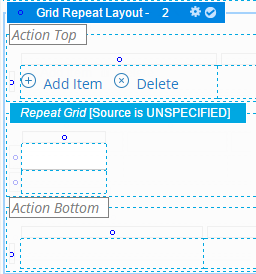
The Grid layout has three areas:


Select a column in the repeating area and open its properties panel.
| Width |
Select to specify the width of this column in pixels. You can also adjust the width of a column directly:
|
| Inline Style |
Optional: Override the stylesheet settings in this cell with local values. Enter CSS code for an inline style for a cells in the column. For guided assistance in composing a style definition, click |
| Filtering |
Appears if the Filtering check box is selected on the Repeat Grid panel. Select a filtering option for this column:
|
| Enable Sorting |
Appears if the Enable Sorting check box is selected on the Repeat Grid panel. This is checked by default. Clear to disable sorting on this column. |
| Categorize by this column |
Appears if the Categorize grid rowscheck box is selected on the Repeat Grid panel. Configure the grid column. Select if you want categorize grid rows based on this columns within the grid. You can select the columns by which you want to categorize the grid, and specify sorting and ascending or descending order Note: Categorizing all columns within a grid would not yield any data columns at runtime. |
| Importance |
Select an importance level for the column. Importance determines which columns display first when a responsive breakpoint is reached. Only one column can have primary importance. This column appears before all secondary columns. When responsive breakpoint is reached at runtime, the columns marked Other are dropped first. At a second responsive breakpoint, the remaining columns are converted to a list, with the Primary column being displayed in the a heading. Any unmarked columns are treated with Secondary importance. |

Select either row in the repeating area and open its properties panel.
|
Height |
Enter a positive number for the height in pixels of this cell. (At runtime, normal browser processing for rendering tables determines the actual displayed height.) You can also adjust the height of a row directly:
|
| Inline Style | Optional. Open the Style Editor panel for this cell to override the stylesheet settings with local values. |
| Make Header? | Select to display all the cell values in the row with the same style that the column heading uses. |

Select a cell from the second row in the repeating area and open its properties panel.
|
![]() The delete icon appears at the right of the repeating row in this area, to indicate how and where it appears at runtime. Do not use it to attempt to remove cells or rows while editing the layout.
The delete icon appears at the right of the repeating row in this area, to indicate how and where it appears at runtime. Do not use it to attempt to remove cells or rows while editing the layout.
Field |
Description |
| Advanced Presentation Options | |
|
|
|
| Cell width | Specify the width of the column in pixels. Provides the same control as the Width setting in the Column properties panel. |
| Cell height | Specify the height of the cell in pixels. Provides the same control as the Height setting in the Row properties panel. |
| Cell read-write classes | Specify a default value for this field. Click the magnifying glass beside it to display the Expression Builder, where you can select or create an expression to generate the default value. Leave the field blank if it does not require a default value. |
| Cell read-only classes | Optional. Type the name of the custom style, for example, custom_stylename, that you want to apply to this cell when the user form or flow action form appears in read-write mode. Define custom styles in the Skin rule. See Skin form — Custom. |
| Cell inline style | Optional. Type the name of the custom style, for example, custom_stylename, that you want to apply to this cell when the user form or flow action form appears in read-only mode. Define custom styles in the Skin rule. See Skin form — Custom. |
The Grid layout has two action areas, one at the top and one at the bottom of the display. You can use one or both.

If you use both, configure each action area separately.
Select Action Top or Action Bottom, then display the properties panel. Select a column header and open its properties panel.
| Visible When | Optional. To control the visibility of the area, enter or select one of the following:
As a best practice, use the Condition Builder to edit this field. Click |
| Run on Client? | Appears when you enter a simple expression in the Visible When field. Select to cause dynamic execution of the condition each time the value of a property stated in the condition changes. |
Advanced tab
| ID | Optional. Provide an identifier for this grid, for JavaScript use. Start with a letter, use no spaces, and include only alphanumeric characters, dashes, or underscores. |
Select a column in one of the action areas and open its properties panel.

| Width | Specify the column width in pixels.
Clear the Set width during execution check box (unlabeled) next to the width field to allow the browser at runtime to determine the width of this column based on the size of the column contents and the size of other columns. The width may vary from use to use depending on the contents of this cell and other cells. (When cleared, the generated HTML for this column includes a <TD> element with no WIDTH= attribute.) The Width value is used as you view the rule form, but not at runtime. For example, clear this check box if the cell is to contain a section that may be wide in some situations and narrow in others. Select (default) the Set width during execution check box to force the Width value to be used by the browser at runtime, even when data values in this column or in other columns would otherwise cause the browser to present a wider or narrower column. If checked, data values may sometimes wrap or appear truncated. |
| Inline Style | Optional. Enter CSS code for an inline style for a cells in the column. For guided assistance in composing a style definition, click  to open the Style Editor. You can select from predefined lists or type a style definition directly, and preview the results. to open the Style Editor. You can select from predefined lists or type a style definition directly, and preview the results. |
Select the row in the top or bottom action area and open its properties panel.

| Height |
Enter a positive number for the height in pixels of this cell. Clear the Set height during execution check box (unlabeled) to allow the browser at runtime to determine the height of this row based on the size of the row contents and the size of other rows. The height may vary from use to use depending on the contents of this cell and other cells. (When cleared, the generated HTML for this column includes a <TD> element with no HEIGHT= attribute.) The Height value is used as you update the rule, but not at runtime. For example, clear this check box if the cell is to contain a section that may be tall in some situations and short in others. Select the Set height during execution check box to force the Height value to be used by the browser at runtime, even when data values in this column or in other cells would otherwise cause the browser to present a taller or shorter column. |
| Inline Style | Open the Style Editor panel for this cell to override the stylesheet settings with local values. |
| Make Header? | Select to display all the cell values in the row with the same style that the column heading uses. This is an alternative to individually selecting the Use Heading Styles check box for each column. This option is unchecked by default. |

Add a control, property, or other section that is appropriate to the display and function of your data. Configure the section's properties by selecting it and then displaying the properties panel. For buttons, see Section and Flow Action forms — Adding a Button Control.
When you select a Header Style of Tabbed, the layout appears in a Tab Group wireframe. Select it to make it active and click  in the header to open the Tab Group properties panel. Your settings apply to all the tabs in the group.
Complete the top field and General tab. There are no settings on the Advanced tab.
Top field
Field |
Description |
| Format |
Select the styles you want to apply to the tabs in the group. Select:
|
General tab
Field |
Description |
| Tab Position |
Select the placement of the tabs at runtime:
If you select |
| Tab Orientation | If you selected a left or right Tab Position, select to display tabs horizontally or vertically. Horizontal is the default. If you select vertical orientation, the tab title is rotated based on the tab position, left or right. |
| Stretch Tabs | Select to stretch the horizontally or vertically to fit the available space. If the Tab Position is Top or Bottom, tabs stretch horizontally; if the Tab Position is Left or Right, the tabs stretch vertically. |