 Harness and Section forms
Adding a list-to-list control

|

|
Note: this control is deprecated in Pega 7.
Use a list-to-list field to allow a user to make multiple selections from a drop-down list. For example, a meeting may involve a dozen people from a department that has 100 employees.
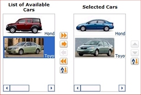
 In the example, the source list (on the left) contains car models, and the destination list (on the right) contains car models the user has selected.
By interacting with the icons or captions at the right of each list, you can add to, remove from, and sort the destination list. List elements added to the destination are removed from the source list.
You can continue to make changes to the list contents until the form is submitted.
For another example, see the PDN article How to add a list-to-list control to a flow action rule.
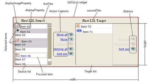
Five icons and captions control transfers between the two lists:
| Icon | Caption | Description |
|
|
Move all
|
Add all entries in the source list to the destination list. |
|
|
Move
|
Add the selected entry or entries in the source list to the destination list. |
|
|
Remove all
|
Remove all entries from the destination list. |
|
|
Remove
|
Remove the selected entry or entries from the source list. |
|
|
Sort asc
|
Sort the source list. |
| Three icons and captions allow you to reorder the target list: | ||
| Icon | Caption | Description |
|
|
Move up
|
Move up the selected entry in the target list by one position. |
|
|
Move Down
|
Move down the selected entry in the target list by one position |
|
|
Sort the target list. | |
You can use SHIFT+CLICK to make multiple selections in either list. You can also use Windows drag-and-drop operations to move selected items to or from either list. Standard Windows keyboard operations for selection also work.
By default, the target list can contain up to 200 list elements. Through a parameter, a developer can choose a larger or smaller limit.
Buttons and captions are dimmed (gray) when not available. The entire list-to-list control is dimmed when presented in read-only mode.
1. Plan and prepare
Determine the name of the report definition or clipboard page (a Page List or class Code-Pega-List) that supplies the values for the source list.
When specifying a clipboard page as the source of values:
Page List can be of any class.When planning to have an activity assemble the clipboard page, create an activity that creates a page corresponding to a Page List property to hold the source list. If the pages in the list correspond to persistent instances in a class, the activity can simply consist of a few steps, such as the Obj-Browse method optionally followed by the Obj-Filter method. At least one non-blank embedded text property is required on each page (for example pyLabel). Values for this property need not be unique.
Alter the flow rule or other application processing so that the activity executes before the user interface element that includes the list-to-list control is rendered. (For example, if the list-to-list control is to be part of a flow action form, you can identify the activity in the Before this Action Run Activity field on the Action tab.)
Identify the Page List property that is to hold the selected pages (the destination list). Usually the embedded pages of this property belong to the same class as the embedded pages of the source list (from the Report Definition or clipboard page). The destination list can have pages of a different class, however, in this case, you must make sure the source embedded properties are mapped to the target embedded properties, and that the mapped properties in the target are supported by the target class's data structure.
 Optionally, the embedded pages of the Page List properties (for both source and destination) can contain a TrueFalse property with the reserved name pySelected. At runtime, the initial display of the list-to-list control presents any items for which pySelected has value "true". This property has no other effect.
Click the down-arrow ![]() at the right end of the Advanced control group and select the List to List control .
at the right end of the Advanced control group and select the List to List control .
Drag the control. When the pointer changes shape to indicate that you can drop the layout, release the mouse button. If the cell is not empty, the dropped control replaces the current contents of the cell. Click ( ) to display the Cell Properties panel.
Complete the Cell Properties panel that appears.
Enter parameters for the ListtoList control, to control these runtime elements:

Field |
Description |
| Property |
Accept the default placeholder value @baseclass. pyTemplateListToList. |
| Label | Check the check box to accept the property default; or uncheck the check box and, in the field that appears, select or provide a label. |
| Label format | Select one of the available options. |
| Default value |
Click
|
| Visibility | Select to determine when the property value is to appear. Always is the default. (If this setting is not applicable, the cell contents are blank.)
Check the Reserve space when hidden check box, if it appears, to have a blank area appear in the section when the paragraph is hidden.
|
| Behavior |
Not used with List-To-List. The list-to-list control does not support the OnChange event. |
Check the Required check box to make this a required field.
Field |
Description |
| Edit Options | Select an edit mode for this control. The edit mode of the control, specified here, takes precedence over section and harness settings.
|
| Advanced Options |
|
Configuring parameters for this deprecated control is only supported in Internet Explorer.
See Actions.
Although the standard control ListToList exists, it supports the capabilities described in this topic only. Because of its non-standard capabilities, do not specify ListToList as the Display Property on the General tab of a Property form.
The generated HTML code for a list-to-list control is a resizable <TABLE > structure.
This control depends on hidden HTML fields (<INPUT TYPE="HIDDEN" ..>).
For advanced cases, you can bypass the steps described in this topic and create a section with hand-crafted HTML code containing the <pega:listtolist > JSP control, which offers many additional options beyond the parameters listed in Step 4 above. See ListToList JSP tag.
You can localize this control by overriding selected standard field value rules named @baseclass.pyMessageLabel.zzzzz and @baseclass.pyButtonLabel.zzzzz, where zzzzz is the default English text.