|
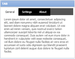
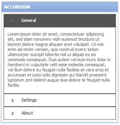
A layout group is a way to display a set of content such as a list of financial accounts and related transactions. The layout group allows you to specify the type of navigation a user will use to navigate sets of information. For example, this could be a tab for each account, or by simply changing the type, the account list can be rendered as either a drop-down menu, accordion, tabbed, or list. Additionally, a layout group is a way to present information responsively that is normally shown within one control-type. A layout group can be rendered as a tab control, an accordion, a stacked format, or a drop-down menu according to screen size. A layout group can contain any number of dynamic layouts, column layouts, repeating dynamic layouts, or other layout groups.
![]() Layout groups are available only to user interfaces rendered in HTML5 Document Type (standards mode). Layout groups have been designed to comply fully with WCAG accessibility guidelines.
Layout groups are available only to user interfaces rendered in HTML5 Document Type (standards mode). Layout groups have been designed to comply fully with WCAG accessibility guidelines.
With a layout group, what would usually appear as a tab control on a regular desktop or laptop converts to a different navigation mechanism on a touch device, negating the need for horizontal scrolling. You can set responsive breakpoints, enabling the layout to adjust to the available space. When the user resizes to the default or custom breakpoint dimensions, tabs turn into an accordion or a menu.
If using a touch device that supports swiping, the user can swipe to navigate across available content in tabbed or menu-style layout groups. Select the Enable swipe action check box below the Display header and title check box. The swipe action setting is enabled by default. With this setting, visible indicators appear on the left and/or right when additional content is available to view. These swipe indicators are shown when a user presses or taps down on the device and are hidden when the user lifts ("taps up") from the screen or moves to another area.
Customizing swipe indicators
You can use customized CSS to change the following behaviors of swipe indicators:
While there are no options to configure the swipe indicators in the skin rule form, you can override the pzBaseCore classes to adjust indicator styling. The preferred option is to add an additional style sheet to the skin rule form and define the styling there.
For example, to override the default swipe indicators with an image called psMyCustomRightSwipeIndicator.png in the library webwb, you would use the following code:
.swipe-indicator {
background-color:transparent;
border: none;
opacity: 1;
}
.left-swipe-indicator {
border-radius:0;
background-image:url(webwb/pzMyCustomLeftIndicator.png);
}
.right-swipe-indicator {
border-radius:0;
background-image:url(webwb/pzMyCustomRightIndicator.png);
}
There are four style formats for layout groups:


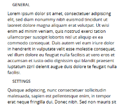
Stacked
Panes are selectable by a stacked format.

Each layout type can be styled independently in the skin, presenting a large number of display options.
A preview of the currently selected format displays to the right. You can also preview formats by selecting Actions > Launch in the toolbar and then choosing one of the following preview options: Run Process, Open Portal, Harness Preview, UI Gallery Preview, Skin Preview.
Applies to the general styles for layout groups (rendered as a menu, accordion, or tabs).
| Default text |
Select Use mixin to apply the skin's standard active mixin. You can then override individual font attributes by clicking Add Mixin Overrides. Select Specify styles to define all your own font attributes independently of the mixin.
You can modify the following attributes:
|
| Default border |
Select Use mixin to apply the skin's standard active mixin. You can then override individual border attributes. Select Specify styles to define all your own border attributes independently of the mixin.
You can modify the following border style attributes:
|
| Default background |
Select Use mixin to apply the skin's standard active mixin. Select Specify styles to define your own border attributes independently of the mixin. You can modify the following default background attributes:
|
| Minimum height |
Specify the minimum height that the dynamic layout will display in the format you specified to ensure content is consistent when swiping on a touch device. Leave minimum height at 0 when a range is not desired. |
| Allow opening of multiple panes | Select this check box if you want to create a multi-expand accordion that allows you to open any number of panes. |
| Hide header on touch devices |
Choose the Menu style format to select this check box if you want to hide the menu header on a mobile device when swiping content to navigate the layouts. |
| Hide expand icon on touch devices |
Choose the Menu style format to select this check box if you want to hide the expand icon from displaying on a mobile device when swiping content to navigate the layouts. |
| Enable support for responsive breakpoints |
Select this check box if you want to add a responsive breakpoint to the layout group. When the screen size reaches the dimensions that you specify, the layout group format changes to the type you specify: Tab, Accordion, or Menu.
|
Control-Specific Styling
Applies to the layout-specific styles for the layout group panel. These options apply individually to the rendering of accordions, menus, and tabs.
| Height, Left Padding, Right Padding |
Determines the position of the labels (tab name, accordion pane names, or menu names) in the layout group. |
| Collapse icon, Expand icon |
Applies only to accordions. Specify an image for collapsing a pane and for expanding the pane. Choose the horizontal position: Left, Right, Center. Set a width (gap) in pixels from the left, center, or right of the panel (according to position) |
| Tab Panel Alignment |
Applies only to tabs. Specify the alignment of tabs within the layout group: Left, Right, Center. Also specify Inner Spacing: the spacing between the tabs. Also specify a Left Offset or Right Offset to determine the space between the first tab or last tab from the left or right side of the layout group. |
| Image, Width, Horizontal position |
Applies only to menus. Specify a menu image. Choose the horizontal position: Left, Right, Center. Set a width (gap) in pixels from the menu label (according to position) |
| Enable rounded corners only for first and last tabs | Applies only to tabs. Restrict rounded corners to the first and last tab only. |
| Tab Panel Background |
Applies only to tabs. Select to use the default background you specified for the layout group (in General settings) or specify a tab panel-specific background using the current mixin or by specifying styles. See Default background for a description of options.
|
| Tab Panel Border |
Applies only to tabs. Select to use the default border you specified for the layout group (in General settings) or specify a tab panel-specific border using the current mixin or by specifying styles. See Default border for a description of options.
|
| Typography |
For all tab states or individually for the Active Text, Inactive Text, and Hover Text, choose from the following:
|
| Borders |
For all tab states or individually for the Active Border, Inactive Border, and Hover Border, choose from the following:
|
| Backgrounds |
For all tab states or individually for the Active Background, Inactive Background, and Hover Background, choose from the following:
|
| Padding |
Determines the position of the text in the layout group. Choose the same padding on all sides or specify the top, right, bottom, and left padding in pixels. |
Display-Specific Styling
Applies to the layout-specific styles for the text content inside the layout group panel. These options apply individually to the rendering of accordions, menus, and tabs.
| Border |
|
| Background |
|
Creating a custom layout group style
To create a new style format:
If you want to create a new format that is a copy of an existing format, right-click the format that you want copy and then click Clone.

|
 Help Home