|
|
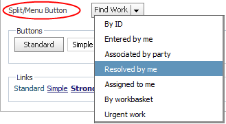
Styles set here apply to the menu items in a split/menu button. this topic is intentionally vague 6/26/12
To preview changes, save the rule and click Run ( ). In the Skin Preview, select the Controls tab.
Use the same formatting
| Use the same formatting for Active and Inactive States |
Applies the same settings to menu items in active and inactive states. A menu item is active when a user hovers the mouse pointer over the menu item. Clear this check box if you want define different styles for active and inactive states. Additional fields appear. |
Text
Applies to the text of the menu item.
| Use mixin |
Select to use a mixin to define the appearance of this element. The Mixin field displays the name and a preview of the currently selected mixin. Click
|
| Specify styles |
Select this check box to define a custom text format:
|
Border
This setting is not used.
Background
Applies to the background of the menu item.
| Use mixin |
Select to use a mixin to define the appearance of this element. The Mixin field displays the name and a preview of the currently selected mixin. Click
|
| Specify styles |
Select this check box to define a custom background: Select the background Type:
|

|

 Skin form — Components tab — Controls — Split/menu button
 to select a different mixin from the list.
 About Skin rules
 Help Home