Skin form — Components tab — Controls — Menus |
|
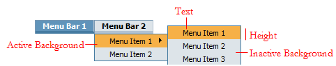
Styles set here apply to the list of items in a menu.
A preview of the currently selected format displays to the right. You can also preview formats by selecting Actions > Launch in the toolbar and then choosing one of the following preview options: Run Process, Open Portal, Harness Preview, UI Gallery Preview, Skin Preview.
| Use the same formatting for Active and Inactive States |
Applies the same settings to menu bars in active and inactive states. A menu item is active when a user hovers the mouse pointer over the menu item. Clear this check box if you want define different styles for active and inactive states. Additional fields appear. |
Applies to the text of the menu item.
| Use mixin |
Select to use a mixin to define the appearance of this element. The Mixin field displays the name and a preview of the currently selected mixin. Click
|
| Specify styles |
Select this check box to define a custom text format:
|
This setting is not used.
Applies to the background of the menu item.
| Use mixin |
Select to use a mixin to define the appearance of this element. The Mixin field displays the name and a preview of the currently selected mixin. Click
|
| Specify styles |
Select this check box to define a custom background: Select the background Type:
|

|
 to select a different mixin from the list.
 About Skin rules