Traditional portals are supported to provide backwards compatibility. As a best practice, use composite portals in newly developed applications.
The labels, layout appearance and function of links and other controls on a traditional portal can be customized to match the context of your application and your organization's vocabulary. You can delete or hide functions used rarely or that do not apply to your processes. Such changes can improve user productivity and reduce training time by presenting users with assignments, images, words, and phrases they already understand.
Several objects affect the traditional portal layout that a worker or manager experiences:
Note: Although the Data-Gadget class is the Applies To key part for workspace gadgets, this class never contains persistent instances.
The Process Work, Dashboard, and Monitor Activity workspaces are used heavily by application workers and managers, and so offer the best opportunity for tailoring.
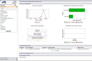
The example at right presents the default Dashboard workspace for a manager, based on the standard portal rule named WorkManager. This contains three workspaces (Dashboard, Monitor Activity, and Process Work) that together reference 19 gadgets. Each gadget defines the appearance and behavior of a rectangular portion of the navigation panel (on the left) or workspace (on the right).
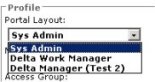 Log off and log in again. On the Dashboard workspace, the Portal Layouts area becomes a selection list (as in the example to the right), allowing you to quickly switch from portal to portal without logging out.
 to expand one or more rows on the Tabs tab. The Narrow Column array identifies controls (gadgets) that appear in the navigation panel. The Wide Column array identifies controls that appear in the workspace area. Both contain a Gadget Name, an optional text label (that can incorporate property values certain to be present on the clipboard using a Reference directive), and an optional image. Order is significant in both arrays — the system presents the first rows at the top of the panels.icon as needed. Save the Portal form and test at regular intervals.
So far you have deleted, relabeled, and rearranged standard gadgets. To introduce your own gadgets:
Set the Applies To key part for HTML rules and activities to Data-Gadget.
You can copy and modify a standard gadget HTML rule to simplify development. (As with portal rules, choose a different Stream Name when copying; it is preferable not to override a standard rule in this situation.) The following may be helpful starting points:
Your HTML code may use facts about the current user and context, available as properties on the pxRequestor page. If you do this, add this page name (and its class, Code-Pega-Requestor) on the Pages & Classes tab of the HTML form.
To replace the Pega logo, create a new binary file that is the same size as the standard binary file rule webwb.logo_metal.gif, and reference it in the Options tab of the portal rule.
To replace the Pega watermark image, override the standard binary file rule webwb.logowatermark.gif, or override the BODY style in the text file rule webwb.desktop_metal.css.

|
access group, portal, requestor page |

|
About Portal rules |

|
Atlas — Standard portal rules |
 User Interface category