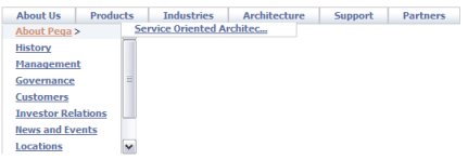
Note: This control is deprecrated in Pega 7 Platform.
In a composite portal, a menu bar can allow the user to switch among spaces. In a flow action or sections within a user form, a menu bar can execute activities or call JavaScript functions.
The structure of a menu bar is defined by a navigation rule. Because the navigation rule undergoes stream processing and can reference clipboard property values, the runtime menu choices available may differ based on user and context.

Follow these steps to include a menu bar in a composite portal. This facility depends on rules of various types:
Create a new navigation rule in that defines the structure and elements of the menu. See About Navigation rules.
Create a section to hold the menu.
A new section contains an initial layout, in SmartLayout format. From the Layout tab, select and add a second layout, of type Free Form with one row and one column, below the SmartLayout. Delete the SmartLayout.
Drag to adjust the width and height of the cell to hold the expanded menu display. Using default styles, each menu row (or tab) requires about 30 pixels of height. You can fine-tune the cell size later.
Click the down-arrow ![]() at the right end of the Advanced control group and select the menu bar control. Drag the control. When the pointer changes shape to indicate that you can drop the layout, release the mouse button.
at the right end of the Advanced control group and select the menu bar control. Drag the control. When the pointer changes shape to indicate that you can drop the layout, release the mouse button.
Field |
Description |
| Property |
Retain the placeholder property pyTemplateMenuBar. (This property is not used.) |
| Label |
Select this check box to use the default label for the property. If this check box is cleared, in the field that appears, select or create a label. |
| Label format |
Select a format from the available options. |
| Default value |
Optional. Enter a constant value for the property value, a property reference, or an expression, to be used only when the user form or flow action form appears in read-write mode rather than read-only mode. Click Choose a default value that speeds data entry. When the system renders a harness or section in read-only mode (for example because the read-write mode requires a privilege that the current user does not hold), the default value does not appear, because data entry is not permitted. |
| Visibility |
Select to determine when the property value is to appear. Always is the default. (If this setting is not applicable, the cell contents are blank.)
Select the Reserve space when hidden check box, if it appears, to have a blank area appear in the section when the paragraph is hidden. Caution: Do not make an input field invisible if your application expects user input on the field. When a user submits an HTML form, an input field that is not visible is not included in the HTTP details. |
Select the Required check box to make this a required field.
Field |
Description |
| Edit Options | Select an edit mode for this control. The edit mode of the control, specified here, takes precedence over section and harness settings.
|
| Advanced Options |
Note: As a best practice, define custom styles in the skin.
|
Note: Configuring parameters for this deprecated control is only supported in Internet Explorer.
You can extend the XML Stream rules to take advantage of four features that make the menu bar facility flexible and powerful:
<pega:include > and <pega:when > to make the menu options depend on clipboard values.You can define styles for menu bars in the skin. You can also create custom menu formats in the skin. See Skin form — Components tab — Controls — Menus.