|
Override the General settings in this step or the colors selected in Quick Create.
Panel sections
Individually customize the border, text padding, and font for each of the panels used in a composite portal as well as for the container for all panels. These settings control the branding of the panels in a panel set in the General section.
Standard — Specify the fonts, border colors, background colors, and height of the Standard bar. The Main color entered in Quick Create is the default. You can individually configure the fonts, border, and background colors for an Expanded and a Collapsed bar using the option boxes displayed in the left and right columns, respectively.
Use the Body section to configure the colors and text padding used in the content area beneath the bar.
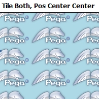
If you select Image as a body background you can use tile
patterns in arrays that are horizontal, vertical, or both (covering the
entire area).
In the example below, the tile pattern is based upon a logo positioned in the center (horizontal and vertical positions set to Center) of the background:
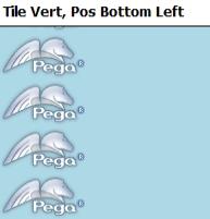
Here is an example of a vertical tile using positions bottom and left. The array is based on a logo in the bottom left corner:
Sub, A, B, C, and D — Use these sections to configure the sub bars and their bodies. By default, sub bars use the Accent color entered in Quick Create. Use the Outline section to define the border and background colors surrounding the header and body.

Modify the colors and fonts applied to accordions and sub-accordions. The Quick Create Main color is the default.
Row/Column
The settings in this format are rendered in repeating row or column layouts . See Adding a Row Repeat layout and Adding a ColumnRepeat layout.
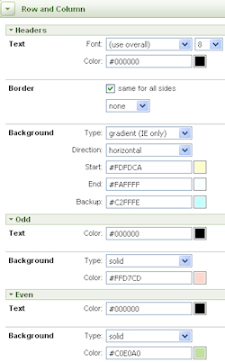
Apply colors and fonts to columns and to odd and even rows. Here is an example:
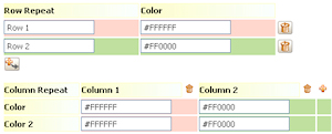
The results look like this:
![]() The field values in the preview are examples only and do not represent wizard selections.
The field values in the preview are examples only and do not represent wizard selections.
Spreadsheet, Transparent, and Default
These threee format settings are rendered in the repeating and action areas of the Grid, Tree Grid, and Tree layouts. See Adding a Grid layout, Adding a Tree Grid layout and Adding a Tree layout. All formats apply to the same layout elements but differ in their default settings. Spreadsheet and Transparent formats always start with the same default values and are not affected by Quick Create settings. You can modify any of the formats to suit your requirements. In Preview mode, use the Style pull-down menu to see your updates as they affect each format.
Use the sections to configure the following layout elements:
Standard Hidden — Use this section to configure a layout that does not have a header. Use the Indent option to move the panel to the right by a specified number of pixels.
Sub Hidden — Use this section to configure a layout without a header.
Complete this step to modify the colors and fonts applied to tabs and sub tabs. The Quick Create Main color is the Standard Tab default. The Accent color is the Sub Tab default.
An expanded header only (single column for fonts, borders, and background colors). The Main color is the default.
Provides no header area, but a border around the contents of the layout with a single text label.
Configure a body area for a custom configuration (an HTML field in an HTML rule defines the content and appearance). This UI element does not appear in preview mode.
Modify the colors and fonts applied to Standard (harness and section), Sub, and Page Repeat tabs. The Quick Create Main color is the Standard tab default. The Accent color is the Sub tab default.
In the example below, the standard tab background is gradient green (dark for active). The font is Arial in a larger size than the non-active tab. The body beneath the tabs is tan. The sub-tabs use dark and light blues to denote active or inactive states, respectively, and use a Times New Roman font.
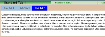
How to modify tab images
Three types of tabs appear in applications: standard tabs in a harness, standard
tabs in a section, and sub-tabs. Default background images are used to
render them. You can override images by selecting the image option for a background and entering a custom image. Expanding the width
beyond the width of the image creates a space between it and the
adjoining image. Reducing the pixel size cuts off the image at runtime.
Each tab comprises a left, middle, and right image. Variations of these images are used to differentiate a tab that is selected (active) or not selected (inactive).
![]() By default, the middle images (active or
inactive) are tiled across the tab and automatically sized to span the
left and right images to equal a total width of 110 pixels. Use the Auto
setting so that the width expands as text is entered in the tab.
By default, the middle images (active or
inactive) are tiled across the tab and automatically sized to span the
left and right images to equal a total width of 110 pixels. Use the Auto
setting so that the width expands as text is entered in the tab.
Combinations of the tab images comprise a tab rendering based upon the position and focus of the tab. The three positions are:
The examples below show the settings used for each tab position and its focus:
Left-most tab active

Middle tab active
![]()

Right-most tab active
![]()

![]() To achieve an overlap effect, use an overlap image in the
Left on Right Collapse and Right on Left. You can use the Image Viewer to
search for standard overlap images (for instance, search on the word
"overlap". Here is an example of a Left on Right Collapse
overlap:
To achieve an overlap effect, use an overlap image in the
Left on Right Collapse and Right on Left. You can use the Image Viewer to
search for standard overlap images (for instance, search on the word
"overlap". Here is an example of a Left on Right Collapse
overlap:

Section tabs and sub-tabs
Use the Dual Left and Dual Right settings. There are no overlaps. These images show the active and inactive states in the same image and must be the same height. Here is an example of the default settings:

Because there is no middle image, the right image must be as wide as
any text you put into the tabs. Use the Auto setting to
allow the width to expand with the text entered.
Click Preview to open in a new window a rendering of the UI elements as configured so far. To view the rendering on the traditional Pega portal, click the Preview Traditional Portal button in the preview window.
Click Next>> to advance to Custom, Step 5.
Click <<Back to return to the previous step.
Click Save to save your updates to the skin rule.
Click Cancel to discard your updates and exit the wizard.
Click Finish to save your updates and exit
the wizard. This action opens a panel containing an array of rules
comprising the skin and its associated portal and text rules. Click the
edit button (![]() ) to open a rule. Click Reopen Skin to return to the first step, or click
Cancel to exit the wizard.
) to open a rule. Click Reopen Skin to return to the first step, or click
Cancel to exit the wizard.