|
|

 Skin form — Styles tab
Styles set here apply to the active and inactive headers of accordion controls.
To preview changes, save the rule and click Run ( ). In the Skin Preview, click theAccordions tab.
| Use the same formatting for Active and Inactive headers | Applies the same settings to active and inactive headers. Clear this checkbox if you want define different styles for active and inactive headers. Additional fields appear. |
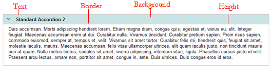
 Text
Text| Style Preset |
Displays the currently selected Style Preset. Click the magnifying glass ( |
| Use Custom Text |
Select this checkbox to define a custom text format:
|
 ) to select a different Style Preset from the Style Preset list.
| Style Preset |
Displays the currently selected Style Preset. Click the magnifying glass ( |
| Use Custom Border |
Select this checkbox to define a custom border:
|
| Style Preset |
Displays the currently selected Style Preset. Click the magnifying glass ( |
| Use Custom Background |
Select this checkbox to define a custom background:
|
| Height | Specify the height of the accordion header by entering a value in pixels. |
 Skin rules — Completing the Styles tab