Skin form — Components tab — General — Button area |
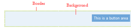
Styles that you set here apply to the background and border of button areas. A button area is the area surrounding buttons in a harnesses.
A preview of the currently selected format displays to the right. You can also preview formats by selecting Actions > Launch in the toolbar and then choosing one of the following preview options: Run Process, Open Portal, Harness Preview, UI Gallery Preview, Skin Preview.
Applies to the border of the button area.
| Use mixin |
Select to use a mixin to define the appearance of this element. The Mixin field displays the name and a preview of the currently selected mixin. Click If desired, you can specify the Top, Left, Right, or Bottom border as none, solid, dashed, or dotted , rather than inheriting the style from the selected mixin. |
| Specify styles |
Select to define a custom border:
|
Applies to the background of the button area.
| Use mixin |
Select to use a mixin to define the appearance of this element. The Mixin field displays the name and a preview of the currently selected mixin. Click
|
| Specify styles |
Select this check box to define a custom background: Select the background Type:
|

|
 to select a different mixin from the list.
 About Skin rules
 Help Home