Skin form — Components tab — Layouts — Trees & grids |
|
Styles set here determine the:
A preview of the currently selected format displays to the right. You can also preview formats by selecting Actions > Launch in the toolbar and then choosing one of the following preview options: Run Process, Open Portal, Harness Preview, UI Gallery Preview, Skin Preview. In the Skin Preview, click the Grids tab. Select the format you want to preview: Default, Spreadsheet, Transparent, or a custom format.
Set the text and background styles for the following:
Keyboard events, such as Enter to open an item.| Use default text for this grid format |
Select to use the default text specified in the Default text area on the General tab. |
| Use mixin | Select to use a mixin to define the color of the text. Mixin displays the name and a preview of the currently selected mixin. Click the magnifying glass icon to select a different mixin from the list. Only the text color from the selected mixin is applied. |
| Specify styles |
Select to define a custom style for the selected format and specify a Color for the text. Enter a hexadecimal value (such as #3d3d3d) or click the box next to the field to Choose a Color.
|
| Use default background for this grid format |
Select to use the default background color specified in the Default background area on the General tab. |
| Use mixin | Select to use a mixin to define the background color. Mixin displays the name and a preview of the currently selected mixin. Click the magnifying glass icon to select a different mixin from the list. |
| Specify styles | Select to define a custom style for the selected format and specify a Color. Enter a hexadecimal value (such as #3d3d3d) or click the box next to the field to Choose a Color.
Click No Fill if you want a transparent background.
|
Styles set here determine the color of the row beneath which a child row will be dropped and the icons that indicate whether the dropped row will be a sibling or child of the selected node.
You set these styles with the Default grid format; they are applicable to all grids, trees, and tree grids.
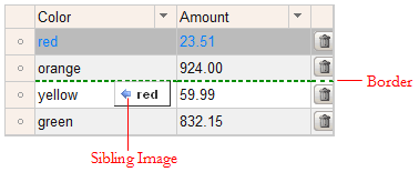
Sets the style for the line indicating where the selected row will be dropped.
| Use default border for this grid format |
Select to use the default border specified in the Default border area on the General tab. |
| Use mixin | Select to use a mixin to define the appearance of the border. Mixin displays the name and a preview of the currently selected mixin. Click the magnifying glass icon to select a different mixin from the list.
For the Top, Left, Right, and Bottom border, select to use the border specified in the mixin (from mixin) or select another option: none, solid, dashed, or dotted. |
| Specify styles | Select to define a custom border:
|
| Use default background for this grid format |
Select to use the default background color specified in the Default background area on the General tab. |
| Use mixin | Select to use a mixin to define the appearance of the background. Mixin displays the name and a preview of the currently selected mixin. Click the magnifying glass icon to select a different mixin from the list. |
| Specify styles |
Select this check box to define a custom background: Select the background Type:
|
For each of the following, specify an image to indicate whether the dropped row will be a sibling or child of the selected node in a tree or tree grid.
|
Sibling Image
No Drag Drop Image
Child Image |
Enter the location of the file, including the relative path. For example,
|
 to select the mixin. Alternatively, you can select custom color and enter the CSS hexadecimal value or click the box next to the field to
  About Skin rules