Show all
revise using new button control proj-428
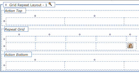
Tree, Grid, and Tree Grid layouts have action areas that can display buttons, above and below the repeating area (the image is of a grid layout):

The repeating area of these layouts can display an express action button; the action areas display action buttons. Both types of button can initiate a range of actions when clicked, either on the selected data row or rows, or to launch some other action such as creating a new work object.
Follow these instructions to add a button to a Tree, Grid, or Tree Grid layout.
 For buttons in harnesses, sections, and non-repeating layouts, see Harness, Section, and Flow Action forms - placing a button in a cell.
 1. Drag and
drop
Click the down arrow ( ) in
the Basic control group (
 ) and select the
Button control (
 ). Drag the Button control to the cell that is to
contain it.
When the pointer changes shape to indicate that a single cell is
selected, release the mouse button to drop the control.
If the cell is not empty, the dropped button replaces the current
contents of the cell.
 2. Complete the
GridAction properties panel — Top fields
Select the button, and then click the magnifying glass ( ) icon to display the Cell Properties panel (for express action buttons) or the Action Cell Properties panel (for buttons in action areas). With one exception, the fields here govern the grid, not its button. That exception is the Show when active checkbox on the Advanced tab of the properties panel of a cell in a repeating row where you place an express action button. Check this checkbox to have the express action button only appear for the row that is currently selected. If this option is not checked, the button will appear at all times for all rows in the grid.
Buttons in these layouts use the GridAction gadget. To access the gadget's properties panel, click the magnifying glass beside the Use Section field:

Fill in the fields at the top of the PegaGadget-GridAction panel that appears:
Field
|
Description
|
|
Type
|
Select Selected Item for the action to apply to the currently-selected row in the repeating area, such as inserting a row before or after the selected item.
Select Item for the action to apply to some other object, perhaps creating a new work object or initiating some other activity or flow.
|
|
Label
|
Enter a label for the button. As a
best practice, start the text with a verb. Consider the
collection of buttons that appear at runtime collectively;
provide button each with a clear and distinctive label. For
example, Cancel order.
To allow users to execute the button activity using a shortcut key combination, include an
ampersand character (&) immediately before a letter in
the caption text. At runtime, users can press the
ALT key and the letter key together to execute
the activity. For example, enter &History as a caption
text to allow users to access work object history with ALT +
h. At runtime, the button label appears with the shortcut key
underscored, as in Visual Basic applications. 5.2
11/27/06 GROVS BUG-1703
 If you use
shortcut keys in your application, be careful to choose
distinct letters for each button; you can't have If you use
shortcut keys in your application, be careful to choose
distinct letters for each button; you can't have
ALT + c as the label for both the Contents
button and Close button. (To include an ampersand in a label
as text, follow the ampersand by a space character.)
 Optionally, if
this button is within a cell of a section that includes
parameter declarations on the Parameters tab, you can enter the notation
param.NAME here, to use a parameter value for the
button caption, where NAME identifies a string parameter.
Make sure that the NAME parameter is declared on the
Parameters tab, and that your
application provides a non-blank value for the parameter
value in all possible situations where the section appears.
See Section
rules — Completing the Parameter tab.
Proj-1424 Optionally, if
this button is within a cell of a section that includes
parameter declarations on the Parameters tab, you can enter the notation
param.NAME here, to use a parameter value for the
button caption, where NAME identifies a string parameter.
Make sure that the NAME parameter is declared on the
Parameters tab, and that your
application provides a non-blank value for the parameter
value in all possible situations where the section appears.
See Section
rules — Completing the Parameter tab.
Proj-1424
|
|
Tooltip
|
Enter a sentence or phrase identifying to users
the purpose and function of the button. Providing a tooltip is important for explaining the button's function to users with assistive devices.
 As a best practice, start the Tooltip text for an
input field with a verb; for example, Cancel the order. As a best practice, start the Tooltip text for an
input field with a verb; for example, Cancel the order.
|
|
Description
|
Not used.
|
 3. Complete the
GridAction Properties panel — Action tab
Field
|
Description
|
|
Action
|
Select from the dropdown menu an action to associate with this button. If the button type is Selected Item, the options presented relate to the data object represented by the currently-selected row. If the button type is Item, the options presented cover a wider range of options and do not necessarily affect the currently-selected row.
|
|
Additional fields
|
Depending on the Action you select for the button, additional fields may appear to provide more detailed information concerning the action. If the action selected requires parameters, a Parameters section appears where you can specify them.
|
 4. Complete the
GridAction Properties panel — Advanced tab
There are four sections on this tab.
|
Icon Class
|
Use this field to specify an icon for the button. If you set this, the button does not need a label; however, make sure the button has a meaningful tooltip to help users understand its function.
To find the image path to enter in this field, select  > User Interface > Galleries > Image Gallery and browse the available images. When you find a good image for the button, select it, copy its Path from the Selected Image display and paste the path in this field. At runtime, the button displays the image you selected. > User Interface > Galleries > Image Gallery and browse the available images. When you find a good image for the button, select it, copy its Path from the Selected Image display and paste the path in this field. At runtime, the button displays the image you selected.
|
|
Show
|
You may want to make the button visible only under certain circumstances, or only to users with specific privileges.
- To base button visibility on circumstances, specify a When rule in the When field.
- To base button visibility on privileges, specify a Privilege in the Privilege field.
|
|
Enable
|
you may want to make the button enabled only under certain circumstances, or only for users with specific privileges.
- To enable and disable the button depending on circumstances, specify a When rule in the When field.
- To enable and disable the button depending on privileges, specify a Privilege in the Privilege field.
|
|
Additional Parameters
|
If the button's action, or the When rule it references, requires additional parameters, you can specify them in this section. Click the + button to add a row, select an existing parameter or create a new one, and specify a value for it
|
Click OK to accept all your changes.
 Adding a Tree layout
 Adding a Grid layout
 Adding a Tree Grid layout

 Tree, Grid, and Tree Grid layouts -
Adding a button


![]() For buttons in harnesses, sections, and non-repeating layouts, see Harness, Section, and Flow Action forms - placing a button in a cell.
For buttons in harnesses, sections, and non-repeating layouts, see Harness, Section, and Flow Action forms - placing a button in a cell.![]() 2. Complete the
GridAction properties panel — Top fields
2. Complete the
GridAction properties panel — Top fields
![]() 3. Complete the
GridAction Properties panel — Action tab
3. Complete the
GridAction Properties panel — Action tab
![]() 4. Complete the
GridAction Properties panel — Advanced tab
4. Complete the
GridAction Properties panel — Advanced tab