
 Gauge chart
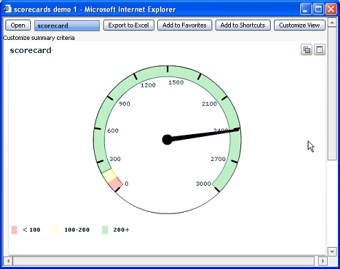
A gauge chart presents a single number as a meter reading. If the chart includes thresholds, a manager can review the chart quickly to determine whether this number is within a targeted range.
For example, this gauge chart reads 2400. The needle falls within the green threshold, indicating that 2400 is a good result, whereas values below 200 are not good.
To create an interactive gauge chart:
- Design and test a summary view report that has a single row in the Fields array of the Content tab.
- Optionally, configure one or more thresholds on the Content tab.
- On the Chart tab, select Use a Chart for the view?
- Select
Interactiveas the Chart Output Type. - Click Configure Interactive Chart. Select the
Gaugetype. Choose a subtype.
Gauge charts are sometimes called scorecard charts.

|
interactive chart, key performance indicator, slider, threshold |

|
About Summary View rules |
 Definitions — G