|

|

 Harness, section, and flow action forms
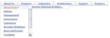
 In a composite portal, a menu bar can allow the user to switch among spaces. In a flow action or sections within a user form, a menu bar can execute activities or call JavaScript functions.
The structure of a menu bar is defined by a navigation rule. Because the navigation rule undergoes stream processing and can reference clipboard property values, the runtime menu choices available may differ based on user and context.
Follow these steps to include a menu bar in a composite portal. This facility depends on rules of various types:
- One or more hand-crafted Navigation rules define the structure of the menu and the actions that result from leaf-level menu choices
- The standard Control rule MenuBar.
- JavaScript functions, saved as a text file rule.
- Optionally, a style sheet saved as a text file rule.
- A section or harness that contains the control
- A composite portal that defines the spaces. (See How to create a composite portal.)
 1. Define the menu structure with a Navigation rule
Create a new navigation rule in that defines the structure and elements of the menu. (See About Navigation rules)
2. Drag and drop the Menu control into a section
Create a section to hold the menu.
A new section contains an initial layout, in SmartLayout format. From the Layout tab, select and add a second layout, of type Free Form with one row and one column, below the SmartLayout. Delete the SmartLayout.
Drag to adjust the width and height of the cell to hold the expanded menu display. Using default styles, each menu row (or tab) requires about 30 pixels of height. You can fine-tune the cell size later.
Click the down-arrow ( ) at the right end of the Advanced control group (
 ) and select the menu bar control (
 ). Drag the control. When the pointer changes shape to indicate that you can drop the layout, release the mouse button.
3. Complete the Cell Properties panel — Top fields
Parameters to the standard Control rule MenuBar control the menu display.
Field |
Description |
||||||||||||||||||||||||
| Property |
Retain the placeholder property pyTemplateMenuBar. (This property is not used.) |
||||||||||||||||||||||||
| Control |
Retain the default Control rule MenuBar. Click the magnifying glass icon (
|
||||||||||||||||||||||||
| Behavior |
Leave blank. Not used. |
 ) to enter parameters for the menu. Complete the following parameters:
 4. Complete the Cell Properties panel — General tab
The General tab controls when the menu is visible. In most cases, accept the default values; the menu is always visible.
Field |
Description |
| Visible |
Select to determine when the menu appears. Select:
|
| Condition |
A menu that is not visible is also disabled and cannot be accessed. |
| Edit Options | Select an edit mode for this control. The edit mode of the control takes precedence over section and harness settings.
|
| Required |
Not used for menu bars. |
| Wrap Text |
Not used for menu bars. |
| Read-Only |
Not used for menu bars. |
 If you selected
 5. Complete the Cell Properties panel — Advanced tab
Style information on the Advanced tab is not meaningful for menu bars.
Field |
Description |
| Default Value |
Leave blank. |
| Width |
This field appears only when the cell is not controlled by SmartLayout column restrictions. Enter a positive number for the width in pixels of this cell. (At runtime, normal browser processing for rendering tables determines the actual displayed width.) You can also adjust the width this column directly:
|
| Height |
Optional. This field appears only when all columns in the Layout are not controlled by SmartLayout column restrictions. Enter a positive number for the height in pixels of this cell. (At runtime, normal browser processing for rendering tables determines the actual displayed height.) You can also adjust the height of a row directly:
|
| Read-Write Style |
Not used. |
| Read-Only Style |
Not used. |
| Inline Style |
Not used. |
| Use Heading Styles |
Not used. |
 ), then drag the border.
 ), then drag the border.
Test
- Save the section.
- Add this section to the harnesses that define the spaces of the composite portal. (Typically, the menu appears in the same panel location — for example Top — in each space.)
- Add the composite portal to your access group.
Refine the menu structure
You can extend the XML Stream rules to take advantage of four features that make the menu bar facility flexible and powerful:
- The XML code can include JSP tags such as
<pega:include >and<pega:when >to make the menu options depend on clipboard values. - The XML code can contain Java expressions (within <% and %> delimiters) that access parameters, call function rules and PublicAPI functions.
- The onClick= JavaScript code can construct and send a URL that executes an activity with supplied parameters.
- Rule resolution operates during stream processing of <pega:include> JSP tags to retrieve the appropriate XML rule depending on the user's RuleSet list.
Refine menu styles
Standard menu styles are defined by the text file rule webwb.pega_yui_menu.css, a final rule. To override these and use custom styles in your menu:
- Choose a short alphabetic code to serve as a consistent style prefix, for example MYCO.
- Copy this CSS file into a text file rule in an application RuleSet version. Use webwb for the first key party, MYCO_yui_menu for the File Name key part, and css for the File Type key part.
- Edit the CSS files, adding the prefix to each class definition that starts with "menu". For example, change menuBar to MYCOmenuBar.
- Update the class definitions as desired, adjusting fonts, colors, background and so on. Save the text file rule.
- Return to the section. Access the Cell Properties panel of the menu. Open the parameters window for the MenuBar control. Set the
Style Prefixparameter value. Save the panel and the section. - Update each harness that includes the section containing the menu bar. List the text file rule on the Scripts and Styles tab.
- Retest to confirm that the updated, prefixed menu styles, not the default styles, are in use.