|
|
Optional. Identify parameters for this section.
Parameterized sections provide flexibility and promote reuse. For example, a single section may include a button which has one of three labels — Increase, Decrease, and Clear — depending on the value of a section parameter. (Because that button always calls a single activity, some mechanism within that activity must operate at runtime to determine the context and desired result.)
Using parameterized sections can promote reuse and reduce the number of distinct sections you need in your application. Be careful to ensure that each parameter has a value in each enclosing rule (section, harness, or flow action) that includes the section.
Parameters are allowed only for JSP-based sections.
Which controls accept parameter values
You can use parameter values in these three situations:- To set label text. See Harness, section, and flow action forms — Placing a text label in a cell. Localization of the label text, if defined, occurs on the resulting text.
- To set the caption on a button. See Harness, section, and flow action forms — Placing a button in a cell. Localization of the button caption, if defined, occurs on the resulting text.
- To set the value of any parameter in any non-auto-generated control. See Control rule — Completing the Parameters tab.
Standard and Advanced parameters
Select a radio button to determine the structure of parameters for this section:
None— This section does not use parameters.Standard— Parameter values are supplied at runtime by a parameter clipboard pageAdvanced— Parameter values are based on specialized gadgets to support landing page operations. .
![]() After you save the Section form, the setting cannot be changed.
After you save the Section form, the setting cannot be changed.
 This tab is wide. To display more of the content, click the collapse arrow (
![]() ) in the portal to temporarily hide the navigation panel. When you finish working with this tab, click the expand arrow (
) in the portal to temporarily hide the navigation panel. When you finish working with this tab, click the expand arrow (![]() ) to display the navigation panel again.
) to display the navigation panel again.
Standard parameters — Setting parameter values
You can use any of these ways to supply parameter values for a section that accepts standard parameters.
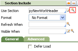
 On the Section Include tab of the Section Include panel (of the rule form that includes the section), click the magnifying glass to access a parameters form. Enter a value for each parameter.
- At runtime before the form is presented, execute an activity that computes values for the section parameters. (For example, the activity can set an Out parameter with the Property-Set method, or call the PublicAPI function putParamValue( paramname, paramvalue). Then, on the Section Include tab of the Section Include panel (of the rule form that includes the section), click the magnifying glass to access a parameters form. Select the
Pass current parameter page?checkbox.  When this section is referenced in hand-crafted HTML code that uses JSP tags, use the <pega:include> JSP tag supply values for the parameters. For examples, see JavaServer Pages tags — Include.
Completing the tab — Standard parameters
Field | Description |
| Name |
As with scalar parameters, these complex parameters are not true properties — no Rule-Obj-Property rule exists for them — but they mimic the structure of the property types. Complex parameter definitions are accepted on this Parameters tab, on the Parameters tab of the Control form. Use the <pega:param > JSP tag, within the <pega:reference ..> JSP tag, to set values for complex and scalar parameters. Typically, complex parameter values are used within the scope of a <pega:forEach ..> JSP tag. |
| Description | Optional. Enter descriptive text to document the purpose of each parameter. This description appears when a developer completes parameter values. |
| Data Type |
|
| Required? | Select to indicate that the parameter (of data type Leave cleared for Boolean parameters. |
| Type for SmartPrompt |
|
Validate As | Optional. Identify a |
Completing the tab — Advanced Parameters
![]() Complete this array to use gadgets for parameters. Such sections support the operations of landing pages and other parts of the Designer Studio.
Complete this array to use gadgets for parameters. Such sections support the operations of landing pages and other parts of the Designer Studio.
Field | Description |
| Parameters Type |
Classes must inherit from PegaGadget in Adv Parameters. This instructs the system to let developers complete this parameter value through a SmartPrompt selection rather than by typing; it has no runtime effect. Or, Click |
| Parameters Display |
Or, Click |
| Default Values | Click to enter default values for your parameters. |
Completing the tab — 3rd party specialty component
![]() When you select Specialty Component on the HTML tab, an array for specifying parameters appears. The parameter radio buttons do not appear.
When you select Specialty Component on the HTML tab, an array for specifying parameters appears. The parameter radio buttons do not appear.
Field | Description |
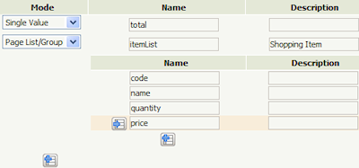
| Mode | Select either Single Value for a scalar parameter or Page List/Group for a collection-based parameter. |
| Name |
For This name is also the key for the scalar value or collection in the JSON returned for the specialty component. |
| Description | Optional. Enter descriptive text to document the purpose of each parameter. The descriptions appear as tool tips on the parameters in the included section's Parameters form. |
The Mode and Name values you enter on the tab ...

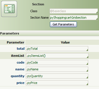
... appear on the included section's Parameters form.

In the Value column, select properties in the current page context. You can enter literal values in the array and retrieve them as regular parameters using unique specialty component IDs and API functions. See Notes: in the HTML tab's HTML Source area for details.

 Section form
 Select
  About Sections