|
|
Styles set here apply to buttons. For the following formats, you can specify the height of the button and the style of the text, border and background:
- Standard — Default format applied to buttons
- Simple
- Strong
You can also create custom button formats.
To preview changes, save the rule and click Run (![]() ). In the Skin Preview, select the Controls tab.
). In the Skin Preview, select the Controls tab.
| Style Preset |
Displays the currently selected Style Preset. Click the magnifying glass ( |
| Use Custom Text |
Select this checkbox to define a custom text format:
|
| Style Preset |
Displays the currently selected Style Preset. Click the magnifying glass ( |
| Use Custom Border |
Select this checkbox to define a custom border:
|
| Style Preset |
Displays the currently selected Style Preset. Click the magnifying glass ( |
| Use Custom Background |
Select this checkbox to define a custom background:
|
| Height | Specify the height of the button by entering a value in pixels. |
 Creating Custom Button Formats
Creating a custom button format
- Click
 .
. - Type the name of the custom format using only alpha-numeric characters (a-z and 0-9) and spaces. The name cannot begin with a number. The name that you enter is converted into the name of the CSS class/classes.
- Specify the values.
- Save the skin.
Using a custom button format
- In the cell containing the pxButton control, click the magnifying glass icon (
 ) to open the Cell properties panel.
 - In the Cell properties panel, click the magnifying glass icon (
 ) to configure the control.
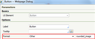
 - In the control Parameters dialog, select Other in the Format drop-down. Type the custom link format name in the blank field that appears, for example, rounded_image. See Completing the Control tab.

See Harness, Section, and Flow Action forms — Adding a Button control.
You can delete styles that you create; click  . You cannot delete standard (out-of-the-box) styles.

|
Harness, Section, and Flow Action forms — Adding a Button control |

 Skin form — Styles tab