|
|

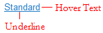
 Skin form — Styles tab
Styles set here apply to links. For the following formats, you can specify the style of the link text (normal) and the style of the link text when the mouse pointer hovers over it (hover):
- Standard — Default format applied to links
- Simple
- Strong
You can also create custom link formats.

|
|
To preview changes, save the rule and click Run ( ). In the Skin Preview, select theControls tab.
 Use the same formatting
| Use the same formatting for Normal and Hover Text | Applies the same settings to normal and hover text styles. Clear this checkbox if you want define different styles for normal and hover. Additional fields appear. |
Specify the style of the link text.
| Style Preset | Displays the currently selected Style Preset. Click the magnifying glass (  ) to select a different Style Preset from the Style Preset list. ) to select a different Style Preset from the Style Preset list. |
| Use Custom Normal Text |
Select this checkbox to define a custom normal text format:
|
Specify the style of the link text when the mouse pointer hovers over it.
| Style Preset | Displays the currently selected Style Preset. Click the magnifying glass ( ) to select a different Style Preset from the Style Preset list. |
| Use Custom Hover Text | Select this checkbox to define a custom hover format:
|
Creating a custom link format
- Click
 .
. - Type the name of the custom format using only alpha-numeric characters (a-z and 0-9) and spaces. The name cannot begin with a number. The name that you enter is converted into the name of the CSS class/classes.
- Specify the values.
- Save the skin.
Using a custom link format
- In the cell containing the pxLink control, click the magnifying glass icon (
 ) to open the Cell properties panel.
 - In the Cell properties panel, click the magnifying glass icon () to configure the control.
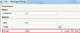
- In the control Parameters dialog, select Other in the Format drop-down. Type the custom link format name in the blank field that appears, for example, custom_link_style. See Completing the Control tab.
See Harness, Section, and Flow Action forms — Adding a Link control.
You can delete styles that you create; click  . You cannot delete standard (out-of-the-box) styles.

|
Harness, Section, and Flow Action forms — Adding a Link control |
 Skin rules — Completing the Styles tab