Styles set here apply to the header and footer of the panel set.
To preview changes, save the rule and click Run ( ). The panel set displays in all tabs of the Skin preview.
 Text
Text
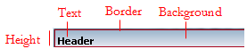
Applies to the Text within the panel set header and footer.
| Use the same formatting for Expanded and Collapsed headers
|
Applies the same settings to expanded and collapsed headers. Clear this checkbox if you want define different styles for expanded and collapsed headers. Additional fields appear. |
Text within the panel set header and footer
Applies to the Text within the panel set header and footer.
| Style Preset
|
Displays the currently selected Style Preset.
Click the magnifying glass ( ) to select a different Style Preset from the Style Preset list. ) to select a different Style Preset from the Style Preset list.
|
| Use Custom Text
|
Select this checkbox to define a custom text format:
- Font— Select the font family and size in pixels (px), points (pts), em (the current font size), or percentage (%). The font family defaults to
(use overall), which is the font you specified in the Overall Font field in the Style Presets.
- Color — Enter a hexadecimal value (such as #3d3d3d) or click the box next to the field to Choose a Color.
- Bold — Select or clear the checkbox to determine the font-weight.
|
Border
Applies to the border around the panel set header and footer
| Style Preset | Displays the currently selected Style Preset. Click the magnifying glass () to select a different Style Preset from the Style Preset list. |
| Use Custom Border | Select this checkbox to define a custom border: - same for all sides — clear this checkbox if you want to specify a different border style for Top, Left, Right, and Bottom.
- Select a border type and specify the pixel width and color of the border:
none, solid, dashed, or dotted.
|
Background
Applies to the background of the panel set.
| Style Preset | Displays the currently selected Style Preset. Click the magnifying glass () to select a different Style Preset from the Style Preset list. |
| Use Custom Background | Select this checkbox to define a custom background:
- solid — Enter a hexadecimal value (such as #3d3d3d) or click the box next to the field to Choose a Color.
- gradient (IE only) — Select the Direction in which you want to blend the colors, horizontal or vertical. Specify the Start and End colors of the gradient, as well as a Backup color for non-IE browsers.
- image — Specify the following:
- Color — Select a background color (fill). Enter the CSS hexadecimal value or click the box next to the field to Choose a Color. Click No Fill if you want a transparent background.
- Location — Enter the location of the file, including the relative path. For example,
images/AlphaCorpLogo.png.
To search for an image, click () to open the Image Catalog tool. Enter any portion of a file name (relative path, file name, or extension) in the Search box, and click Find. If you can’t find the image, make sure it is in the webwb directory. - Tile — Specify tile settings for the image. Select
None if you want to use a single image; Horizontal if you want a row of images in the background; Vertical, if you want a column of images in the background, or Both, if you want rows and columns containing the image in the background. - Position — Specify the placement of the starting tiled image, for example, top left.
|
Height
Sets the height of the panel set header and footer.
| Height | Specify the height of the panel heading bar by entering a value in pixels. |
 Skin rules — Completing the Styles tab
About Skin rules

 Skin form — Styles tab