|
The top section of each rule and data form contain important information, controls, and visual cues.
 Through a preference, you can display a labeled tab for
each open rule form or data form. Select the Show
Tabs check box in the Edit
preferences group. See Developer
portal — Setting preferences.
Through a preference, you can display a labeled tab for
each open rule form or data form. Select the Show
Tabs check box in the Edit
preferences group. See Developer
portal — Setting preferences.
 Understanding the top left
area
Understanding the top left
area
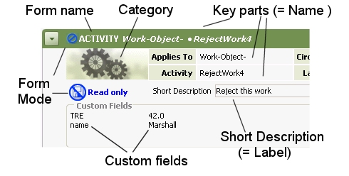
The top left portion of each rule form includes the form
name, a mode icon, and the key parts of the specific rule.
Click the expand button ( ) to expand the header area. Click the
collapse button (
) to expand the header area. Click the
collapse button ( ) to hide the header
area.
) to hide the header
area.
Through a preference, you can cause the header to
appear expanded on forms when initially opened. Select the
Expand Header check box in the
Edit group. See Developer portal — Setting
preferences.
|
Form Name |
Displayed in the upper-left corner, the form name provides an easier-to-say name associated with the rule type or data class. See Rules by form name and Data classes by form name for the complete lists. Form names are similar to common names in most cases. |
||||
| Category Image |
The category image suggests how this rule type (or data class) is used. |
||||
| Form Mode |
Indicates whether this form contains a locked (read-only) instance, or errors, or other modes. A smaller version of the icon is always visible in the top bar. Two common examples:
See How to complete rule and data form fields for an explanation of form modes. |
||||
| (varies) |
The contents of the header depends on your Explorer
setting. To review or change this setting, access the
Application Explorer and choose
|
||||
| Names (Key Parts) |
The expanded header area lists all key parts, with field labels. You cannot alter the value of rule key parts directly on the form. You determine key parts in the New form or the Save As form. See Completing the new rule dialog rule and How to enter rule keys using Save As. |
||||
| Short Description |
The Short Description text aids other developers in identifying the purpose and source of this instance.
|
||||
| Custom Fields |
Optional. For rules only. If a
developer has defined custom fields (of type
Custom fields provide another way — in addition to key parts, RuleSets, versions, and circumstance — to label or classify rules. For more about the uses and development of custom fields, see How to classify and select rules based on Custom Field values.
|
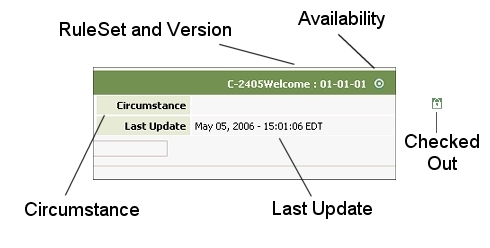
Understanding the top right
area
The RuleSet Name, version, and Availability icon appear at the top right of the form. (These fields are for rules only; they do not apply to data instances.)
Click the plus sign at the top left to see other qualifications and facts:
| RuleSet and Version |
For rules, identifies the RuleSet and version that
apply to this rule. Rules in RuleSet names beginning
with the five characters |
| Availability |
For rules, an icon indicates whether this rule is
available, blocked, withdrawn, or final. See available
rule. Click the Availability toolbar button
( A green clock icon indicates that this rule is time-qualified. |
| Locked? |
A green lock icon ( |
| Checked Out From |
When you later check this rule in (with the Check-in
button |
| Checked Out By |
|
| Circumstance or Base |
If this rule is circumstance qualified, the property
name and value appear here, with a circumstance icon
( If this rule is a base rule for other rules (that
are qualified by circumstance or time-qualified), the
base rule icon ( |
| Last Update |
Identifies the date and time this instance was last saved. |
 Click any tab to bring
it to the front. (Some users can access only the left tab of
certain rule forms.)
Click any tab to bring
it to the front. (Some users can access only the left tab of
certain rule forms.)
Every form has History tab. It can contain a text description of the rule or data instance, and show who created and updated it and when. In some cases, you can roll back a rule to an earlier version. See:
Many rule forms contain a Pages & Classes tab. See How to complete a Pages & Classes tab.
Other tabs vary by form. Consult the help topics for information on specific tabs and fields.
|
check out, rule resolution, sibling, time-qualified rule |
|
How to use the
developer toolbar
Visual dictionary |
 Identifying parts
of rule and data forms
Identifying parts
of rule and data forms
 For flow rules,
flow action rules, and certain class rule instances,
the text you enter here may be visible to users of your
application. See
For flow rules,
flow action rules, and certain class rule instances,
the text you enter here may be visible to users of your
application. See  The appearance of this area is
determined by an HTML rule named
Embed-CustomFields.defaultFields, which
your application can override. Your form may present
drop-down lists, check boxes, and radio buttons, and
may validate your entries. (For more information, see
Pega Developer Network article
The appearance of this area is
determined by an HTML rule named
Embed-CustomFields.defaultFields, which
your application can override. Your form may present
drop-down lists, check boxes, and radio buttons, and
may validate your entries. (For more information, see
Pega Developer Network article  PRKB-17693 How to allow
developers to review or update Custom Field
values.)
PRKB-17693 How to allow
developers to review or update Custom Field
values.) )
) )
) When a displayed
rule is checked out (usually by yourself), this field
shows the original RuleSet and version. Click the link
to open the current checked-in version.
When a displayed
rule is checked out (usually by yourself), this field
shows the original RuleSet and version. Click the link
to open the current checked-in version. ) the revised rule
instance returns to this RuleSet and version, replacing
the earlier copy. See
) the revised rule
instance returns to this RuleSet and version, replacing
the earlier copy. See  When you access a rule that is
checked out by a developer, the Checked out
by field identifies the Operator ID of that
user. Click the link to review the checked-out copy.
When you access a rule that is
checked out by a developer, the Checked out
by field identifies the Operator ID of that
user. Click the link to review the checked-out copy.
 ). See
  ) appears.
 Developer portal basics