|

|
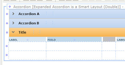
Using the Accordion control, you can stack SmartLayouts vertically, each with a visible header, within an accordion group. At runtime, when the user clicks one header, the layout body becomes visible and the other open body closes. For an example, see PDN article 25414 How to display collapsed form sections using the Accordion control.
Configure styles for the Accordion control in the Skin rule. See Skin form — Styles tab — Layouts — Accordion.
For information about using the Accordion control in harnesses, see Harness forms — Adding an accordion container.
![]() When accordion controls are within a section that is within a panel of a panel set, runtime behavior automatically adjusts to consume the entire available height, and to supply scroll bars when necessary.
When accordion controls are within a section that is within a panel of a panel set, runtime behavior automatically adjusts to consume the entire available height, and to supply scroll bars when necessary.
 1. Adding and deleting an accordion SmartLayout
To create an accordion layout, do the following:
- Click the down-arrow (
 ) at the right end of the Layout control group (
 ) and select the Accordion control (
 ). Alternatively, click the Layout control group itself to pop-out the Layout control group window.
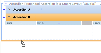
 - Drag and drop the control onto the form. As you move the pointer over existing frames, a yellow line indicates where the accordion will be dropped.
The accordion layout appears in a wireframe on the form.
Alternatively, you can select an existing accordion layout and click the Insert Row Above ( ) or Insert Row Below (
 ) icon to create a new one above or below the selected one.
To create an accordion group, do the following:
- Select the Accordion control and drag it onto a top or bottom accordion border.

- Release the pointer. A new accordion layout appears on the below (or above) the existing accordion.

To delete an accordion layout, select the layout and click the Delete Row button (![]() ). Do not use the Delete Cell button for this action.
). Do not use the Delete Cell button for this action.
 2. Complete the Layout Panel — Top fields
To access an accordion SmartLayout properties panel, select the layout wireframe to make it active, and click the magnifying glass icon (![]() ) at the top-level header. Each accordion within a group represents a new layout and has its own properties panel. Select the accordion you want to modify. Each accordion is numbered and its value appears in the header; the number changes to match the tab you selected.
) at the top-level header. Each accordion within a group represents a new layout and has its own properties panel. Select the accordion you want to modify. Each accordion is numbered and its value appears in the header; the number changes to match the tab you selected.
Your updates to this panel can update the rule form immediately or upon clicking Apply, depending on the Property Panel settings in your Edit preferences. See Setting your preferences. If the panel is pinned(![]() ), the wireframe on the rule form changes immediately to reflect your inputs. If the panel is not pinned(
), the wireframe on the rule form changes immediately to reflect your inputs. If the panel is not pinned(![]() ), click Apply to apply your inputs.
), click Apply to apply your inputs.
Complete the top fields, General tab, and Advanced tab.
Field |
Description |
| Format |
Select |
| Title | Optional. Enter text to be presented above the table in the header or subheader. This text may include directives or JSP tags, such as <p:r > or <pega:lookup >.
|
| Visible When | Optional. Leave blank to always present the header. To control visibility of this header, enter or select one of the following:
As a best practice, use the Condition Builder to edit this field. Click the magnifying glass icon (
pyCurrentSpace=="ASpaceName" Then select the Run on Client? checkbox. |
 3. Complete the Layout Panel — General tab
Field |
Description |
| Width |
|
| Smart Layout | Choose Single, Double or Triple to control the number of column pairs in the Smart Layout. |
| Header Type | To maintain an accordion layout, leave Accordion selected. |
| Style Prefix |
|
| Retrieve Activity | Optional. If Defer Load? is selected, you can specify an activity to be run when the container is expanded by a click. This activity can compute property values and other aspects of the expanded container. As a best practice, create a defer loaded wrapper section with the retrieval activity (instead of having multiple defer loaded sections with wrapper activities.) |
| Defer Load |
Optional. Choose this option to delay loading at runtime of the section content until the user clicks the header. To enable users to take actions, such as submit, on a work item while other content is still being loaded, configure sections to use defer loaded asynchronous declare pages. See PDN How to configure non-blocking UI using Asynchronous Declare Pages (ADP). |
| New Layout | Optional. Choose this option to convert the selected accordion and those below it into a new accordion group below the original group. Deselect it to merge the selected accordion and those below it into the layout above it. If this is the only accordion in a group, this option is selected by default and cannot be changed. |
| Allow Changes to Columns |
Optional. Selecting this checkbox converts this SmartLayout to a quasi-freeform layout. This gives you greater flexibility, enabling you to add and remove columns. Column restrictions remain in force, but you can change the type of any column, including to the Row restrictions remain in force, but you can remove them if all columns have a If you Allow Changes to Columns, you cannot undo this change. See PDN article 25970 Using SmartLayout features — How to customize, use Merging Cells, and change Field Width. |
 4. Complete the Layout Panel — Advanced tab
Field |
Description |
| Body Visible When |
As a best practice, use the Condition Builder to edit this field. Click the magnifying glass icon ( |
| Run on Client? |
Appears when you enter a simple expression in the Visible When field. Select to cause dynamic execution of the condition each time the value of a property stated in the condition changes. |
| ID |
Optional. Type a value for the |
| Header Image |
Optional. Click the magnifying glass icon( |

 Section forms
 )
) If this section is to become part of navigation in a composite portal, you can make the header visible only when a specific space is the current space. Enter an expression here similar to the following:
 Select whether the width of columns in the table are to be set as a percent or in absolute pixels. Choose: