|
|

 Skin form — Styles tab
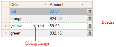
Styles set here determine the color of the row beneath which a child row will be dropped and the icons that indicate whether the dropped row will be a sibling or child of the selected node.
This tab is available only for the Default format. The styles apply to all grids, trees, and tree grids.
To preview changes, save the rule and click Run ( ). In the Skin Preview, click the Grids tab. Select the format you want to preview:
 Default, Spreadsheet, or Transparent. Drag and drop rows to view the specified styles.
Sets the style for the line indicating where the selected row will be dropped.
| Style Preset |
Displays the currently selected Style Preset. Click the magnifying glass ( |
| Use Custom Border |
Select this checkbox to define a custom border:
|
 ) to select a different Style Preset from the Style Preset list.
| Style Preset |
Displays the currently selected Style Preset. Click the magnifying glass ( |
| Use Custom Background |
Select this checkbox to define a custom background:
|
 Images (Sibling, No Drag Drop, Child)
For each of the following, specify an image to indicate whether the dropped row will be a sibling or child of the selected node in a tree or tree grid.
- Sibling Image — indicates the dropped row is a sibling of the selected row.
- No Drag Drop Image — indicates the selected row cannot be dropped in the current location.
- Child Image — indicates the dropped row is a child of the selected row in a tree.
|
Sibling Image
No Drag Drop Image
Child Image |
Enter the location of the file, including the relative path. For example, |
 Skin rules — Completing the Styles tab