|

|

 Harness, Section, and Flow Action forms
A Tree layout allows users to view, navigate, and access the properties in pages in an embedded Page List property . The user can quickly expand and collapse branches of the tree to find entries of current interest.
The layout can display a custom skin; is cross-browser compatible; can be configured to be editable and localizable. Depending on the settings of the control, the user may then be able to perform express actions such as "Approve", or open the data object represented by a branch for further review or editing.
 The UI Gallery contains a working example of this repeating layout. To view and interact with this example and review its configuration, select
  > User Interface > UI Gallery and select Tree in the Repeating Layouts group.
 Adding a Tree layout
You can quickly add a grid layout to a section in either of two ways:
Start with the data
- Select or create a section to hold the layout.
- In the Application Explorer, select the
Page Listproperty you want to use as the data source in your layout and drag it to your section. - Drop the rule above or below the default layout. In the pop-up dialog that appears, select
Treeas the layout type. - Delete any default layout you do not need.
- Add the properties you want to include by dragging a property name from the lists of properties in the Application Explorer and dropping it on the repeating cell in the layout. Alternatively, select a property in the repeating Cell Properties panel.
- Complete the configuration described in this topic.
Start with the layout
- Select or create a section.
- Click the down-arrow (
 ) at the right end of the Layout group (
 ) and select Layout (
 ).
). - Click and drag the layout onto the section. When the pointer changes shape to indicate that you can drop the layout, release the mouse button.
- On the Layout Options form:
- Click the Repeating radio button.
- Select
Treeas the repeat type. - Click OK.
- Delete any default layout you do not need.
- Open the Hierarchy Cell properties panel and specify the property that you want to use as the data source in the List/Group field. You can reference nested PageLists and PageGroups; for example,
Page.Page.Page.Page.PageList.
- Add the data source properties in the repeating Cell Properties panels.
- Complete the configuration steps described in this topic.
To delete a Tree layout, select the layout and click the Delete Row button ( ). Do not use the Delete Cell button for this action.
How to use the properties panels
You configure many elements in a tree layout using properties panels. To display the panels, turn on the wireframe, select an element, and click the magnifying glass icon ( ). To select an element, click the following:
- Sections — a header label on a wire frame
- Rows and columns — a circle (o) next to or on top of a cell
- Cells — inside a cell
Property fields may appear at the top of the panel, or in one or more tabs. If the panel is pinned ( ), click Apply to apply your changes. Click the red x at the top right of the panel to close it. If the panel is not pinned, click Apply to apply your changes and continue editing, or OK to apply your changes and close the panel.
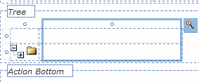
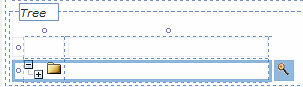
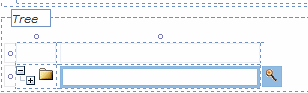
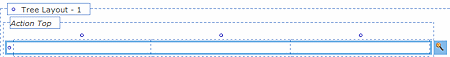
The layout has three areas:
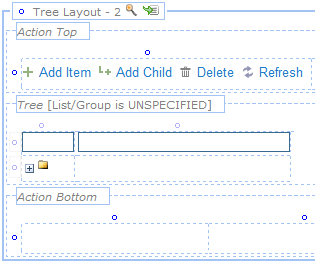
- Layout area — The framework that contains the action and repeating areas. You define the header format, header type, and overall width.
- Action areas — The top and bottom areas in which you can place buttons or other controls linked to actions, such as Add Item, Add Child, Delete, or Refresh. The default Grid actions are stored in the template rule, pzPegaDefaultGridIcons, which you can copy and modify to create your own configurations. See Section and Flow Action forms — Adding a Button Control. To remove the default actions, clear the cell.
 Applications prior to V6.3 do not use the pzPegaDefaultGridIcons template rule.
 - Repeating area — Between the action areas the system displays information dynamically created from the data source. The first row in this area holds column headers representing the fields in the data source. The second row repeats as needed to display the requested data.
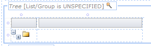
The left column in this row contains the hierarchy control cell ( ), which contains controls that allow the user to display or hide data below the first display layer (for example, tasks within task groups). The right column contains the repeating data.
You can specify what field of the data source to include in the column, or configure the data's appearance.
Select the Tree Layout header and open the properties panel. Configure the layout using the following fields:
Field |
Description |
||||||||||||||||||||||||||
| Format |
 Choose a format to control what appears above the layout (known as a header or subheader), and aspects of the body. This choice primarily affects styles and appearance. Information in or below a subheader (including Choose a format to control what appears above the layout (known as a header or subheader), and aspects of the body. This choice primarily affects styles and appearance. Information in or below a subheader (including Hidden Sub) present information that is right-indented from information in a header.Using the Skin rule, you can review or revise the styles (colors, fonts, padding and margins) associated with header and subheader formats.
|
||||||||||||||||||||||||||
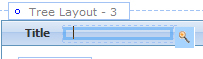
| Title | Optional. Provide a title that appears in the layout header. | ||||||||||||||||||||||||||
| Visible When |
Optional. If you leave this field blank, the grid is always visible. To control its visibility, enter or select one of the following:
As a best practice, use the Condition Builder to edit this field. Click the magnifying glass icon ( |
||||||||||||||||||||||||||
| HTML |
This field appears when you select the Custom format. Identify the second key part of an HTML rule that defines the display of the header contents. |
 )
)General tab
Depending on your Format choice, you may see here a Header Type field. The available options are:
Bar
|
Provides a static horizontal bar at the top of the layout. |
Collapsible
|
Provides a horizontal bar at the top of the layout, with the ability to expand or collapse, to show or hide the layout, when clicked |
Tabbed
|
Creates a new group of layouts with tabbed headers. Only one layout within the group can be displayed at once. The tab group appears in a Tab Group wireframe. Use the group's properties panel to control the appearance of all the tabs in the group. See the topic Tab Group properties panel below. |
Accordion
|
Creates a new group of layouts that contain collapsible headers. Only one layout can be displayed at once. |
Depending on your Header Type or Format choices, you may see one or more of these fields:
| Expand When | Optional. Only applies to Collapsible header styles.
 ) to open the tool. See Using the Condition Builder to configure dynamic UI actions. ) to open the tool. See Using the Condition Builder to configure dynamic UI actions. |
||||||||||
| Run on Client? | Appears when you enter a simple expression in the Visible When field.
Select to cause evaluation and execution of the condition each time the value of a property stated in the condition changes. If unselected, the expression is evaluated and the condition executed when the form is initially presented and whenever the form is refreshed. By default, controls that allow typing, such as Text Input, are evaluated when the user leaves the field. To re-evaluate conditions as the user types, use the Apply Conditions action with a Keyboard event. See Control Form — Completing the Control tab. |
||||||||||
| Defer Load |
Appears for To enable users to take actions, such as submit, on a work item while other content is still being loaded, configure sections to use defer loaded asynchronous declare pages. See PDN How to configure non-blocking UI using Asynchronous Declare Pages (ADP). |
||||||||||
| Retrieve Activity |
Appears when you select Defer Load. Specify the activity that will retrieve the data. As a best practice, create a defer loaded wrapper section with the retrieval activity (instead of having multiple defer loaded sections with wrapper activities.) |
||||||||||
| New Tab Group |
For Header Type of If this is the only tab in a group, this option is selected by default and cannot be changed. |
||||||||||
| New Layout |
For Header Type of If this is the only accordion in a group, this option is selected by default and cannot be changed. |
||||||||||
| Template Styles |
If you selected a |
||||||||||
| Width |
Select a grid-width option to determine whether the width of the individual columns within the layout (action and repeating areas) are set as a percentage or in pixel values. Use the options as follows:
|
||||||||||
| Paging |
Optional. If the data results comprise more than a single page (approximately 20 rows of data), you may want to specify a traditional Paging format. This option is not available if the data source is a report definition. The system retrieves a segment, known as a page, containing the number of rows defined in the Items per Page setting, from the total data set on the clipboard. It presents the page navigation controls in a format defined in this option. You can drag and drop rows within a page. The options are:
|
||||||||||
| Items per Page |
Appears if you select a Paging option. Select the item limit per page (20 is the default). To specify a custom value, select |
||||||||||
| Style |
Select a style for the repeating area elements (text, borders, backgrounds, and images) as defined in the Skin rule. See Skin form — Styles tab — Layouts — Repeat Tree/Grids. Specify the skin in your Designer Studio General Preferences panel. The initial settings are as follows:
|
 ) or collapsed (
  ) when you save the Harness, Section, or Flow Action form becomes the state upon initial runtime presentation.
 The display may truncate (partially obscure) a data value if the value is wider than width defined by the pixel value. The user can resize the columns to view the truncated content.
 If the results produce less than one page, the paginate gadget does not appear at runtime.
Advanced tab
Depending on your choice of Format, additional fields may appear:
| Header Image |
To add a header image at the top of the Tree:
|
| Image Title |
Appears when you have selected a header image. Add text here to describe the image: those using assistive devices will hear this title although they may not be able to perceive the image. |
| Paginate Activity |
Optional. Appears if you selected a paging option in the Paging field on the General tab.
For guidance on configuring the parameters in your activity, use a copy of the standard template activity pyTemplateAdvancedGridActivity. |
Title cell properties
If you select the Standard or Standard (sub) formats, a cell appears to the right of the tree's title.
Open the properties panel to set the following values:
| Value |
Select a field value that appears as the column title. |
| Label For |
Indicate the property that appears in this column in the repeating rows. |
General tab
| Visible |
Select one of the options presented. The default is |
| Condition |
If you selected Other Condition for the Visible field, complete this field.
As a best practice, use the Condition Builder to edit this field. Click the magnifying glass icon ( |
| Required |
Select to make this a required field if the user adds data to the display. |
| Wrap Text |
Select so that long text entries in this field appear over multiple lines, rather than requiring a scrollbar. |
| Read Only |
Select to prevent edits to this field. You can refine this control by selecting or creating a when rule in the |
Advanced tab
| Width | Specify the cell width in pixels. |
| Height | Specify the cell height in pixels. |
| Default Value | Specify a default value for this field. Click the magnifying glass icon ( ) to display the Expression Builder, where you can select or create an expression to generate the default value. Leave the field blank if it does not require a default value. ) to display the Expression Builder, where you can select or create an expression to generate the default value. Leave the field blank if it does not require a default value. |
| Read-Write Style | Optional. Type the name of the custom style, for example, custom_stylename, that you want to apply to this cell when the user form or flow action form appears in read-write mode. Define custom styles in the Skin rule. See Skin form — Custom. |
| Read-Only Style | Optional. Type the name of the custom style, for example, custom_stylename, that you want to apply to this cell when the user form or flow action form appears in read-only mode. Define custom styles in the Skin rule. See Skin form — Custom. |
| Inline Style | Optional: Enter CSS code for an inline style for a cells in the column. For guided assistance in composing a style definition, click the magnifying glass icon () to open the Style Editor. You can select from predefined lists or type a style definition directly, and preview the results. |
Select the Tree header in the repeating area and open the Tree properties panel.
You define the data source in the Hierarchy Cell properties panel.
General tab
| Edit Mode |
The edit mode sets the default presentation and behavior configuration for a repeating grid, determining how users view and edit properties. By default, each edit mode is configured with grid actions — events and associated actions. The default action for all edit modes is You can add, delete, or edit grid actions as desired; click the magnifying glass icon (
You can configure sequential actions based on a single event for a repeating grid; for example, You can also configure Keyboard actions to enable users to navigate and access items in a repeating grid. For example, you can configure the Up and Down arrows to set focus to the previous and next rows in a grid, and the Enter key to open the selected item. For more information about edit modes, see PDN article 26349 About repeating layout edit modes.
Select one of the following Edit Modes. See Completing the Control tab for a description of actions.
The system uses existing grid actions to determine whether to set focus to new rows.
For |
||||||||||||||||||||||||||||||||||||||||||||||||||||
|
Depending on the mode you select, you will see a different array of the following fields: |
|||||||||||||||||||||||||||||||||||||||||||||||||||||
| Flow Action |
|
||||||||||||||||||||||||||||||||||||||||||||||||||||
| Details as read only |
Appears if the Edit Mode is
|
||||||||||||||||||||||||||||||||||||||||||||||||||||
| Reordering |
Select to allow users to move objects higher or lower on the display by dragging and dropping individual rows. Depending on the properties of the objects the rows represent, rows may be moved above or below other rows, or dropped into a row that can receive them to become child entries of that row. Visual indicators provide clues about the process: a line appears between two rows in the list if that is where the row you have started dragging will appear if you release it. A row that can receive the row you have selected as a child will change background color. If your mouse cursor is over an area where you cannot drop the row you have selected, an indicator will remind you that the area is not a valid target. If you attempt to drop the row there, the display will remain unchanged. |
||||||||||||||||||||||||||||||||||||||||||||||||||||
| Column Resizing |
Select to allow users to adjust the width of columns on the display by dragging individual columns to the left or right. |
||||||||||||||||||||||||||||||||||||||||||||||||||||
| Row Resizing |
Check to allow users to click a row border and drag it beyond the Height setting in the Row Properties panel. |
||||||||||||||||||||||||||||||||||||||||||||||||||||
| Row Hover |
Select if you want an OnHover style for rows, changing the appearance of a row when the cursor hovers over it. You can set the hover text and background color in the Skin rule.
|
||||||||||||||||||||||||||||||||||||||||||||||||||||
| Sorting |
Select to allow users to sort on a column in the grid. This setting applies to all columns. You can disable sorting for individual columns by clearing the Enable Sorting checkbox in a column's Cell Properties panel. Sorting is not available for columns containing images, or controls such as buttons or links. If enabled, a tool tip appears at runtime when the user hovers the mouse pointer over the column header. The user can alternate the sort order (ascending/descending) by clicking the header. Icons indicating ascending sort (
|
||||||||||||||||||||||||||||||||||||||||||||||||||||
| Filtering |
Select to allow users to show only those rows that match a column value filter. This setting enables filtering for all columns that include a property. You can set filter types or disable filtering for individual columns using the Filtering options in the Column Properties panel. This option is not available in Read/Write mode. If a column can be filtered, a filter icon (
When finished, the user clicks Apply. The filter icon changes to a filter-on icon ( You can use the Skin rule to replace the default icons.
— Columns containing images, action controls such as buttons or icons, hidden controls (pxHidden), prompt select controls, and subsections cannot be filtered. — Filtering on — The following property types cannot be filtered:
|
||||||||||||||||||||||||||||||||||||||||||||||||||||
| Show Details |
Appears if edit mode is |
||||||||||||||||||||||||||||||||||||||||||||||||||||
| Expand All |
Appears if Show Details is selected. Select to display details for all rows when the user opens the form. |
||||||||||||||||||||||||||||||||||||||||||||||||||||
| Fixed Size |
Select to specify the maximum height and width of the layout. Further fields appear:
|
||||||||||||||||||||||||||||||||||||||||||||||||||||
| Open on double-click | Appears if the Edit Mode is Read Only or Embedded Pane. When checked, the related work item opens for editing in a work item gadget when the user double-clicks on a row of data in the display. If PRPC cannot find the gadget, it opens the work item in a new tab or new window. |
||||||||||||||||||||||||||||||||||||||||||||||||||||
 next to the field to open the template section used to render the layout. By default, the templates are standard rules .pyGridModalTemplate and .pyGridDetails. To create custom templates, copy these rules into your Applies To class. Do not change the Purpose.
 ) and descending sort (
 ) appear to the right of the header label. You can use the
  ) appears on the right side of the column's header cell. The user clicks the icon to display the filter pop-up menu. On the menu, the user selects the checkbox next to each property to include. The menus also contain filtering mechanisms suitable for the property types in the column as follows:
 ) indicating that a filter is applied to the column.
Advanced tab
| ID | Optional. Provide an identifier for this Tree layout. Start with a letter, have no spaces, and include only alphanumeric characters, dashes, or underscores. |
| Summary | Describe the data to be displayed. |
| Refresh on Update | Appears if Edit Mode is Modal Dialog. When checked, the entire layout is refreshed each time data is updated or submitted. |
| Append Activity |
Select or create an activity that runs when the user adds an entry. |
| Delete Activity |
Select or create an activity that runs when the user deletes an entry. |
| Target for Edit |
Appears when edit mode is Embedded Pane. Select a custom section in which you want to display the details. For example, assume you want the detail area to appear to the left of a tree instead of below (default). Create a section (named gridResults) containing a two-column layout with the grid embedded in the second column and an empty section in the first column. Enter the name of the empty section in the Target for Edit field. |
Column properties
There are two columns in the repeating section. Select the first column to display the Hierarchy Column properties panel. Select the second column to display the Label Column properties panel. The options you see depend upon the type of column.
| Width |
Specify the column width of this column in pixels. You can also adjust the width of a column directly:
The unlabeled Use at Runtime checkbox to the right of the width field is enabled by default and cannot be edited. This forces the Width value to be used by the browser at runtime, even when data values in this column or in other columns would otherwise cause the browser to present a wider or narrower column. Data values may sometimes wrap or appear truncated. |
| Filtering |
Appears if the Filtering checkbox is selected on the Repeat Grid panel. Select a filtering option for this column:
|
| Enable Sorting |
Label Column panel only. Appears and is selected if Sorting is selected on the Tree properties panel. Clear the checkbox to disable sorting on this column. |
| Inline Style |
Optional. Enter CSS code for an inline style for a cells in the column. For guided assistance in composing a style definition, click the magnifying glass icon ( |
 ), then drag the border.
Hierarchy control cell properties
Select the hierarchy control cell and open its properties panel.
| List/Group |
Identify the PageList property that you want use as the data source. You can reference nested PageLists; for example, Page.Page.Page.Page.PageList. |
General tab
| Show +/- Icon | Select one of the available values. If you select Other Condition, the Condition field appears where you can specify or select the When rule that governs whether the row will be visible. |
| Icon | Specify the image to appear in the hierarchy control cell if you wish to replace the default image. |
Advanced tab
| Defer Load Activity |
In situations where loading all the data available might take a significant amount of time, you may choose to load only the data required by the current display. Select or specify in this field the activity to call to get data when it is required. |
| Right Click | Optional: Specify a the Name key part of a navigation rule that defines a context menu to appear when the user right-clicks a row in the grid. Such a menu can offer standard actions such as "Add After", "Delete", and so on. See About Navigation rules and PDN article 26111 How to create context menus for grid layouts using navigation rules. |
| Width | Specify the width of the column in pixels. Provides the same control as the Width setting in the Column properties panel. |
| Height | Specify the height of the cell in pixels. Reducing the height can make the tree more vertically compact at run time. Provides the same control as the Height setting in the Row properties panel. |
| Inline Style | Optional: Override the stylesheet settings in this cell with local values.
Enter CSS code for an inline style for a cells in the column. For guided assistance in composing a style definition, click the magnifying glass icon ( |
Row properties
Select either row in the repeating area and open its properties panel.
| Height | Optional. Enter a positive number for the height in pixels of this cell. (At runtime, normal browser processing for rendering tables determines the actual displayed height.) You can also adjust the height of a row directly:
The unlabeled Use at Runtime checkbox to the right of the width field is enabled by default and cannot be edited. This setting forces the Height value to be used by the browser at runtime, even when data values in this column or in other cells would otherwise cause the browser to present a taller or shorter column. |
| Inline Style | Open the Style Editor panel for this cell to override the stylesheet settings with local values. |
| Make Header? | Select to display all the cell values in the row with the same style that the column heading uses. This is an alternative to individually selecting the Use Heading Styles checkbox for each column. This option is unchecked by default. |
 ), then drag the border.
Column header properties
Select the header cell in the repeating area and open its properties panel.
| Value | Enter the title for this column. |
| Label For |
Select from the data source the field that will be rendered in the cells of this column. Normally this is the label or title of the item. |
General tab
| Visible | Select one of the available values. The default is Always. |
| Condition |
If you selected Other Condition for the Visible field, complete this field.
As a best practice, use the Condition Builder to edit this field. Click the magnifying glass icon ( |
| Required | Select to make the values in this column required. |
| Wrap Text | Select to force the text in this column to wrap to additional lines if it is longer than the width of the column. |
| Read Only | Select to make the cells in this column read-only. If you select it, a field appears where you can specify a When rule to govern when the cells in this column are to be read-only. |
Advanced tab
| Width | Specify the width of the column in pixels. Provides the same control as the Width setting in the Column properties panel. |
| Height | Specify the height of the cell in pixels. Provides the same control as the Height setting in the Row properties panel. |
| Read-Write Style | Optional. Type the name of the custom style, for example, custom_stylename, that you want to apply to this cell when the user form or flow action form appears in read-write mode. Define custom styles in the Skin rule. See Skin form — Custom. |
| Read-Only Style | Optional. Type the name of the custom style, for example, custom_stylename, that you want to apply to this cell when the user form or flow action form appears in read-only mode. Define custom styles in the Skin rule. See Skin form — Custom. |
| Inline Style | Open the Style Editor panel for this cell to override the stylesheet settings with local values. |
Repeating cell properties
Select the data cell in the repeating area and open its properties panel.
| Property |
Select a Single Value property. Typically, this is from within data source's embedded page property. Alternatively, you can drag a property name from the properties visible in the Application Explorer onto the cell.
|
| Control |
Many controls on the Basic and Advanced groups are associated with default controls, which appear in this field when you drag and drop a control into the cell. For example, the Button control populates the field with pxButton, the Text Area control with pxTextArea, and so on. |
| Behavior |
Appears only if the control is not auto-generated, or if an auto-generated control was configured using the Client Event Editor in a release prior to V6.3. Click the magnifying glass next to this field to display the Client Event Editor, where you can specify formatting conditions and actions for this field. For general information on this capability, see Harness, section, and flow action forms Help — Client Event Editor.
|
General tab
| Visible |
Select one of the options presented. The default is |
| Condition |
If you selected Other Condition for the Visible field, complete this field.
As a best practice, use the Condition Builder to edit this field. Click the magnifying glass icon ( |
| Required |
Select to make this a required field if the user adds data to the display. |
| Wrap Text |
Select to force the text in this column to wrap to additional lines if it is longer than the width of the column. |
| Read Only |
Selected by default, which prevent edits to this field. You can refine this control by selecting or creating a when rule in the Read Only Condition field that appears when you select this option. |
Advanced tab
| Width | Specify the width of the column in pixels. Provides the same control as the Width setting in the Column properties panel. |
| Height | Specify the height of the cell in pixels. Provides the same control as the Height setting in the Row properties panel. |
| Default Value | Specify a default value for this field. Click the magnifying glass beside it to display the Expression Builder, where you can select or create an expression to generate the default value. Leave the field blank if it does not require a default value. |
| Read-Write Style | Optional. Type the name of the custom style, for example, custom_stylename, that you want to apply to this cell when the user form or flow action form appears in read-write mode. Define custom styles in the Skin rule. See Skin form — Custom. |
| Read-Only Style | Optional. Type the name of the custom style, for example, custom_stylename, that you want to apply to this cell when the user form or flow action form appears in read-only mode. Define custom styles in the Skin rule. See Skin form — Custom. |
| Inline Style | Open the Style Editor panel for this cell to override the stylesheet settings with local values. |
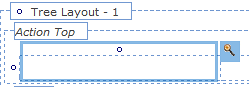
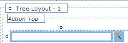
The Tree layout has two action areas, one at the top and one at the bottom of the display. You can use one or both. If you use both, configure each action area separately.
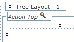
Select Action Top or Action Bottom, then display the properties panel. Select a column header and open its properties panel.
| Visible | Select one of the options presented. The default is Always. |
| Condition |
If you selected Other Condition for the Visible field, complete this field.
As a best practice, use the Condition Builder to edit this field. Click the magnifying glass icon ( |
General tab
Not used.
Advanced tab
| ID | Optional. Provide an identifier for this tree. Start with a letter, use no spaces, and include only alphanumeric characters, dashes, or underscores. |
Column properties
Select a column in the top or bottom action area and open its properties panel.
| Width |
Specify the width of this column. Select the checkbox to the right of the field to lock the width to the value you have specified. Clear the Use at Runtime checkbox (unlabeled) next to the width field to allow the browser at runtime to determine the width of this column based on the size of the column contents and the size of other columns. The width may vary from use to use depending on the contents of this cell and other cells. (When cleared, the generated HTML for this column includes a <TD> element with no WIDTH= attribute.) The Width value is used as you view the rule form, but not at runtime. For example, clear this checkbox if the cell is to contain a section that may be wide in some situations and narrow in others. Select the Use at Runtime checkbox to force the Width value to be used by the browser at runtime, even when data values in this column or in other columns would otherwise cause the browser to present a wider or narrower column. If checked, data values may sometimes wrap or appear truncated. |
| Inline Style |
Optional. Enter CSS code for an inline style for a cells in the column. For guided assistance in composing a style definition, click the magnifying glass icon ( |
Row properties
Select the row in the top or bottom action area and open its properties panel.
| Height |
Enter a positive number for the height in pixels of this cell. Clear the Use at Runtime checkbox (next to the height field and (unlabeled) to allow the browser at runtime to determine the height of this row based on the size of the row contents and the size of other rows. The height may vary from use to use depending on the contents of this cell and other cells. (When cleared, the generated HTML for this column includes a <TD> element with no HEIGHT= attribute.) The Height value is used as you update the rule, but not at runtime. For example, clear this checkbox if the cell is to contain a section that may be tall in some situations and short in others. Select the Use at Runtime checkbox to force the Height value to be used by the browser at runtime, even when data values in this column or in other cells would otherwise cause the browser to present a taller or shorter column. |
| Inline Style |
Optional. Enter CSS code for an inline style for a cells in the column. For guided assistance in composing a style definition, click the magnifying glass icon ( |
| Make Header? |
Select to display all the cell values in the row with the same style that the column heading uses. This is an alternative to individually selecting the Use Heading Styles checkbox for each column. This option is unchecked by default. |
Action cell properties
Add a control, property, or other section that is appropriate to the display and function of your data. Configure the section's properties by selecting it and then displaying the properties panel. For buttons, see Section and Flow Action forms — Adding a Button Control.
When you select a Header Style of Tabbed, the layout appears in a Tab Group wireframe. Select it to make it active and click the magnifying glass icon () in the header to open the Tab Group properties panel.
Complete the top field and General tab. There are no settings on the Advanced tab.
Top field
Field |
Description |
| Format |
Select the format you want to apply to the tabs in the group. To configure the format's appearance, go to the Style Presets > Layouts > Tab area on the Skin rule form's Styles tab.
|
General tab
Field |
Description |
| Tab Position |
Select the placement of the tabs at runtime:
If you select |
| Tab Orientation |
If you selected a left or right Tab Position, select to display tabs horizontally or vertically. Horizontal is the default. If you select vertical orientation, the tab title is rotated based on the tab position, left or right. |
| Stretch Tabs |
Select to stretch the horizontally or vertically to fit the available space. If the Tab Position is Top or Bottom, tabs stretch horizontally; if the Tab Position is |