|

|

 Harness, Section, and Flow Action forms
Every section and every flow action contains at least one layout (or other form of repeating layout).
You can add layouts above or below the current layouts. Configure styles for layouts using the Skin rule.
 1. Adding and deleting layouts
To add a new layout, click the down-arrow ( ) at the right end of the Layout control group (
 ) and select the layout control (
 ). Alternatively, click the Layout control group itself to pop-out the Layout control group window. Drag the control on to the work area. When the pointer changes shape to indicate that you can drop the layout, release the mouse button.
To copy an existing layout, click  to present the SmartFrames wireframe, right-click the existing layout, and then click Copy. Select the location in which you want to paste the layout, right-click and then select Paste Above or Paste Below. You can also use the toolbar controls to Cut (
 ), Copy (
 ) and Paste (
 ) existing layouts or select an existing layout and click Insert Row Above (
 ) or Insert Row Below (
 ) to add a new layout above or below the selected layout.
To delete a layout, select the layout and click the Delete Row button ( ), not the Delete Cell button.
2. Complete the Layout Options form
Select a radio button and complete this form to control the appearance of the grid. Then click OK.
Field |
Description |
| Template |
Select to create a SmartLayout grid containing fixed-width, fixed-height column pairs. Each column pair is designed to hold one label and one field, typically for a Select one of the following templates or use a custom template as defined in the Skin rule:
|
| Repeating | Select to create a layout that can present values from the following sources:
|
| Freeform | Select to create a freeform layout providing you with full control over the width and height of each cell. Use this option in special situations where a the restrictions of a SmartLayout are not appropriate.
For example, use freeform when a cell of the layout must contain a large control such as an embedded section, list view, or List-to-List control. Enter two positive integers to control the initial number of rows and columns in the grid. |
 PRPC records the template cell height and widths in styles for the <TD> HTML element. If at runtime a cell contains an object that is explicitly larger than these values, browsers expand the table cell to attempt to display the entire object, overriding the fixed size restriction. The resulting display may vary somewhat by browser version.
 When displaying large amounts of data, the Grid, TreeGrid, and Tree layouts introduced in V6.1 provide a display that, in most cases, is easier to implement and work with than repeating row, column, or tabbed layouts. These V6.1+ layouts can display a custom skin; are cross-browser compatible; are sortable by column; and have fields that can be configured to be editable and localizable. See
 You can convert a SmartLayout to a freeform layout at any time. However, use care, because the reverse is not possible. You can't directly convert a freeform layout to a SmartLayout.
 The SmartLayout capability was introduced in V5.5. If you have a harness, section, or flow action created in a release before V5.5, you can update the rule to use SmartLayouts, which provide more consistent spacing and use of styles. See How to convert a section or flow action to SmartLayouts.
3. Complete the Layout panel — Top fields
Click the magnifying glass icon ( ) to open the Layout panel.
Complete the top fields, General, and Advanced tabs.
Field |
Description |
||||||||||||||||||||||||||
| Format |
 Choose a format to control what appears above the layout (known as a header or subheader), and aspects of the body. This choice primarily affects styles and appearance. Information in or below a subheader (including Choose a format to control what appears above the layout (known as a header or subheader), and aspects of the body. This choice primarily affects styles and appearance. Information in or below a subheader (including Hidden Sub) present information that is right-indented from information in a header.Using the Skin rule, you can review or revise the styles (colors, fonts, padding and margins) associated with header and subheader formats.
|
||||||||||||||||||||||||||
| Title |
Enter text to appear in the header or subheader. This text may include directives or JSP tags, such as <p:r > or <pega:lookup >.
This field is not visible if the Format field contains |
||||||||||||||||||||||||||
| HTML |
If the Format field contains |
||||||||||||||||||||||||||
| Visible When |
Optional. Leave blank so that the layout is always visible. To control its visibility, enter or select one of the following:
As a best practice, use the Condition Builder to edit this field. Click the magnifying glass icon ( |
||||||||||||||||||||||||||
| Run on Client? |
Appears when you enter a simple expression in the Visible When field. Select to cause evaluation and execution of the condition each time the value of a property stated in the condition changes. If unselected, the expression is evaluated and the condition executed when the form is initially presented and whenever the form is refreshed. By default, controls that allow typing, such as Text Input, are evaluated when the user leaves the field. To re-evaluate conditions as the user types, use the Apply Conditions action with a Keyboard event. See Control Form — Completing the Control tab. |
 )
) ) to open the tool. See
 4. Complete the Layout panel — General tab
Complete the General tab.
Field |
Description |
||||||||||
| Width |
|
||||||||||
| Smart Layout | SmartLayouts only. To change the template selected previously. You cannot use Single with a Width setting of Stretch-Spacer. |
||||||||||
| Template Styles |
You can change the template selected previously for a custom layout. If you change the Template to
|
||||||||||
| Header Type |
Select one of the following header types. This field does not appear if the Format value is
|
||||||||||
| Expand When |
Optional. Only applies to
As a best practice, use the Condition Builder to edit this field. Click the magnifying glass icon ( |
||||||||||
| Run on Client? | Appears when you enter a simple expression in the Expand When field.
Select to cause dynamic execution of the condition each time the value of a property stated in the condition changes. Conditions are automatically re-evaluated when the user updates a property value. By default, controls that allow typing, such as Text Input, are evaluated when the user leaves the field. To re-evaluate conditions as the user types, use the Apply Conditions action with a Keyboard event. See Control Form — Completing the Control tab. |
||||||||||
| Defer Load? |
This field appears for |
||||||||||
| New Tab Group |
For Header Type of If this is the only tab in a group, this option is selected by default and cannot be changed. |
||||||||||
| New Layout |
For Header Type of If this is the only accordion in a group, this option is selected by default and cannot be changed. |
||||||||||
| Allow Changes to Columns | Select this checkbox if you want to:
|
 The display may truncate (partially obscure) a data value if the value is wider than width defined by the pixel value.
 ) or collapsed (
  ) when you save the Harness, Section, or Flow Action form becomes the state upon initial runtime presentation.
 5. Complete the Layout panel — Advanced tab
Complete the Advanced tab.
Field |
Description |
| Column Visible When or Row Visible When or Body Visible When |
The when condition rule is evaluated for each element, and so can cause some elements to appear and other elements to be omitted. As a best practice, use the Condition Builder to edit this field. Click the magnifying glass icon ( |
| ID |
Optional. Enter an alphanumeric ID for this layout, for use in JavaScript functions. |
| Header Image |
Optional. Click the magnifying glass icon( |
Use the Column Properties panel to change the type of a column, to change the width of a freeform column, or to apply an inline style to all cells in the column. There are SmartLayout column settings.
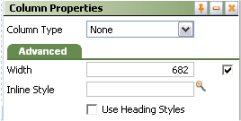 To view or change column properties, click a column header and then click the magnifying glass icon ().
Click the magnifying glass icon () at the top of a SmartLayouts column to open the Column Properties panel. The contents of this panel differs depending on whether the column is part of a Smart Layout.
Field |
Description |
| Column Type |
Select a Column Type. For SmartLayouts, drag and drop operations work best when adjacent cells have the |
| Advanced tab | |
| Width |
Set the column width in pixels. This field does not appear for columns that are part of a SmartLayout. |
| (no label) | Use the checkbox next to Width field (called the Use at Runtime checkbox) as follows:
|
| Inline Style | Optionally, enter CSS code for an inline style for a cells in the column. For guided assistance in composing a style definition, click the magnifying glass icon () to open the Style Editor. You can select from predefined lists or type a style definition directly, and preview the results. |
Each column in a SmartLayout has one of four types:
Field— Cells in this column have field stylesLabel— Cells in this column have label styles.Spacer— Cells in this column are empty.None— No restrictions on cell contents.
When you use a SmartLayout template, field styles and labels initially appear in adjacent paired cells, making it easy to drag and drop properties with the associated label.
Cells in a SmartLayout Label column ( ) have label styles applied by default, but you are not limited to placing labels in the cell. Such cells can hold a field (a property value), a section, or various other controls. Similarly, cells in a SmartLayout Field column (
 ) have field styles applied, but can hold a label, a field, a section, or other controls. You can override many of the style attributes.
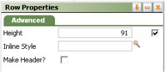 Use the Row Properties panel change the type of a row, or to apply an inline style to all cells in the row.
To view or change row properties, click the circle at the left end of the row. Then click the magnifying glass icon () at the right end of the row. The contents of this panel differs depending on whether the row is part of a SmartLayout.
Field |
Description |
| Advanced | |
| Height |
Optional. Enter a positive number for the height in pixels of this cell. (At runtime, normal browser processing for rendering tables determines the actual displayed height.) This field appears only when no columns in the Layout not controlled by SmartLayout column restrictions (that is, all columns have the
|
| (no label) |
Clear the Use at Runtime checkbox to allow the browser at runtime to determine the height of this row based on the size of the row contents and the size of other rows. The height may vary from use to use depending on the contents of this cell and other cells. (When cleared, the generated HTML for this column includes a <TD> element with no HEIGHT= attribute.) The Height value is used as you update the rule, but not at runtime. For example, clear this checkbox if the cell is to contain a section that may be tall in some situations and short in others. Select the Use at Runtime checkbox to force the Height value to be used by the browser at runtime, even when data values in this column or in other cells would otherwise cause the browser to present a taller or shorter column. This field does not appear for rows that are part of a true SmartLayout. |
| Inline Styles |
Optionally, enter CSS code for an inline style for a cell in the column. For guided assistance in composing a style definition, click the magnifying glass icon ( |
| Make Header? |
Select this option to have the heading styles apply to each cell in the column. |
 As a best practice, use SmartLayouts to achieve uniform height of cells throughout your application's forms. You can set the width of SmartLayout templates in the
  ), then drag the border.
Select a cell and press Enter or click the magnifying glass icon () to open its properties panel.
Field |
Description |
| General tab | |
| Property |
Appears in SmartLayout field columns. Select a Single Value property. Typically, this is from within data source's embedded page property. Alternatively, you can drag a property name from the properties visible in the Application Explorer onto the cell.
If the source is a Report Definition, the list contains Column Name properties defined in the rule. If there are joins in the report, property names appear as
|
| Control | Appears in SmartLayout field columns. Select a control rule to format the value in this cell. If left blank, the property uses the control rule (if any) in the Control field on the property form's General tab.
Many controls on the Basic and Advanced groups are associated with default control rules based on the property type. When you drag and drop a control into the cell, the rule appears in this field. For example, the Button control populates the field with pxButton, the Text Area control with pxTextArea, and so on. |
| Value | Enter text that describes the contents of the column. |
| Label For |
Select a single value property that to associate with the Value. |
| Advanced tab | |
| Default Value | Appears in SmartLayout field columns. Specify a default value for this field. Click the magnifying glass beside it to display the Expression Builder, where you can select or create an expression to generate the default value. Leave the field blank if it does not require a default value. |
| Read-Write Style | Optional. Type the name of the custom style, for example, custom_stylename, that you want to apply to this cell when the user form or flow action form appears in read-write mode. Define custom styles in the Skin rule. See Skin form — Custom. |
| Read-Only Style | Optional. Type the name of the custom style, for example, custom_stylename, that you want to apply to this cell when the user form or flow action form appears in read-only mode. Define custom styles in the Skin rule. See Skin form — Custom. |
| Inline Style | Enter CSS code for an inline style. For guided assistance in composing a style definition, click the magnifying glass icon () to open the Style Editor. You can select from predefined lists or type a style definition directly, and preview the results. |
 This field does not appear if the value in the Control field contains an Action mode control rule such as pxButton.
When you select a Header Style of Tabbed, the layout appears in a Tab Group wireframe. Select it to make it active and click the magnifying glass icon () in the header to open the Tab Group properties panel. Your settings apply to all the tabs in the group.
Complete the top field and General tab. There are no settings on the Advanced tab.
Top field
Field |
Description |
| Format |
Select the format you want to apply to the tabs in the group. To configure the format's appearance, go to the Style Presets > Layouts > Tab area on the Skin rule form Styles tab.
|
General tab
Field |
Description |
| Tab Position |
Select the placement of the tabs at runtime:
If you select |
| Tab Orientation | If you selected a left or right Tab Position, select to display tabs horizontally or vertically. Horizontal is the default. If you select vertical orientation, the tab title is rotated based on the tab position, left or right. |
| Stretch Tabs | Select to stretch the horizontally or vertically to fit the available space. If the Tab Position is Top or Bottom, tabs stretch horizontally; if the Tab Position is Left or Right, the tabs stretch vertically. |
Creating and deleting rows and columns
Use the cell controls to add rows and columns, delete rows or columns, or merge cells.
In most cases, select an object in the layout before clicking an icon. Certain operations may be unavailable depending on your selection and the layout characteristics.
Control |
Description |
|
Delete the contents of a single cell (not a row or column) |
|
|
Insert a new row before (above) the selected row |
|
|
Insert a new row after (below) the selected row |
|
|
Delete the selected row or layout |
|
Merge right — Combine the selected cell and the cell to the right. |
|
Merge down — Combine the selected cell and the cell below it. |
|
Unmerge All — Undo the previous merges. |
The Insert column before ( ), Insert column after(
 ), and Delete column (
 ) operations are not available for Smart Layout columns. They are available in Freeform layouts.
- To reorder rows or columns within a layout, you can select and drag a single row or column using the dots above or to the left of the table; these act as handles.
- To duplicate rows or columns within a layout, select by handle but also hold the
Ctrlkey. Release theCtrlkey to drop a duplicate row or column. - To move a cell containing a Field, hold down the
SHIFTkey, select the cell, drag and drop it in another cell, in the same one layout or another layout. - To cut, copy, or paste a Field in a cell, right-click in the cell to access a context-menu. You can copy a cell from one rule and paste it into a cell on a different rule.