
At Pega, we get a lot of questions about our design system, Constellation, especially around forms.
-
Why are form fields laid out this way? Some fields are 50% wide in a two-column view, others are full column wide.
-
What if I want three, four, five, or more columns in forms?
-
Why is there a lot of white space to the far right of a form in some cases?
-
Why don't my checkboxes and radio groups stack the way I want them to?
-
Why can't we use disabled buttons on incomplete forms?
A Prescription of Design
To understand why we build forms the way we do in Pega Constellation, it's important to know what a prescribed design system is (and isn’t). A prescribed design system gives you industry-standard design principles right out of the box. No need to design each new flow or pattern every time you start a project. Constellation is built to deliver business-transforming workflows fast, keeping you out of meetings and in business.
Building at the Speed of Change
Constellation minimizes settings to maximize value. Instead of manually deciding the placement, width, and height of form fields, Constellation automatically arranges them based on the type and order of data you've chosen. This ensures forms are appropriately laid out for different devices and zoom levels, letting you focus on providing value without sweating the small stuff.
Usability
Constellation design principles emphasize speed, readability, usability, scan-ability, preventing users from being overwhelmed with unnecessary data, and reusing common interaction patterns whenever possible.
Accessibility
Accessibility is a subset of usability, with legal implications in many countries. We target WCAG 2.2 AA standards – sometimes referring to AAA standards for additional guidance. This includes considerations for readability, proper tabbing order, and the use of standard HTML tags for compatibility with assistive technologies. We also account for users with touch-only, keyboard-only, mobility issues, cognitive issues, and vision impairments.
Responsivity
Constellation takes into account that devices can vary greatly in size, from small mobile phones to large displays, like jumbotrons. Additionally, users may zoom in up to 400%, as required by WCAG 2.2 SC 1.4.10. A normal laptop display to one person may render like a mobile phone display to another user with a zoomed display. Don't fixate on how a form may or may not fit on your screen – it assuredly will be different for everyone else.
Because of this, authored size and layout configurations are suggestions to Constellation, never a fixed value. The concept of ‘above the fold’ is not reality, unless that fold is 256 pixels tall.
Prescribed Design’s Impact on Form Design
In short, your only concern should be adding the minimum number of critical fields to your form in a logical order, breaking up that into groups or steps, and letting auto-layout do the rest.
Why is there “extra white space” to the right? Why isn’t there a four-column layout?
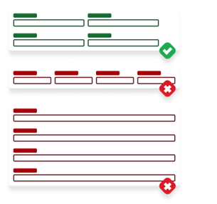
Readability and accessibility prescriptions guide direction here. Authors often want more columns of form fields—three, four, or even five.
Internally, we have tested and have seen issues for low vision users even with a form containing a three-column layout – and while the three-column layout included out-of-the-box is now optimized for readability – it is not recommended.
At the end of the day, maximum content width for UI needs to land somewhere, otherwise super-wide monitor users can’t consume critical data in a consumable way either. Rather than an arbitrary preference, Constellation leans on the WCAG 2.2 SC 1.4.8 standard. This provides an optimal out-of-the-box, it-just-works experience, whether it's for a demo or daily use by a user with low-vision.
So, due to various user abilities, screen sizes, technologies, and preferences at play – even if it seems like there's a lot of white space to the right for content – your personal ideal of space usage is most assuredly an unusable amount for others.
However, we are considering this as a future user-set preference.
Why do checkboxes and radios take up an entire row?
Looking to our usability principles of scan-ability, most eye tracking patterns scan the leftmost side of content first when interacting with it.
Constellation takes inspiration from the layout of the printed page. Sentences flow from left to right, with some lines being longer than others. Just like a paragraph with varying sentence lengths, we want the form to feel easy to scan and navigate. Gaps at the beginning of a row can make it hard to see if there are more form fields, often leading to bugs and feedback issues.
Since text areas, rich text editors, tables, radio button groups (horizontal and vertical), and checkboxes can have varying dynamic heights, placing them next to each other in a two-column layout creates large dead zones at the left edge of form. As such, Constellation prevents them from being able to be placed horizontally to another form field. They must be in their own row.

All other form fields stagger using the suggested dynamic templates’ column number.
One outlier is a table within the form, as they fill the entirety of white space. The visual language provides scroll cues, and the column widths are all generally under the readability maximum width, meeting the readability recommendations from WCAG.
Be aware that tables are difficult to work inside of a form and their editing and validation patterns are a bit cumbersome for users.
Why doesn’t Constellation use disabled buttons?
While disabled buttons seem like a good pattern for incomplete forms, they pose significant accessibility and usability challenges. Due to the nature of the disabled property in HTML, buttons like this can't be accessed with a keyboard or read by a screen reader, making them essentially invisible. They often have low opacity, which provides context for those with excellent vision but not for others with low vision. Adding contrast still won’t help, as it now may seem like an active button to sighted users and still invisible for blind users using assistive technology.

Instead, Constellation provides error validation checking on when clicking “Submit”, helping users know what they need to do to move forward – something a disabled button cannot do.
Wrap up
These design principles aim to help everyone succeed, regardless of their device, ability, or screen size – providing equal opportunities to complete work efficiently.
If you have feedback for us, think we’ve missed something, or even disagree – please discuss and ask questions on the reach out to us in the Pega User Experience Expert Circle.