This article is part of Pega’s Design-Driven Development series, in which we showcase design thinking in action. This article discusses a quick solution implemented in Pega Agile Studio using Theme Cosmos on Pega 8.6 only.
People who use Pega Agile Studio are busy — typically working on multiple projects and cases at a time. With so many ongoing processes and the need for consistent communication among team members, notifications can feel overwhelming. In this article, we’ll briefly discuss a recent solution that made notification management easier and helped users get things done.
First, let’s step into the work process of a Pega Agile Studio user and explore an issue that some of our users experienced with notifications.
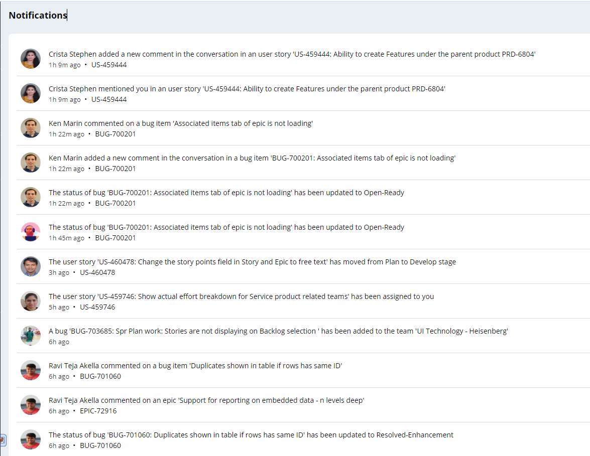
Imagine you are in Pega Agile Studio, searching for mentions and work that’s been assigned to you. To look for this, you head to the “notifications” page and click “view all,” where you’re presented a flat list of all notifications from your team members. Since there are many notifications presented all at the same time, you must scan the list for only the information that is relevant to you. While doing this, it’s possible you may miss an assignment or a mention. This, of course, is frustrating— not only might it cause you to skip over an important action item, but it also takes up your time, since you must scan through the list to identify work items.
We knew our solution had to provide users a quick and easy way to view their action items — one that would display only their notifications in an easy-to-view format that would yield fast actions.
That’s why we decided to create two categories for notifications: “mentions” and “assigned to me.” These categories would filter the notifications based on @ mentions in the Pulse feed (presented as “mentions”), and work assigned to the user (presented as “assigned to me”). These categories would be displayed as tabs next to the notifications view, so the user would simply click on the tabs to view their mentions or assigned work.
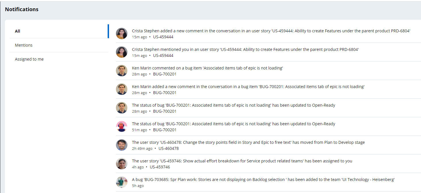
With this solution in place, users can view their work items at-a-glance and begin working on tasks immediately. Most importantly, this solution prevents users from accidentally overlooking important notifications that demand their attention. In sum, we made finding and acting on notifications convenient, saving users time and worry – just one example of an intuitive UI/UX solution in Pega.
Recommended resources:
- Design-thinking in action: improving the UX of the navigation panels
- Horizontal screen flow: Using an evidence-based framework to solve complex UX challenges
Don't forget
-
JOIN THE CONVERSATION on Collaboration Center
-
FOLLOW @PegaDeveloper on Twitter
-
SUBSCRIBE to the Pega Developer Podcast on Spotify or via RSS