
This article is part of Pega’s Design-Driven Development series, in which we showcase design thinking in action.
Imagine this situation: we need to show a set of steps or stages in proper order, from left to right. It’s important for the user to view all the stages horizontally. However, alignment is a big problem when it comes to displaying the steps. When we left-align the text, as we do today, we get an empty space at the end of the list of items. When users see the empty space, it appears to be inconsistent, so they often report it as a bug.
A situation like this affects the user’s journey and experience. When end spacing is inconsistent, users are distracted from the task they want to accomplish and wonder if the flow is working properly. When users think there is a bug, it undermines their confidence and slows adoption.
There are times when it is necessary to display information horizontally, but at times it is difficult to properly implement without sacrificing the design and usability of a page. In this post I’d like to demonstrate an evidence-based approach to solving UX challenges. I’m using the horizontal screen flow improvements that will be in our upcoming Pega Platform 8.6 release as an example here, but the steps in this approach are broadly applicable to solving almost any kind of UX problem.
1. Research multiple solutions
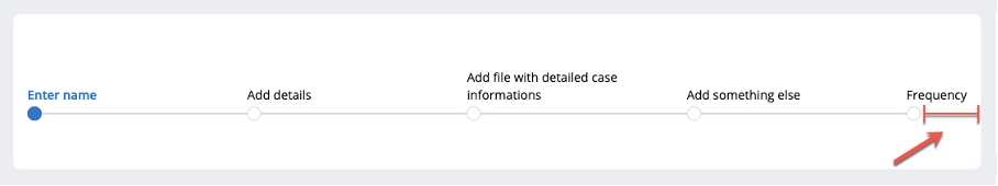
After understanding the horizontal screen flow problem, we explored various possible solutions. For example, in the diagram below, each field is equal in width (flex-grow: 1;), except for the last one (flex: 0 0 auto;). This causes the last field to match the content; but in extreme cases, it can cause behavior like this:
That wasn’t going to work.
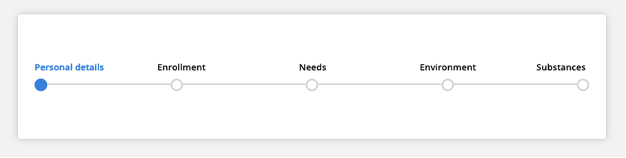
We looked at other examples on the web—and it seemed that centering all the elements was the most common solution. In contrast, our current design had the first element aligned to the left, the last to the right, while the rest were centered, like this:
Visually, the hybrid approach looked like a good option, but we wanted to be sure that it was the best for our users—and testing would help us do that.
2. Explore each solution in detail
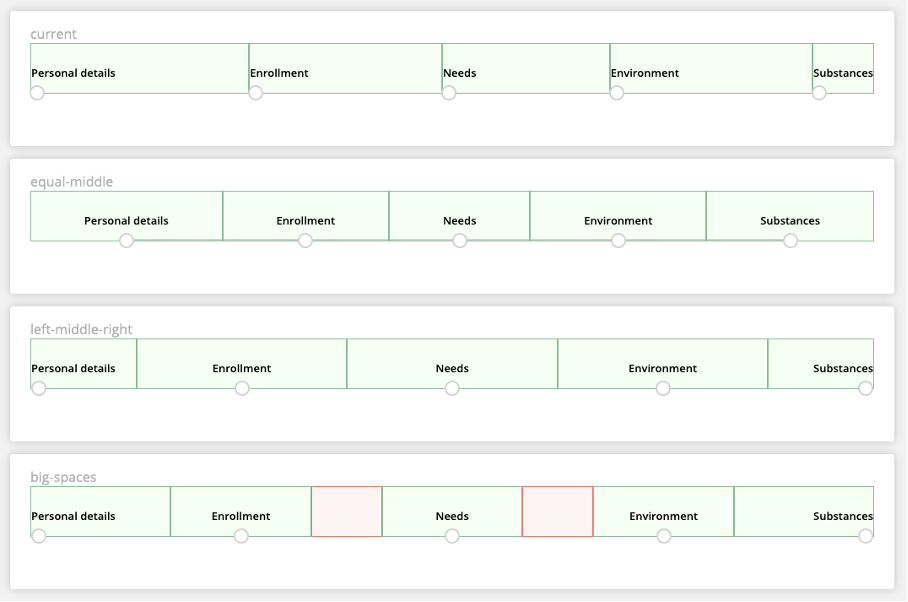
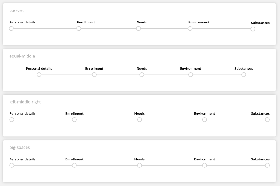
We decided to design an evidence-based method for evaluating each solution. We calculated the intervals between the elements and the text space, then tested four possible solutions:
- the “current” solution of left-aligning each step of a process
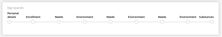
- the “equal-middle” solution of centering each step
- the “left-middle-right” commonly used in other websites, where the first step is left-aligned, middle is centered, and the last is right-aligned
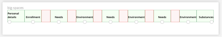
- and finally, the “big-spaces” solution, where additional spaces are added after each step and create more padding
Each solution had advantages and disadvantages.
3. Analyze the results
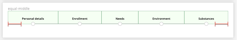
The equal-middle solution is common in the industry, but there’s one disadvantage: there’s a small amount of unused space around the edges.
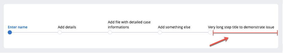
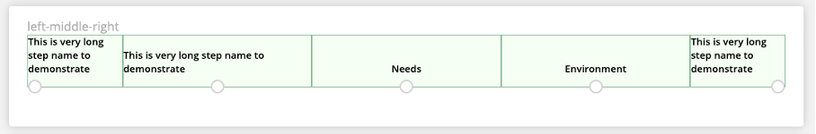
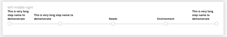
The left-middle-right solution largely meets the design requirements, but the text space for the first and last element is half the space of the others. Since we don’t know what the actual text of the individual steps will be, we run the risk of the first and second steps looking different despite having the same content, as when the title of the first step is especially long. In this situation the fifth step might look odd as well, despite the large amount of free space on the left side. It's wrapped in a way that could strike the user as unusual.
Similarly, the big-space solution works moderately well: the points are distributed at equal distances and the text space is also equal. The disadvantage of this solution is the potential loss of space. There are no space concerns in the example above, but we do have to consider there may be additional steps that would benefit from using the big-spaces but are prevented from doing so. The red color in the example below indicates unused space.
4. Select the best solution
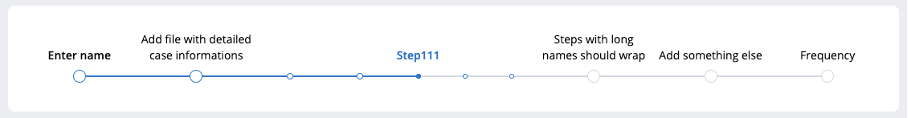
Considering the pros and cons of all these approaches, we developed a modified equal-middle solution will be implemented in version 8.6 of the Pega Platform.
Here’s what it looks like:
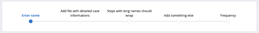
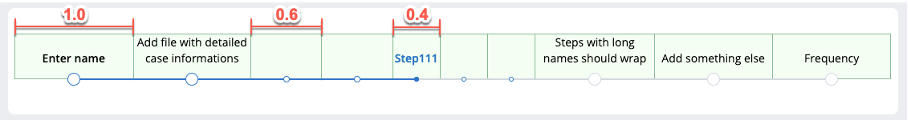
We calculated distances between individual elements. In order to make it as easy as possible for the user to use this form of step indicator, we also introduced different markers for steps on different levels. In addition, the distances for the steps are different in length, indicating at which level the step is located. The illustration above shows the ratio of individual steps, with main steps at 1 (129.4px), second level at 0.6 (77.63px) and lower level at 0.4 (51.75px), Varying the space between elements in this way helps users better orient themselves visually in any given flow.
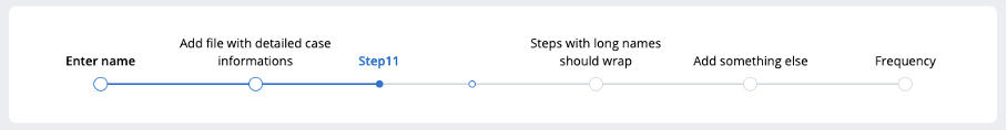
Coloring the edges was also a problem. In our previous version, we would color the entire bottom field border, including space in the step that followed the step indicator. Users frequently mis-interpreted it as a bug (how could they have progressed past the last step that they had completed?) and became frustrated when the behavior could not be modified.
In the new approach, we added, two <div> elements to each step: one sticking to the left edge, and the other to the right. As a result, we no longer had to color the whole bottom field border but could also only cover half of it. What this meant is that we could now apply different colors, depending on the status of the step. There are many scenarios in which one might want to apply different colors to represent progress, and so the new solution is also much more modifiable.
5. Measure the impact
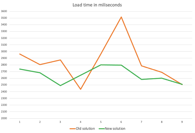
As a result of using this approach in our Pega Platform 8.6 release, we expect a decrease in reported bugs. More than this, when measuring how this approach performs, results show that loading time was reduced in the examined case by an average of 331ms, which translates into 10% of the total load time.
The goal of UX design is to create user experiences that are both aesthetically pleasing (a design that feels natural) and responsive (a design that helps users to get more done). This horizontal screen flow problem demonstrates is how a methodical approach that explores and competes multiple possible solutions can produce an evidence-based solution that is optimal for almost every situation.
Related Resources
- Show your UX savvy by taking the UX Essentials mission.
- Explore the power of the Cosmos Design System.
- Visit Design at Pega Community to join the conversation.
Don't Forget
- JOIN THE CONVERSATION on Collaboration Center
- FOLLOW @PegaDeveloper on Twitter
- SUBSCRIBE to the Pega Developer Podcast on Spotify or via RSS