
Imagine you’re booking a flight online. To begin searching for a flight, you likely fill in the details of your trip, using a form. You then select your flight, and are prompted to create a member account, also using a form. You’re then taken to a screen where you enter your payment details — again using a form. In this way, forms can make up a large part of just a single online experience. In fact, forms are so common that we typically don’t pay close attention to them — until they go wrong. We’ve all had experiences with poorly designed forms‚ and know how frustrating they can be.
For example, let’s say a user is filling out the form below as part of a job application:
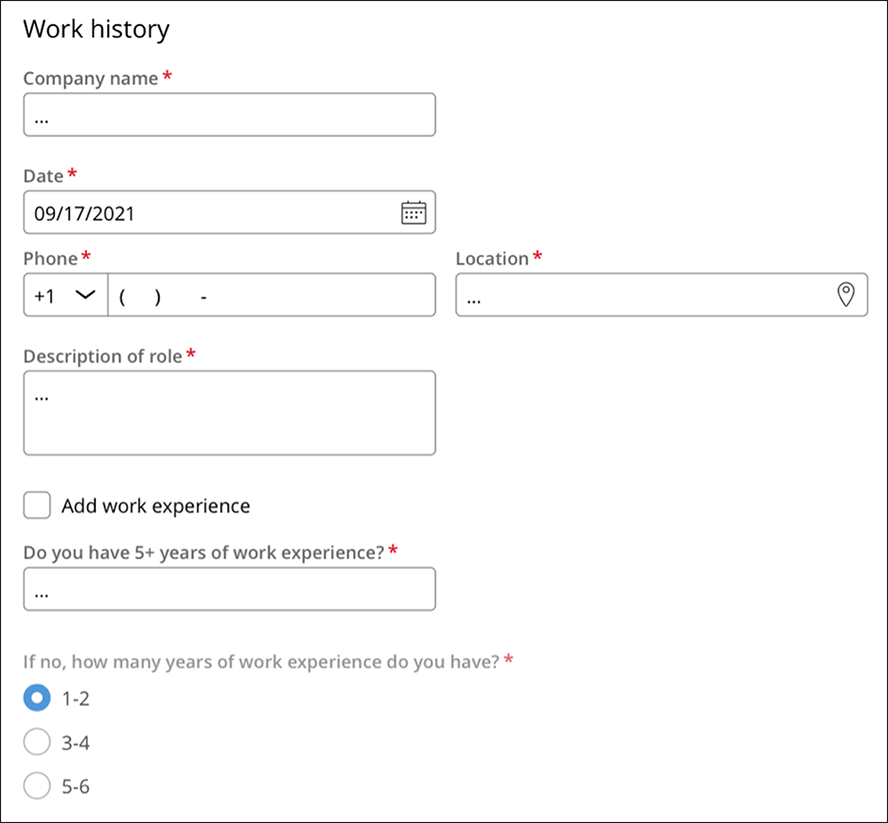
Many things are confusing here: does the user need to fill in today’s date, or their start date? Their location and phone number or the company’s? The text box included is so small that the user likely must scroll to review what they’ve written. And finally, the last question is required, but not everyone will need to complete that field.
Bad forms often lead to a frustrating user experience, and they can hurt your business. For example, if a user isn’t able to enter information into a form to buy something from your business, they can easily leave the transaction and go to a competitor’s website instead. Or at the very least, they’ll carry negative feelings about your brand from the experience. This is especially true when they’re dealing with high-stakes processes, where good UX is crucial and expected.
So, what makes a form good? When we were designing Cosmos, our design system for enterprise, we knew that forms would be one of the most important things to get right. So, we challenged ourselves to ask: what makes a form effective? And how can we apply those findings to enterprise workflow applications?
We conducted some research with a group of unmoderated participants. We first asked the participants what they believe makes a form a good one. And we heard that people thought the best forms are understandable, quick to complete, error-proof, and accessible.
So how do these characteristics translate into an actual form design?
We had some ideas about what types of forms might work best for enterprise applications and decided to test several form layouts with the same group of participants.
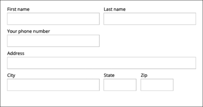
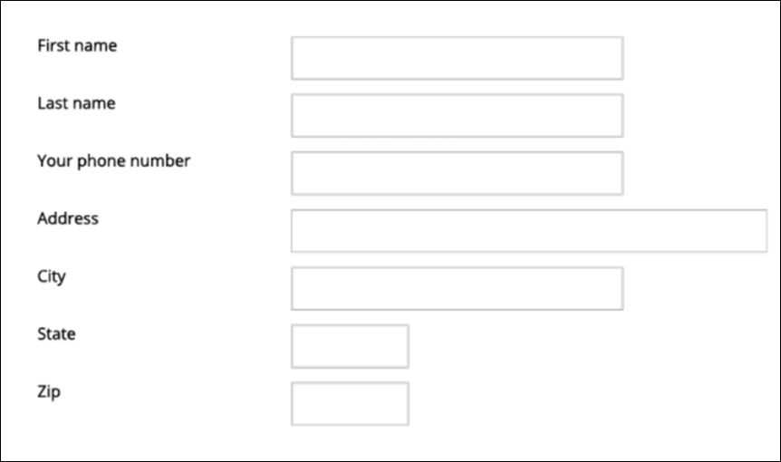
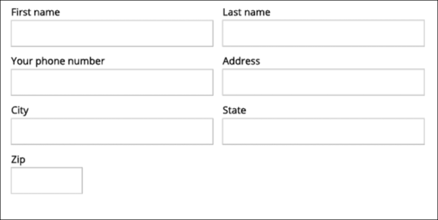
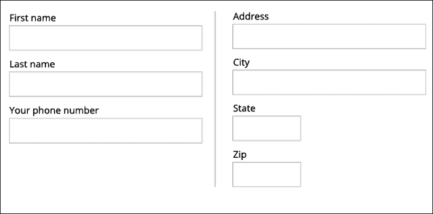
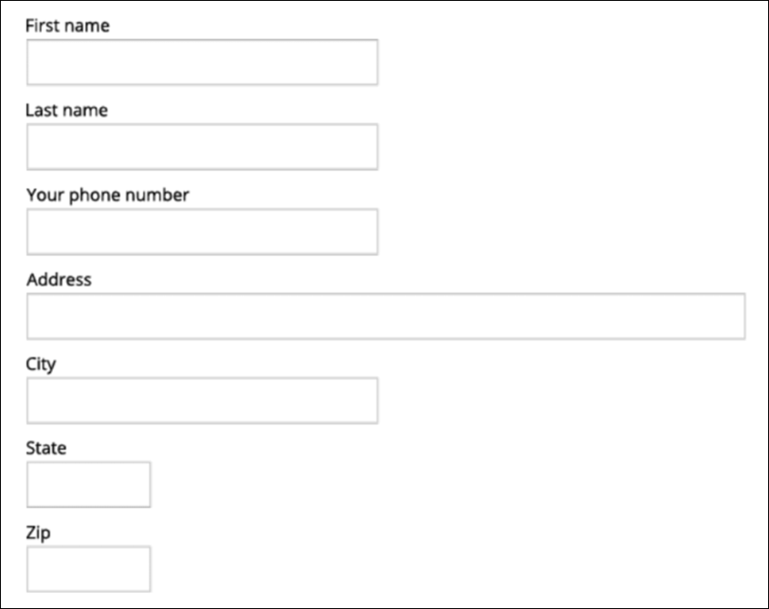
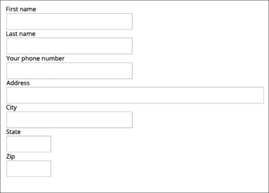
These are the form designs we showed them, and why we chose to include them in our study:
Proposed design
Left labels
Two columns
Two columns stacked
One column
One column tight
Each participant completed all six forms.
We then measured the time it took each participant to complete each form. We found that the left-label and two-column formats were statistically slower – people paused just a little before filling them out. On the other hand, the one column format and top labels forms, as well as the participants’ consistent tabbing behavior, all helped the participants complete the forms faster.
Our participants also told us which form formats they prefer and why. They preferred formats that logically grouped fields, like the proposed and two column stacked forms. Interestingly, the two-column stacked layout tended to cause more user error, as people would read fields horizontally from left to right, as opposed to vertically, from the top down. When tabbing through the form, participants would also mistakenly fill out data for the field on the right, in the field below.
Based on these findings, we came up with the following do’s and don’ts for form design:
DO:
- Group fields logically—Users prefer the stacked and proposed formats because they grouped fields clearly
- Use the one column format for unrelated fields—This helps users complete forms faster
- Set a max width for your form—Reducing the stretch of fields makes forms easier to read and helps group things logically
DON'T:
- Use two or three column layouts for the entire form—Two and three column layouts take longer to fill out and are less preferable
- Place labels to the left of fields—Users find it difficult to associate fields with labels when labels are to the left. Placing labels directly above fields also helps users complete forms faster
We used these principles to create our form design for Cosmos. Over time, visual changes were made to the design for a smoother user experience. We ensured that field widths were consistent, determined the number of columns various inputs should take up in a form, and ensured that all labels were consistently placed on top of fields.
Today, forms in Cosmos React (8.7) can look like this:
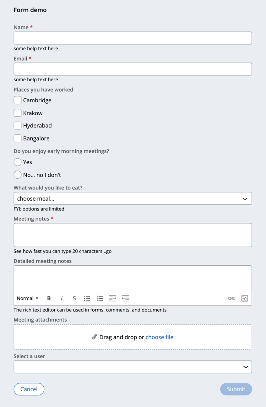
Both versions of the Cosmos design system – Cosmos React (8.7+) and Theme Cosmos (8.5+) – make it simple to design intuitive forms. Both versions of Cosmos 8.7 offer designers pre-defined form layouts and features for great form UX out-of-the-box. Today, out-of-the-box features include the following:
Form layout
We recommend using Cosmos’ default one- or two-column form templates, depending on the field types you’re including in a form.
Complex fields, like rich text editors, text areas, radio groups, and checkboxes, automatically stretch across the form and use a two-column layout in Cosmos React. Simpler controls, such as text inputs or combo-boxes, are shorter in width and only require a one-column layout. In this way, you can make the best use of the screen real estate within your forms.
Button placement
Cosmos strategically places action buttons in the same area across all forms (on similar devices). This way, users always know where to go to take core actions on a form, like submitting a form, returning to the previous screen, exiting a form, and saving edits to continue later.
Your users won’t waste time searching their screen for these actions, and you no longer need to spend time deciding and standardizing where to place them in the UI.
Field errors and warnings
Finally, Cosmos supports error and warning states for form fields, so that users can easily identify and solve any issues as soon as they encounter them.
From the beginning, we’ve understood that forms are a core part of enterprise applications, so we’ve done the work to make them as user-friendly as possible out of the box. As such, you design exceptional forms quickly and your users get work done with an intuitive and efficient user experience.
Recommended resources:
- Learn more about Cosmos React at design.pega.com
- Learn how to configure forms in Cosmos React
- Take the Pega Cosmos Designer mission to discover more about Cosmos React and learn best practices for forms and more
Don't Forget
- JOIN THE CONVERSATION on Support Center
- FOLLOW @PegaDeveloper on Twitter