I’m going to let you in on one of the secrets to a great user experience: Consistency.
I’ve never heard anyone say, “I don’t care about our users, let them suffer,” but I have heard, “We don’t have the resources or time to make the user experience we want.”
It is easy to become inconsistent in how components work, look, and feel in your application if all your designers and teams are not working from common components. This is more work for your design team (coming up with a new pattern every time) and more work for your development team (not being able to reuse work they, or another team, has done before).
Consistency is your best friend. Making things work the same way every time is a better user experience, and it’s better for your development team. Pega users are likely already familiar with the power of reuse in rules, and I’m going to talk to you about the best way to reuse UI: Design templates.
What is a design template?
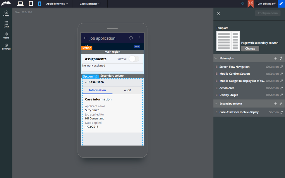
A design template is used to create UI inside Pega. A template has a series of regions that are filled with content. When an application author changes a layout, the content inside reflows to fit inside the same region names.

This allows application authors to create high quality and consistent UI every time. No more fiddling around in sections trying to get the exact same layout – use a template! Design templates separate data from presentation.
Pega ships with the most common templates already in the product, but you can create your own to fit your application’s particular needs.
How to design a great design template
Designing a design template (say that 10 times fast) has the following stages:
- Identify need
- Layout & regions
- Template name & image
Let’s break down the best practices of designing a design template by discussing each stage.
Identify need
In an application, most of your layouts are going to be repeated patterns. There will be others that are one-off. Use templates for the repeated patterns for the best results.
When creating a new template at Pega, we ask a series of questions before deciding if we need a new template:
- Is this pattern being used (or potentially being used) in multiple places? – Templates should be created for repeated patterns, not one-offs. This keeps your number of templates manageable.
- Is this significantly different from an existing template? – Often when we were first defining templates, a designer would present a design that was just a little bit different from an existing template. The templates team would question this design and try to find out why it was a different design. Sometimes it in fact would be a new template with a different use case, but most times it was a variation on something that already existed. The designer would take the existing template to their development team and utilize that– meaning less work, less things to manage, and more consistency.
- Should this be an edit of an existing template, or a new template? – Templates are not designed to be static. They’re editable, and you can move around your regions, or add new regions, without affecting existing sections! Changing a template can update your entire application to a new pattern by only changing one rule.
Pega provides the most common templates in our out-of-the-box applications. We recommend that you start with these templates and build upon them as necessary.


Layout & regions
If you’ve determined a template is needed, you presumably have a design for it. Well, you more likely have a design for a screen or view, and it’s time to annotate it so that you can build a template.
Templates consist of regions. When building with a template, a user adds fields to a specific region, and if a template is edited, or the template is switched, fields stay in that particular region.

For consistency across your application, and the most reliable template switching, use standard region names. At Pega we use these:
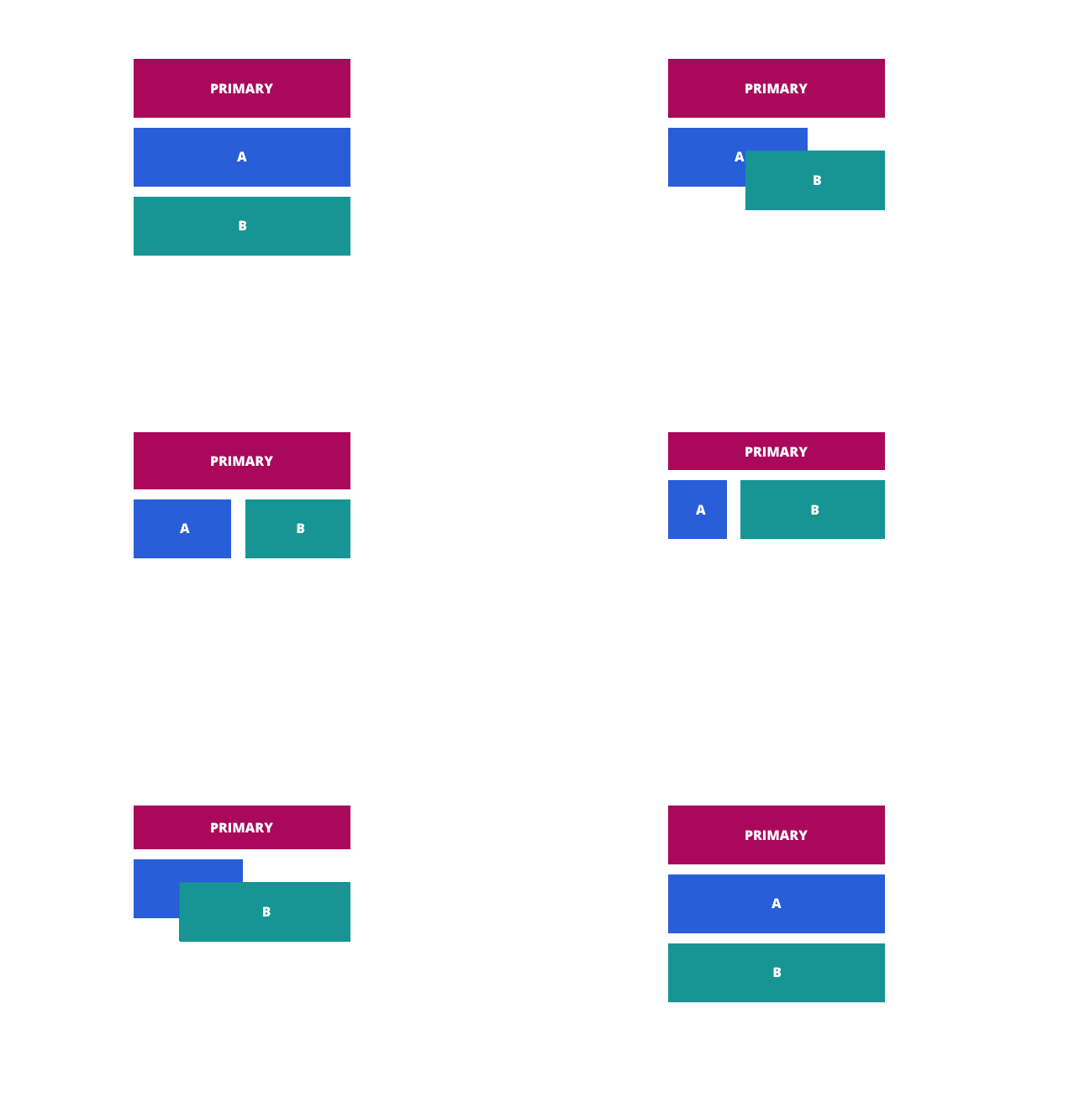
- Primary – The primary data in a layout is added to this region.
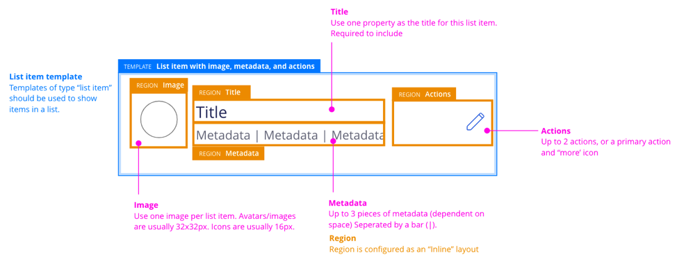
- Title – Consists of one property, which serves as the title
- Metadata – Generally used to show a series of properties, in conjunction with a title.
- Actions – Where any action buttons or menu is shown in a layout
- Breadcrumbs – A region for breadcrumbs.
- Widget – Where a user is expected to place a widget that can be its own section.
- A, B, C, D etc – Any region that doesn’t have a specific and succinct purpose is named with letters of the alphabet.
Consistent naming helps developers put things in the right place. When building templates in your application, start with the region names defined by Pega, and only add new ones when necessary.
Template name & image
Lucky for you, if you’ve been following the best practices laid out here, you’re in great shape for the final step. Once a template has been designed and the regions named, it needs to be named and given an image to help people find it in the template picker.

We name templates based on a formula:
[Behavior/Channel] [Type] [Contents] [Attribute]
- Behavior/Channel: Optional. Use to clarify if there is a specific behavior this template has, or if it for a specific channel. Examples: Expandable, Flipping, Mobile, Watch.
- Type: Required. Describes what type of template it is. We recommend using our four categories as a starting point: Page, List item, Card, Header.
- Contents: Required. A description of the contents. Use the names of your regions to guide this. Examples: “primary with 4 regions,” “metadata and actions,” “image and action,” “two regions and widget.”
- Attribute: Optional. Any final descriptors of the template used to distinguish it from others. Examples: Centered.
Then, put them all together:
“Page with cards and layout group”
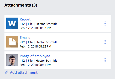
“List item with image, metadata, and actions”
“Card with image and metadata, centered”
“Expandable page header with primary and four regions”
(These names are, we admit, a bit wordy.)
The image used for a template should assist in the understanding of a template. We created a template that we use to build our templates. You can download it, along with the Pega Design System files, here.
Summary
Design templates are the best Pega tool to get a consistent, reusable UI. Design and build them once to use them over and over in your application.

