
Designers use many systems to create consistency, look and feel, and functionality of applications. And it might sound like these systems – design systems, pattern libraries, style guides – are all interchangeable. While they may have common elements, each system serves a fundamentally different role in your design process. If you are a designer working with Pega products, you’ll need to know the difference.
But what’s the difference between these when it comes to building software?
To start, let’s define each term.
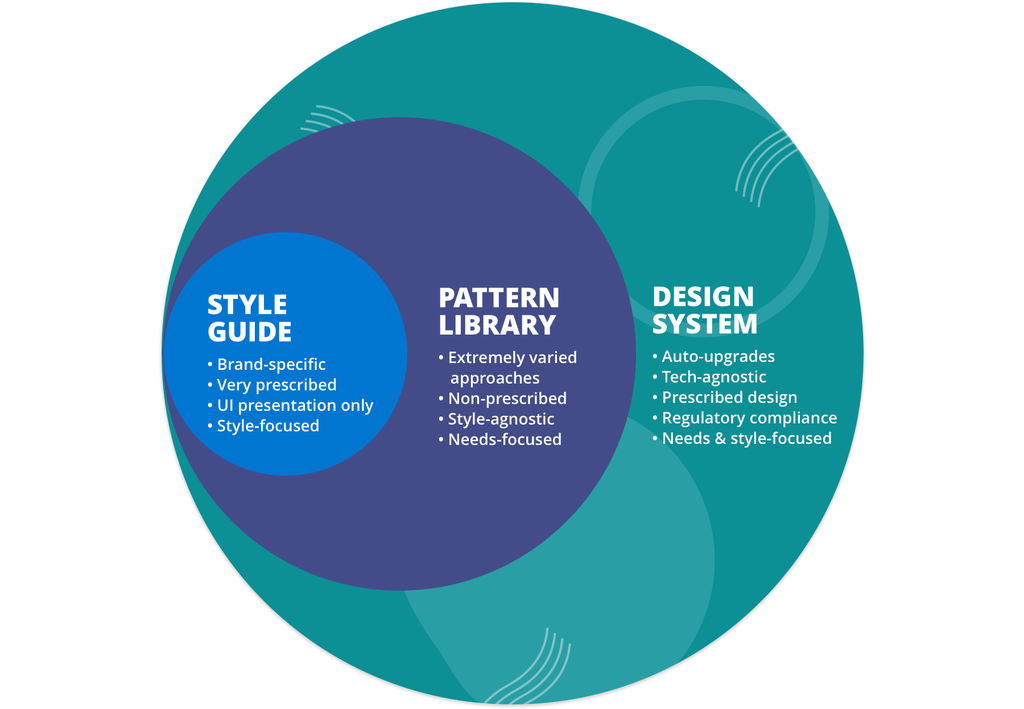
A style guide documents the look and feel, colors, typography, and voice and tone of an application. Style guides are valuable tools for both designers and content strategists – they document the guidelines for designing and writing the words within the application.
A pattern library is composed of both UI elements and components, along with common workflows and use cases. Pattern libraries help designers work with frequently combined or related elements to quickly see and prototype how groups of elements can be visually combined.
A design system may include style guides and pattern libraries and adds more: it’s a design builder kit – or a shared library of UX patterns, which are made up of components that provide a consistent experience – through the systemic combination of holistically-aligned rules, patterns, and workflows. A design system is design… combined with engineering. And unlike most pattern libraries, which are made up of individual patterns and pattern slices, design systems are designed to connect and work with existing data processes and underlying UI technology.
Style guides and pattern libraries both offer best practices for how an application may look and even examples of the visual elements coming together. But they don’t provide individual design assets for scaled use across an application, along with the backend behavior of those design assets. Additionally, the design system does a lot of the work for you – for example, it automatically adheres to standards in accessibility and usability.
The design system contains a much bigger structural framework to combine how the visual designs work with the underlying technology. It allows you to build your application, while patterns and style libraries tell you about what your application should look like. Our design system, Cosmos, automatically upgrades components and their corresponding patterns. That way, when you subscribe to get updates to the latest Cosmos version in Sketch, you’ll be getting the latest and greatest.
So, how do you use each of these resources effectively?
Use a style guide to learn about the brand and its visual implementation in the UI. A style guide is a prescribed, brand-specific encyclopedia of UI guidelines that will help you better understand the look and feel of a brand – so that you can carry that over when designing your application. For example, a style guide might show you an example of a button, its preferred colors, or shapes.
Use a pattern library to understand how various visual elements can address specific user needs within the application, together. Pattern libraries can help you learn preexisting combinations of design elements so that you don’t need to recreate the wheel when mapping out landing pages, home pages, and more. A pattern library will consistently illustrate where your button appears in modals and illustrate the various page designs in which such a button might appear.
But while a style guide will help you design an on-brand, stylish application, and a pattern library can offer many ideas for combining components according to user needs, it’s the design system that will help you use your components and patterns to focus on your customer’s experience. That’s because it encompasses all the above to present your software as functional, trustworthy, consistent, and beautifully aligned to your company’s brand.
Following our example, when using the design system, your button is functional, works the way it’s supposed to work, takes the user to where they need to go, appears in the right place every time, and its design is automatically updated as the base design evolves – so everywhere the button may appear gets the up-to-date treatment. You know what to expect from this button’s behavior as well as its appearance. That’s what we wanted to achieve when designing in Cosmos, Pega’s design system for enterprise applications: a prescribed, familiar, and scalable experience that helps people get work done. So as a Pega app designer, you’re not focusing on the little things like buttons – you’re focusing on how to create the right flow, data interfaces, and experiences for the people using your products.
Style guides, pattern libraries, and design systems are all important tools for enterprise design. But when it comes to taking your prototype and making it functional, scalable, and user-driven, the robust design system is your best instrument.
Recommended resources:
-
Subscribe to get updates to the Cosmos Sketch library.
-
Learn about the Cosmos design system in Pega Cosmos Designer.
-
Explore more design resources on design.pega.com.
Don’t forget
JOIN THE CONVERSATION on Collaboration Center
FOLLOW @PegaDeveloper on Twitter
SUBSCRIBE to the Pega Developer Podcast on Spotify or via RSS