
Are you a designer working with the Pega Cosmos design system for the first time? Welcome!
Maybe you’ve checked out the website, taken the Pega Cosmos Designer Academy mission, subscribed to get updates to the design system Sketch library, met with your team, and identified your user personas and the problems you’re solving on their behalf. Now you’re on your way to making a functional Pega app prototype!
We created the Cosmos design system to help you and low-code app developers craft working prototypes quickly. But if you’re new to working with an enterprise design system, it’s natural to wonder if there’s anything you’re missing before you get started and if you’ve set yourself up for success. We hear you! So, here are some quick tips — the dos and the don’ts — to help you design a great Pega application using Cosmos, on your first try.
DO this when designing with Cosmos
- Use page layout templates
Cosmos includes page layout templates designed to work specifically with Cosmos patterns and components. These templates are predefined, well tested, and proven to serve most use cases for your application. If you’re curious why we ask that you use templates instead of getting creative with your own, it is because templates make upgrades, fixes, and quality control much easier. When using a template, users will learn things fast and better understand project expectations. They are also more likely to complete their work if they are following a guide that tells them what to expect. A Pega case page is a typical example of a template: it includes the Summary Panel, Activity Area, and Utility Panel patterns and components designed to appear in a certain order and function in a prescribed way.
- Embrace prescribed design
Prescribed design is a set of default designs and templates with pre-set configurations that reduce design time. This allows the designer to create pages and flows that focus on user needs, instead of smaller design decisions like button color and placement. A prescribed design system defines how applications behave in terms of navigation, workflow, and information architecture. Prescribed design doesn’t mean inflexible design — it iterates over time as user needs change. This means that Cosmos isn’t designed to make you wonder about the shape, color, or placement of a button. We’ve done that work for you, and we have standards for where each component should go — you don’t need to recreate the wheel screen-by-screen. Instead, you get to focus on what’s more important — understanding what data the user needs to see, when they need to see it, and how to surface it.
Embracing the prescribed nature of Cosmos can actually help you elevate your career by forcing you to stay focused on the user, and ultimately more strategic in your job.
- You can brand Cosmos your way
Worried about how the prescribed design of Cosmos will mesh with your company’s brand? Don’t be! Cosmos can and should be themed as per your brand standards. There are easy and scalable ways to make Cosmos look and feel like your brand, without sacrificing all the built-in functionalities. It’s a win-win for both your product and your brand.
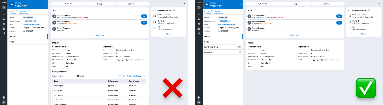
- Reuse patterns and components
Since Cosmos is a prescribed design system (see point two above), this also means that we intend patterns and components to be reused. For example, in the To Do list (or Tasklist), we are using a Summary List template to show users what's next, who's doing it, and when it is due. Then, we’re reusing that same Summary List template in the Files and Documents widget to show the type of attachment, the name, and when it was added. There are multiple reasons for this: for you, reusing design assets makes upgrades, fixes, and quality control much easier and more efficient. And for your users, reusing patterns helps them learn the software faster and clarifies what to expect during the workflow.
- Rely on Pega case workflows
In Pega, cases (or work items) help users understand and act upon work in various ways: in stages, steps, priority levels, urgency levels, due dates, and more, — all of which we designed to create an efficient and scalable workflow. As a designer, it’s important for you to design workflows that follow the established ways of naming and organizing work. Otherwise, your users will experience unexpected workflows and you’ll face unmaintainable designs that don’t scale, or pages that take a long time to load. Pega offers many ways to learn about workflow standards and we encourage you to understand them before you begin to design with Cosmos.
If you’re ever in doubt about how to organize your application’s workflow in your prototype, check out the Pega case management for designers module in the Pega Cosmos Designer mission, and work with your Lead System Architect (LSA) to lay out your ideas into a Pega-approved workflow and case structure.
- Design to get users info they need – without TMI
You know when you get that TMI, or “too much information”, feeling? When someone tells you a lot of things they believe to be helpful to you, but you can only act on bits of the information and must parse the rest to figure out what’s important and what isn’t at the moment? Too much information isn’t helpful, it’s overwhelming! And in UI, oversharing happens more often than you’d expect. Whenever your user must stop work to try to figure out what the system wants them to do, they’ve experienced TMI.
Cosmos offers lots of tips to help you avoid TMI. We’ve optimized Cosmos so it presents just the right amount of information for most templates and patterns (see: Summary Panel). But when you’re working with information-heavy UIs, it’s also on you, as the designer, to always optimize your work to reflect only the minimally critical and least disruptive amount of information to show the user.
Here’s a practical example: color. Too much of it never made a UI prettier or clearer. Only use color to draw your user’s eye to the most important data available at the current moment in the workflow. In Cosmos, color highlights statuses, the types of assets attached to a case, notices, and what to do next — all valuable information that color communicates.
- Ask for help
Designing an enterprise application can be overwhelming — there are many use cases to think about, user needs to address, and standards to learn. But at Pega, we’re committed to empowering you to do your best work with Cosmos. And we’re confident that by using the resources and guidelines and collaborating with your team, you’ll be on your way to build great enterprise apps and raise your organization’s design maturity through better, more intuitive, results-driving UX.
To that end, we’re here to help! Ask questions in the Collaboration Center, check out the resources on the Cosmos website, and engage your team to really think about users’ workflows.
DON’T do this when designing with Cosmos
Now that you know what to do when working with Cosmos, here are a few straightforward (and practical) actions to avoid.
- Don’t customize frivolously
We’ve said it before, but we’ve predesigned components so that you don’t need to reinvent the wheel. Remember that Cosmos offers data views and widget components right out of the box. And many of those components offer configuration options. For instance, you can render a List in many ways.
It’s true that Cosmos components may also be extended and customized, but involve your developer and ensure that your use case is truly unique. This might occur for a rare, high-value pattern that isn’t part of Cosmos yet, and in such a case, you could work with your developer to build a custom component for React. But in most cases, avoid this.
- Don’t get TMI in tabs
Remember the TMI that we just talked about? Here’s an example of what not to do: insert multiple cards or objects into case tabs. Case tabs are singular in focus and should only present one idea or type of data at a time. If you have too much, or too disparate information, in a single tab, consider using separate ones.
- Don’t forget your user persona
As your application gets more complicated, remember to still ask yourself:
“Who am I designing for?”
“Do they need to see this?”
“Do they need to see this at this moment in their workflow?”
For example, are the form fields or Summary Panel data that you’re presenting to a user relevant to their organizational role?
- Don’t neglect the content in your multi-step forms
Forms are some of the most complex (and most important) parts of your application. That’s where users interact and communicate with the system, so it’s important to get forms right so that you get the best data from users. When working with multi-step forms, remember to organize the information logically so that users do not feel overwhelmed. Having steps within a form allows users to save work as they go, prevents information overload, and helps people feel more engaged.
To help you think through multi-step forms or screenflows, we’ve created a flowchart to help you identify the right component for your form design.
As you get started with Cosmos, you’ll want to explore and experiment with the components, patterns, and templates within the system. We encourage you to do that and to subscribe to our Sketch library for updates.
Remember: Cosmos is built on industry best practices and user research to save you time, encourage you to think deeper about UX, and become a better advocate for your users. It’s your design tool and application builder kit, but it’s also your tool for thinking deeper and growing your expertise as a true designer of enterprise user experience that enabled you to go beyond visual design.
Recommended resources:
Don’t forget
JOIN THE CONVERSATION on Collaboration Center
FOLLOW @PegaDeveloper on Twitter
SUBSCRIBE to the Pega Developer Podcast on Spotify or via RSS