Dry erase marker fumes permeated the air, and the marker emitted short little squeaks against the board. Crammed uncomfortably close to each other in a tiny one person office, I and two other leads didn’t dare take our eyes off the board or think about anything else, lest we fall behind the breakneck pace of the enthusiastic client talking and scrawling on the whiteboard.
Referring to UI screens, he exclaimed, “What I want is to build reusable components once and use them in multiple places!” while scribbling diagrams of components.
That was an enduring and insightful anecdote from my career before joining Pega. I spent four exhilarating years traversing the country, helping major enterprise customers build mobile and web applications using another vendor’s model-based web and mobile application development tooling and platform. The client at the whiteboard (I’ll call him Ryan) was a seasoned architect and the technical authority at his company at the time. He was the most passionate client I’ve encountered—passionate about his industry and passionate about leveraging the latest technology in his business. Ryan also understood that model-based development tooling could accelerate the development cycle. As an expert in this tooling and platform, I was brought as a development lead to help achieve this vision.
Fast forward to today: I frequently recall Ryan’s vision in my front-end related work here at Pega. When I’m building Pega Platform apps, I often get excited (maybe too excited) and think, “This is exactly what Ryan was talking about!”
The Pega Platform platform is designed to achieve his goal, and a good example of this is in our UI architecture.
Like Ryan’s vision for reusable UI components, Pega Platform lets you create reusable sections, templates, and controls, to name a few. But Pega Platform also goes far beyond that: in addition to letting you build usable components, many modern mobile and UI patterns are already built for you! They’re available in Pega Platform’s UI Kit.
Based on the stellar designs from the Pega Design team, I’ll share with you some of the latest features in UI Kit 8 shipped in Pega 7.2.2. But first, for readers unfamiliar with the UI Kit, let me start with a brief overview.
What is the UI Kit?
Within Pega engineering, we value and rely on a Scrum-based agile process, which includes defining strong Epics that contain an overview and business value. I can think of no better way to briefly describe the UI Kit than to borrow the overview and business value directly from one of our UI Kit epics:
Overview: “UI Kit provides core out of the box UI foundations and components that Pega customers and Pega Strategic Applications can use to standardize on UI functionality.”
Business value: Providing common UI functionality in UI Kit offers many advantages, including
- Faster development cycle, as customer developers can re-use common UI elements and styling instead of building from scratch
- Avoid duplication of work in strategic applications
- Increased uniformity in Pega strategic apps built on UI Kit
- Provides tried and tested UX patterns to optimize workflow
With this information in mind, let’s get to the good stuff.
Features in UI Kit 8 in Pega 7.2.2
Sticky headers
You’ve seen them. And if you’re a UI developer, maybe you have implemented them with CSS `position: sticky`. A sticky header is just that—a header that stays visible as you scroll. By default, UI Kit 8 contains sticky headers in many areas. So, if you’re scrolling to see case information, your case name, case number, and the Actions menu conveniently stays fixed in a sticky header.
Below, the case type, case number, status, Actions menu, and Pulse icon remain in the sticky header as you scroll through the form.

Pulse side panel
Pulse is Pega’s built-in social collaboration component that lets users share messages, files, and URLs in various contexts, including case processing. In previous UI Kit versions, the Pulse component for case processing was below the case details. In UI Kit 8, Pulse is exposed via a Pulse icon that toggles a Pulse side panel. The Pulse icon is conveniently placed in the sticky header for easy access, and having Pulse in a side panel keeps it out of the way when it’s not needed.
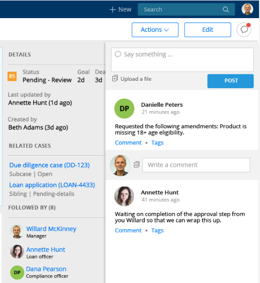
Increased Usage of Flexbox
One aspect I like about working at Pega is that UI engineering stays on top of current UI trends and standards and quickly integrates them into our app dev platform and strategic applications. Our adoption of Flex is a perfect example.
In UI Kit 8, many sections in the UI Kit were modified to use Flexbox. In addition to better responsive behavior with complex layouts, it also means less DOM markup (which improves performance) and improved responsive features in your applications.
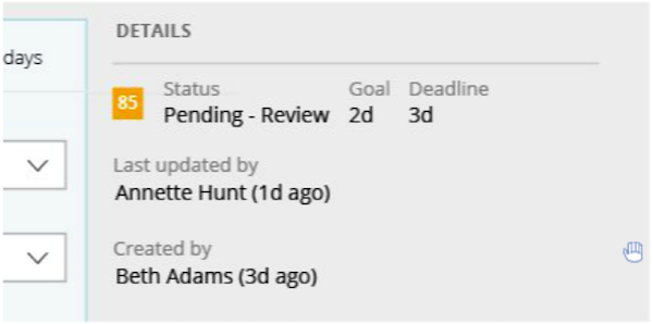
Case details moved to the side panel
The important details of a case should have a prominent place in the UI. In the previous release, the case details were below the work area, requiring you to scroll. In UI Kit 8, the case details section is conveniently located in the side panel.
New dashboard widgets
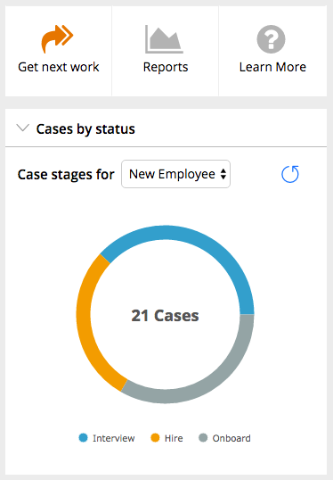
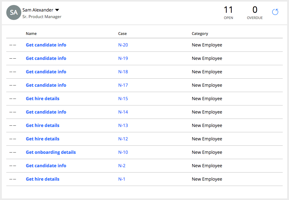
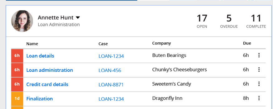
UI Kit 8 also includes a few new dashboard widgets you can use as is, or customize to your liking. The Case Manager shortcuts widget includes shortcuts for “Get next work,” “Reports,” and “Learn more.” The Case Status widget uses Pega’s charting capabilities to create a pie chart to visualize the total number of cases and the breakdown of what stage those cases are in. And the Team worklist widget allows you to see the cases assigned to particular team members.
Part of the value of the UI Kit is the ability use these widgets as a starting point and customize for your needs.
Case Manager Shortcuts widget and Case Status widget
Team Worklist widget
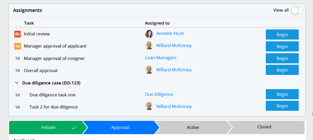
New Assignment List UI in review harness
While on the review page, the Case view widget lets you easily see assignments and related cases. Use the “View all” button to reveal completed assignments
Improved UI in general
There are other visually appealing improvements throughout the UI Kit, including:
- Icons in the navigation
- “New” menu moved from top to the side navigation
- Combining urgency and priority into a single icon with color coding to denote severity
- Optimizations for larger screen sizes and resolutions
- Updated screen flow UI
- Updated login screen
- Improved focus styles
- Improved responsive layouts
Ready to try it out?
The simplest way to explore these features is to create a new application. In your application definition, you’ll noticed that, by default, UIKit 08.01 is listed in your “Build on applications” list.

Create a case type as you normally would and explore the features I’ve just discussed.
If you don’t have a 7.2.2 server handy, you can always spin up a trial 7.2.2. server in the Pega Cloud.
If you’re interested in upgrading your existing application from an older version of the UI Kit to the newer one, you can do that, too. While we continually strive to make it easier to upgrade existing apps to newer versions of the UI Kit, this involves a bit more thought and work, depending on how you’ve implemented your application.
Making a “Case” for using UI Kit 8 in your applications
As a front-end developer and the product owner for the UI Kit, my colleagues and I constantly work with internal Pega teams to upgrade to the latest UI Kit in Pega Strategic apps, and I encourage you, too, to make time in your development cycle to upgrade to UI Kit 8 in your Pega applications. Besides the ability to quickly achieve modern desktop and mobile designs, you also get other optimizations, including performance and responsiveness. It’s hard to argue with these benefits.
We’re currently working on UI Kit 9 and 10, and I can’t wait to tell you about it once it’s released. So, check back soon!

