Choosing colors for interactive and digital products is no artistic exercise, but an art in itself.
Next to color's aesthetic, cultural, semantic, and psychological aspects, it's important that equal efforts go into accessibility of color, too. Why?
Vision impairments are very common. According to the WHO there are at least 2.2 billion people with vision impairment, and the 2017 Global Burden of Disease Study estimated that the annual cost of lost productivity due to moderate to severe vision impairment is about $16.5 billion in the United States of America alone.
At Pega, we strongly believe that all applications should be accessible – and that’s why color accessibility is part and parcel in the Pega Cosmos design system. Here we introduce three ways that Cosmos enhances color accessibility of applications.
Cosmos provides enough contrast
Certain eye conditions (such as cataracts, glaucoma, optic neuropathies, macular degeneration, diabetes, eye trauma, and laser eye surgery) can cause people to experience poor contrast sensitivity. Color-blind people also rely on contrast: it’s often the only way to distinguish between adjacent colors and text on colored backgrounds.
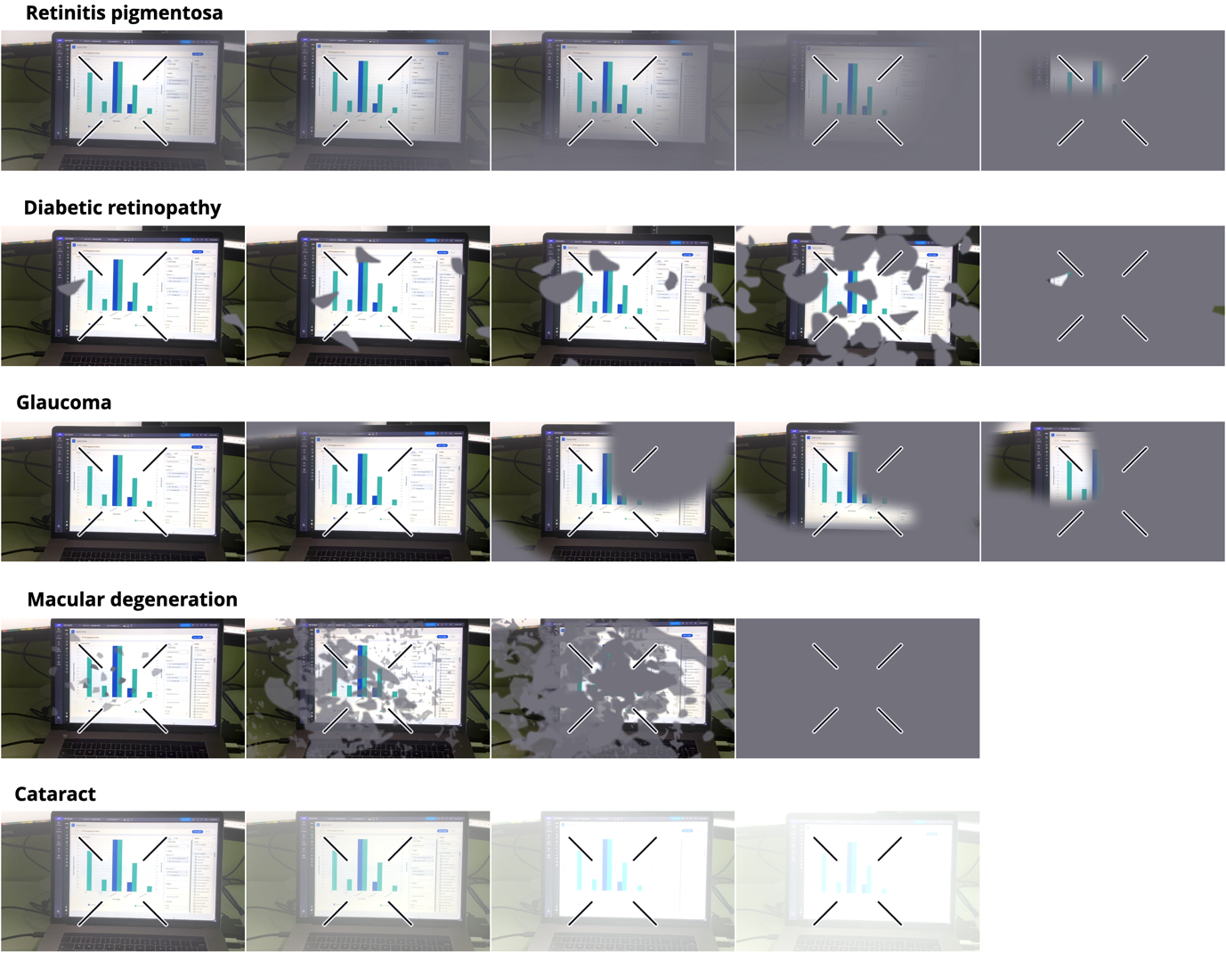
People living with these conditions will benefit from interfaces that use a high degree of contrast between background and foreground colors. Of course, extremely high contrast may not make sense for all people. About three in 100 people with photosensitive epilepsy may experience seizures triggered by high-contrast interfaces, especially when paired with animation. If you know that this may apply to some of your users, reconsider your use of contrast.
There are three levels of WCAG 2.1 contrast ratios
The Web Content Accessibility Guidelines (WCAG) currently offer three defined contrast ratios:
- 3:1 (= Level A)
- 4.5:1 (= Level AA)
- 7:1 (= Level AAA)
The minimum level – level A is a 3:1 contrast ratio. In Cosmos, this contrast level may be used for:
- Meaningful icons on colored background
- Form inputs to show expected interactions
Everything else in Cosmos uses the contrast level AA with a ratio of 4.5:1 – this is the minimum contrast requirement for all text and images of text in web and/or mobile interfaces. Level AA is the minimum contrast ratio required for people with moderately low vision, who do not use any contrast-enhancing technologies to access the interfaces. An example of an app with a level AA-compliant contrast ratio is the U.S. Decennial Census of Population and Housing.
Contrast level AAA, with a contrast ratio of 7:1, is only recommended for digital products and assets used by audiences with vision loss and who do not use assistive technologies to access interfaces.
What this means for designers using Cosmos
Since color contrast comes out-of-the-box, you can rest assured that contrast requirements are properly met for levels A and AA according to WCAG 2.1. (Newer versions of WCAG with versions 2.2 and 3.0 are on their way and at Pega we keep an eye on those and will adopt new standards once they are official.)
There is also no need to worry about contrast for:
- Logo types
- Text in logos or brand names
- Decorative user interface elements without a function
These are exempt from any contrast requirements in WCAG 2.1.
Aiming for level AAA is very limiting in terms of design and branding. Increasing color contrast makes colors appear muddy, which causes loss of color semantics and is perceived by sighted people as unpleasant to look at, which is why everything else in Cosmos uses a 3:1 and 4.5:1 contrast ratio.
However, if some of your users rely on a 7:1 contrast ratio, consider incorporating a contrast toggle on your webpage or app. People relying on a 7:1 contrast ratio can then temporarily enable level AAA color contrast when needed. Consider this enhancement when building customer-facing sites and applications, with critical functions such as airline booking sites, insurance, or any governmental sites or apps.
Cosmos addresses different types and levels of color blindness
Color blindness may be permanent or temporary. Permanent color blindness is caused by genetic mutations. People living with these mutations lack a certain cone type in their retinas. An estimated 8% of the male population (1 in 12 men), and an estimated 0.5% of the female population (1 in 200 women) suffers from permanent color vision deficiency.
Permanent color blindness
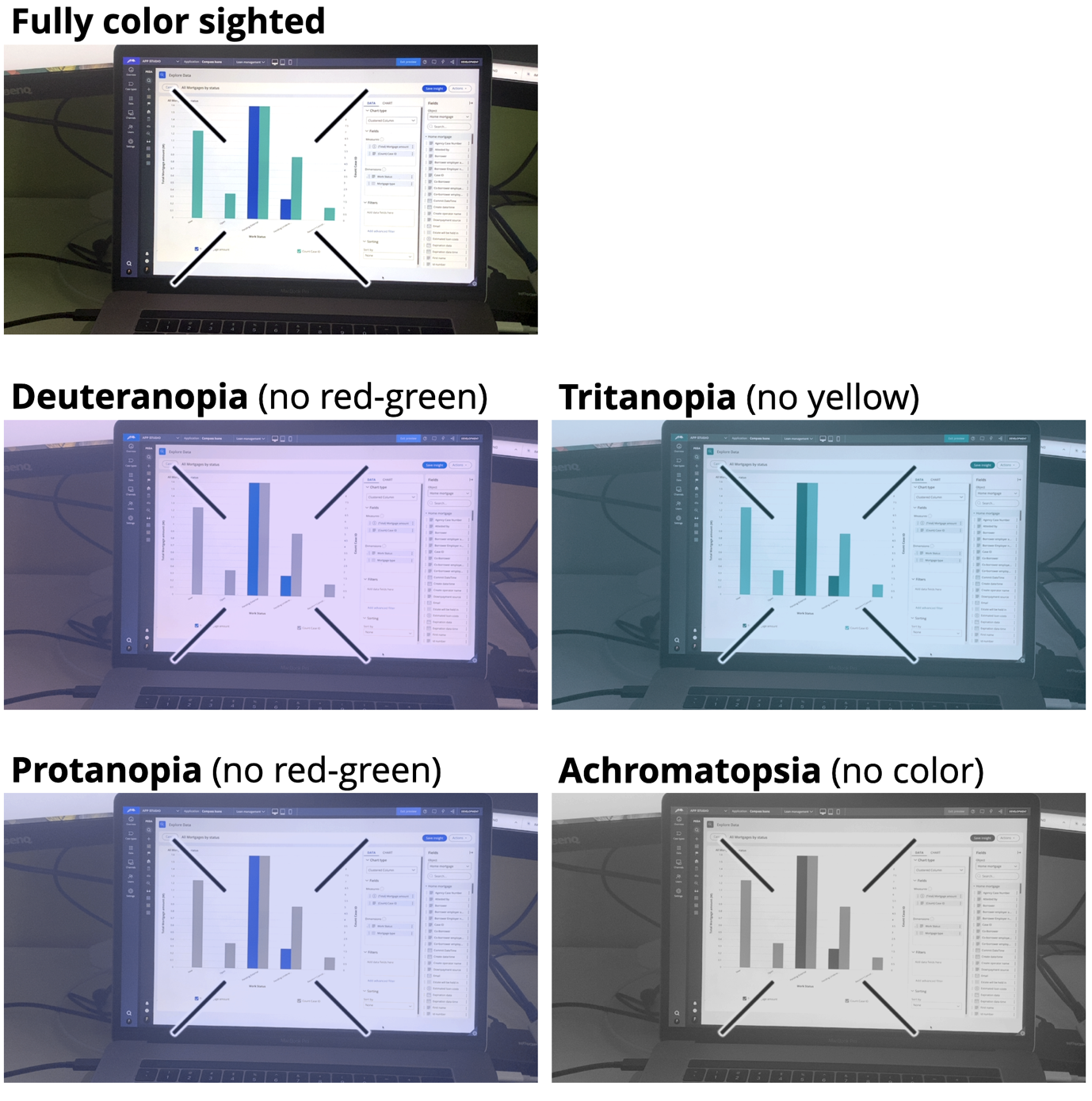
There are four main types of permanent color blindness, and each one has a less-pronounced subtype. Focusing on the needs of the four main types will automatically cover the needs of the subtypes.
- Protanopia (no red cones, affects red-green perception)
- Deuteranopia (no green cones, affects red-green perception)
- Tritanopia (no blue cones, affects blue-yellow perception)
- Typical achromatopsia (no cones, rod monochromacy, affects all colors)
Temporary color blindness
Temporary color blindness is typically drug induced. For example:
- Xanthopsia: Congestive heart failure and abnormal heart rhythm are often treated with drugs containing extracts from the digitalis plant. In some cases, these drugs cause yellow-tinted, blurry vision in patients. The effect can last as long as the drug is taken, and reverses after the patient stops taking the drug.
- Dyschromatopsia: Several drugs taken over a longer period of time can slowly damage the optic nerve, leading to poorer vision and red-green color blindness. These drugs are typically used to regulate heart rhythm, or treat tuberculosis or certain joint and skin conditions that last longer than five years.
- Cyanopsia: Some drugs to treat ED cause a blue-tinted, blurry vision. Side effects start after taking as little as 25mg and last anywhere from several hours to several months.
Each form of color blindness comes with its own needs. In Cosmos, we address these needs in a variety of ways – such as inclusion of labels and iconography, strong contrast between semantically important colors such as green and red, but also by avoiding certain color combinations.
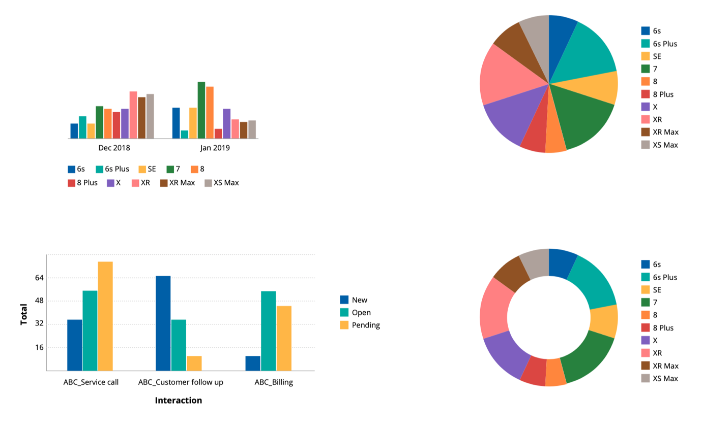
For example, red-green blindness is the most common type of color blindness. People with protanopia, deuteranopia, and dyschromatopsia lack the ability to distinguish certain color combinations such as:
- Red and green
- Brown and green (or red)
- Blue and purple
- Gray and teal (or pink)

Cosmos addresses this by avoiding these color combinations next to each other, especially in areas such as interface messages, and data visualization.
What this means for designers
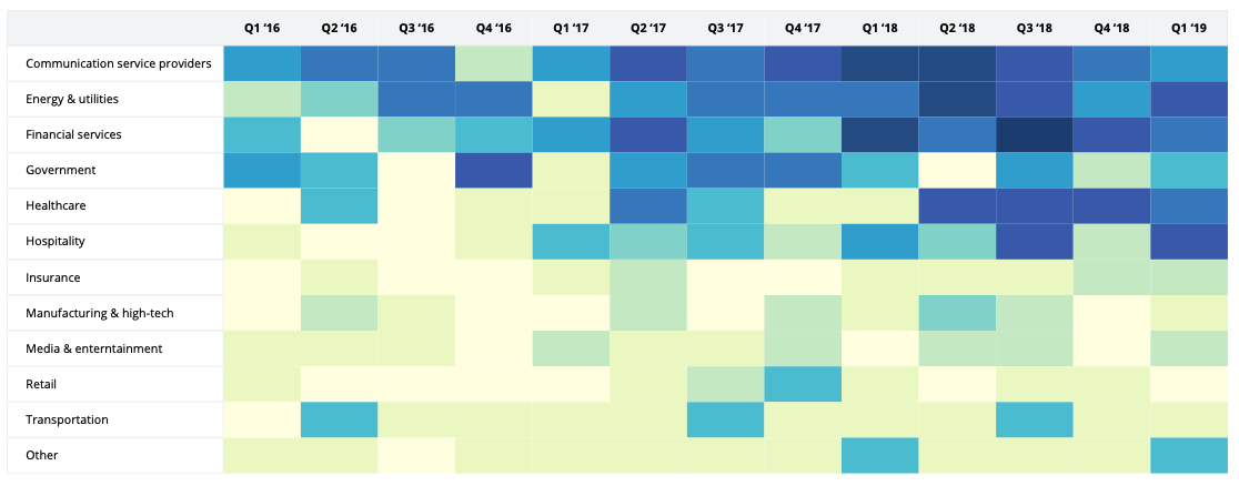
Cosmos already takes care of color accessibility for every component that ships with Cosmos, including color palettes for data visualization.
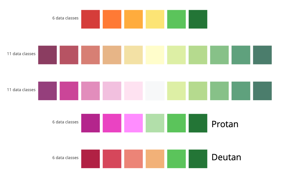
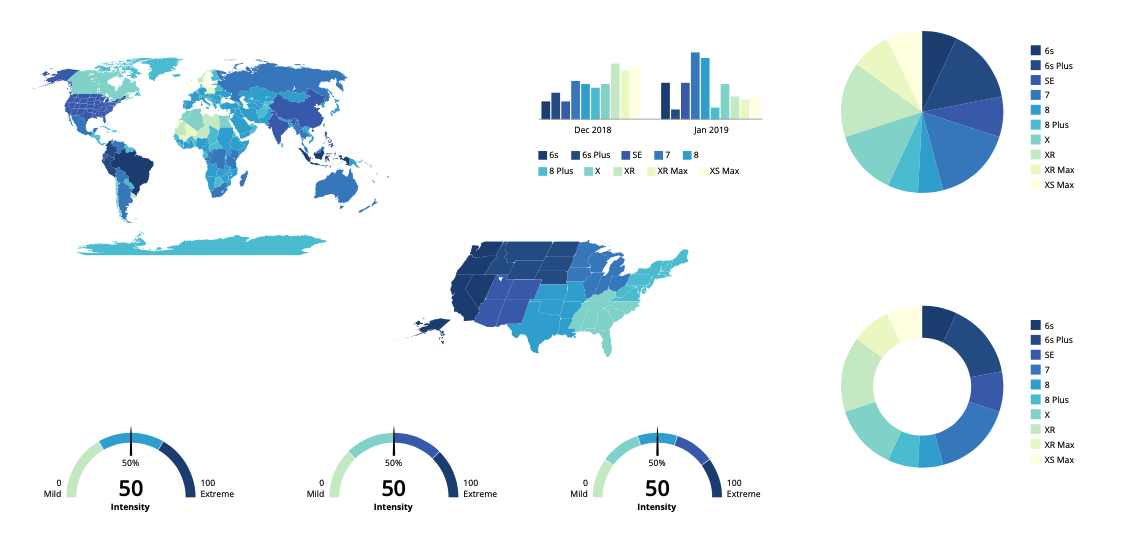
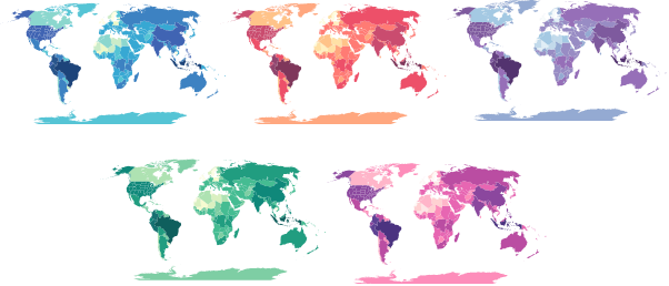
The application of accessible color in data visualization is an area that chart authors often forget. Cosmos embraces this fact and offers 29 carefully-crafted color palettes to encode categoric, continuous, and divergent data, including four palettes that are specifically tailored to the needs of people with Protanopia and Deuteranopia.
Should you have a need to introduce new colors or color palettes into your application, you need to ensure that they are accessible to color blind people. One method to do this is to use the built-in accessibility checker in Pega App Studio.
Tested and validated with people
There are many useful tools out there that empower designers and developers alike to check color contrasts, or to “simulate” what users with color blindness will see.
These tools are great for a start, but they do fall short in some areas — it’s not yet possible to simulate human perception accurately. At Pega, we work with these tools as part of our design and development process. We even have an accessibility checker for color built into Pega App Studio. But we don’t just rely on tools, because we know technologies can only provide direction.
When comparing the results of several contrast checkers with results of several usability studies with color blind and color-sighted people, we noticed the contrast checkers have a weakness with teals, bright light blues, and certain types of red tints and pinks. All the contrast checkers do give the same recommendations: to use black text on color, where users perceive white text as more legible. Since we design for real people, in Cosmos, we to stick with human perception rather than relying on tool-based recommendations.
Color blindness simulation tools also have their limits, and when validating data visualization color palettes with a group of color-blind people, we realized we needed to create special color palettes for each permanent red-green color blindness type: people with protanopia and deuteranopia.
What this means for designers
It is only possible to ensure accessible colors, by testing them with the full range of color-blind types, and people with low vision. Cosmos already takes care of accessibility for the most common types of red-green color blindness. If you’re introducing new colors in your application for critical functionality, you should consider testing them with color-blind users.
Design confidently for accessibility with Cosmos
We did a lot of research with people, as well as available technologies and their limitations, to create accessible Cosmos components – and it took many iterations to get the color palettes right.
When using Cosmos, your application will be all set for A and AA levels of contrast requirements as recommended by current WCAG 2.1. You’ll access a wide selection of accessible color palettes for data visualization that people with color blindness will be able to use confidently.
Recommended resources:
- Explore the Pega Cosmos design system.
- Subscribe to get updates to the Cosmos Sketch library.
- Take the Pega Cosmos Designer mission in Pega Academy.
Don’t forget
JOIN THE CONVERSATION on Collaboration Center
FOLLOW @PegaDeveloper on Twitter
SUBSCRIBE to the Pega Developer Podcast on Spotify or via RSS

