2021 UX Star Award Winner: Lloyds Banking Group

2021 UX Star Award Winner: Lloyds Banking Group
The UX Star Award is awarded to a team that has significantly improved the UX of their enterprise Pega application by implementing design best practices.
Updated on August 4, 2022
Lloyds Banking Group
Fraud & Disputes team
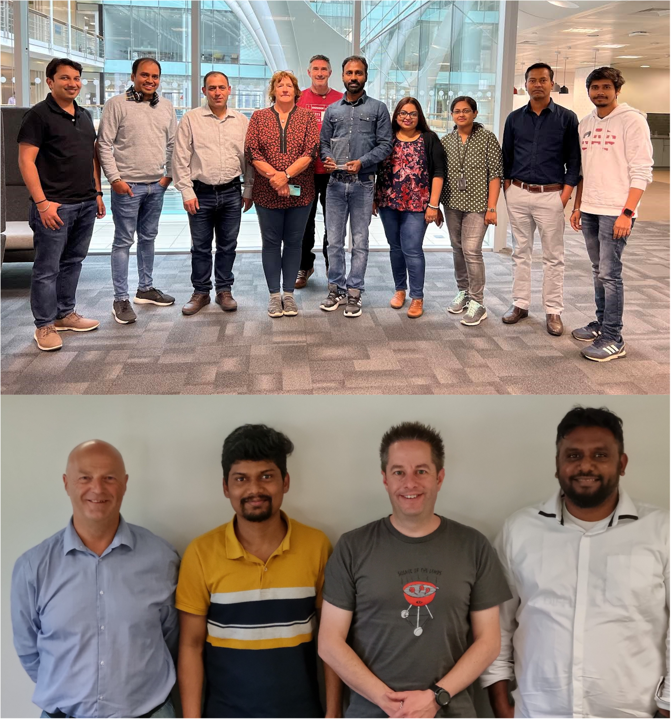
Lloyds Banking Group, UK’s largest financial services organization, received Pega's 2021 UX Star Award for recreating the UX of their Fraud & Dispute (F&D) application. Lloyds Banking Group used the Theme Cosmos version of the Cosmos design system to automate F&D processes and bring value to agents, customers, and the business. We met with Caroline McGachie, Transformation Lead, Fraud & Disputes, from Lloyds Banking Group's Fraud & Disputes team to hear how they did it.
Read our Q&A with Caroline below.
As our processes evolved and we had developed new functionalities, it became increasingly important to consider the user experience for the agents who used our application every day. We knew there was a way to simplify and standardize the way agents recorded and updated various customer needs.
So, we wanted to create an intuitive application for F&D agents to use, with consistent screens, actions, and workflows to use across different customer journeys. By doing this, we also wanted to make it easier to induct and cross-skill colleagues.
I appreciated how Theme Cosmos mirrored other colleague and customer facing UIs—it was harmonious with the other screens that we’d be using. Plus, it included UI elements often found on mobile devices, like a slide button for selection, and I really wanted to give the F&D agents something similar to what they’d use as customers.
Our team met weekly to collaborate on the rebuild. It was really intense, deep design work. As a starting point, we identified what data to display on a screen using the original application, and then added or removed from that based on what we needed in the new application. We discussed how agents would use that data, and then Veera Jayaraman, User Experience Design Lead, would pull together a screen design.
Once we had the wireframe for a screen, we filled in the details: we pinpointed all the different scenarios customers could report, at what point we needed to invoke APIs to send or retrieve data, what information was needed or available in those APIs, what retry or error handling options we’d need to include, and how the screen might need to adapt for other case types. Once Veera worked his magic on all of these considerations, we’d have a completely different screen at the next session.
Creating these screens came with good natured, passionate argument, and a lot of deep, exciting UX work. Our UX and front-end experts really thought through all the elements that agents would need to see on each individual screen, and how to present them in the best way possible. Sometimes we’d revisit a screen and discover new elements that could make the user journey even better, so we'd go back and forth making improvements until everything was finalized. The whole process was exciting from start to finish, and when we completed a screen, everyone felt an incredible sense of accomplishment.
Working this way also meant we designed each screen once, and used it in three different journeys, with four different brands, multiple payment types, and many different charging strategies for interest, fees and charges.
We simplified processes for our agents and grew several key metrics.
Instead of working across five separate applications for case management, we moved everything into this application to give us one integrated workflow tool. We’re now able to create cases for a new product using the core workflow we’ve built, instead of building a separate workflow solution. The decision to do this was in part linked to the modern and intuitive UX, which is replacing green screens from the previous case handling approach.
This potentially lets us simplify our target operating model due to reduced complexity in the various processes F&D agents follow.
We've also allowed customers to report issues to us via our digital channels. We've applied rules that let Pega complete simple and low risk demands without any colleague intervention from the front or back office.
It’s the icing on the cake. We worked hard at every decision and design point to improve the user experience for our F&D colleagues, and we’ve received some really great feedback on the changes. That’s all we were initially hoping for, but being recognized with an external award is a fantastic plus!