This article is part of our new series on effective in-app / UX & UI copy
I know you’ve been the victim of badly written UI copy. Everyone has been – when you couldn’t figure out the entry format in a form, or when the label above a text box didn’t clarify what the website is asking. And system messages that sound like computer code, rather than a message for a human (“Error 35856”, anyone?!) can confuse and mislead. When that happens, you know that words were an afterthought in the design process. And as a user? Yuck. You feel frustrated and annoyed.
When you’re writing for people doing work, or for an enterprise context, your words will carry a lot of responsibility – even if they’re small labels, instructions, or microcopy.
Writing for employee-facing enterprise UI is a relatively new craft, and not every design team has the support of a content designer or UX/UI copywriter in this context. But whether you’re a designer, business architect, low code developer, or even a writer that works on these types of apps, it’s critical to understand how the words in your interface will guide users to complete workflows. Words are a critical part of the interactions that get people the right information at the right time and empower them to complete their work.
Anyone can learn how to write clearly for UI, but don’t confuse it with copywriting or writing to market a product or a service. Effective UI copy isn’t necessarily about writing skill or storytelling talent (though good copywriters certainly thrive in this space). It’s more about driving logic and action through the words that are part of your interface design.
UI writing is about GUIDING someone towards outcomes.
If the user doesn’t understand what they should enter in a form—or why it’s important for that information to be accurate—they won’t be able to get anything done.
So, you’re interested in improving your app copy skills as a Pega designer or citizen developer? In this article, I’ll share high-level tips. In the next article, I’ll talk about how we’re thinking about UI copy in Cosmos, our design system for enterprise, and how we’ve arrived at some of those recommendations.
But today, let’s talk about how to get started with UI copy. And yes, just like good design, it starts way before any text is typed.
1. It’s about the user’s workflow, not yours – so think about your copy early.
Perhaps you can recall a time when, as a developer or designer, you’ve thought: “This workflow or path is super awkward, but let’s bring a copywriter in to throw some words on it and explain what needs to happen.” Ack! Please don’t do that – if you’re looping in a writer at that point, it’s usually too late for true user-centricity! And if you have access to a writer or content strategist, take advantage of their expertise before you polish off your mockup!
Regardless of who’s doing it, UI copy is a critical part of your wireframing and workshopping process. As you and your team are coming up with the flow, you should be coming up with the message to the user. Make the message a part of your design process, and then design for the message you want to tell the user— so the words in your UI drive the design, and aren’t an afterthought.
2. Plan to avoid TMI in your UI and plan what you’ll need to say.
We’ve talked about TMI—or too much information or unnecessary detail that the user can’t act upon—in UX design before, and it’s especially critical to avoid this in your UI copy. A good time to fight TMI is at the wireframing stages. As you’re designing the flow with your team, ask: what info are we going to give users at every touchpoint?
When I coach early-career writers, I ask them to try a basic exercise. Imagine a scenario where a user is working on a flow – let’s say, a complicated form where they must input information accurately. A modal must appear to warn the user that it’s important to fill out the subsequent screens. At this point, I might ask the writer to draft the modal copy with everything they think the user will need to know. The result can be a modal with multiple paragraphs: about the type of information the user will see, how important it is to fill out, what it will be used for, and how long the form will take. Then I ask: “Be honest. Do you really think the user will read it?” Probably not— and that defeats the purpose, doesn’t it?
Then we do the second part of the exercise: can this message be cut down to fewer words? How about again? What if you rank the things the user MUST know to proceed vs the things it would be NICE to know, and rearrange the information according to this hierarchy? Will the “nice-to-know” information have influence on what we want the user to do next? In many situations, you’ll find that it doesn’t, and those 1-2 “must-know” things are enough to include and the rest of the information can be implied or omitted.
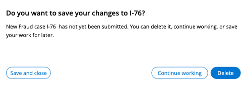
Here’s an example of a save modal where this informational framework is clear. The topmost—header-level—shows the most critical information: save or not to save. The subcopy offers additional detail and could be omitted if space was of the essence.
Our design system, Cosmos, is optimized to present just the right amount of information that a user needs to do a job. But when you’re working with information-heavy UIs, it’s also your judgment call on how to give the user the minimally critical amount of information, and it’s up to you to advocate for that on your design team.
3. Plan to write so that everyone using your app will be able to understand you.
Of course, you can’t be expected to know how every possible user could interpret written information. But you need to TEST your copy and your content, just as you test your designs—because copy is an integral part of your design. And in that design process, you need to be thinking about all types of users that could be using your enterprise application. Often this means optimizing for accessibility and localization early on, alongside your mockups.
Ask yourself: can a person using a screen reader understand your planned headers? (People with visual limitations rely on screen readers, so consistency is important – they will scan labels and headings for the information they need). Is the name of your object going to make sense in other languages? Does your capitalization make it clear what is the name of an object, and what is its function? What about the hierarchy of your menus?
4. Remember the 3 Cs of writing: clear, consistent, concise… and the 1 P: precise.
Once you’ve drafted your first attempt, remember to check for CCCP. I always use this rubric to pressure-test my own UI copy.
I ask myself: Is the meaning (and subsequent actions) clear? Is the terminology used consistent with guidelines and elsewhere in my application? Is the text written in the shortest way possible? But before I’m done, I check: was I also precise enough? In practical terms, that often means checking for tentative words like “should” or “may”.
Consider:
“This line should be 5 mm thick.”
Should it be? OR must it be? What happens if it isn’t? Is it a recommendation or a mandate? It begs all SORTS of questions from people who pay attention to details.
“This line must be 5 mm.” Ahhh. Much clearer.
If my copy is clear, consistent, concise, and precise, I know the UI will give users the right information— and they’ll get work done faster with less confusion.
If you’re still with me – remember how I mentioned that UI writing is fundamentally guiding? That’s what we believe enterprise design must do. Cosmos, our design system, is built all around guided workflows that guide users towards the individual outcomes they need to achieve on each workflow. And our design system also offers pre-built UI templates with out-of-the-box and suggested UI copy for important application pages, templates and patterns (like forms, information display components and more) to support those outcomes. So, you don’t need to write, design, and customize everything from scratch – we give you our recommended best practices to start.
At the end of the day, a user should be able to look at your application and know exactly what to do and how, with the help of your UI and its supporting copy. Cosmos supports clear, concise, and consistent UI as part of the overall design process, and we believe that application language is critical to that step.
Learn more
-
Learn to design with Cosmos by taking the Pega Cosmos Designer mission in Pega Academy
-
Explore Cosmos patterns, templates and components on design.pega.com
Don’t forget
- JOIN THE CONVERSATION on Collaboration Center
- FOLLOW @PegaDeveloper on Twitter
- SUBSCRIBE to the Pega Developer Podcast on Spotify or via RSS