Conversation
Accenture
IN
Last activity: 15 Nov 2025 7:16 EST
How to dynamically change the Min and Max scale in chart Y axis
Description:
I am experiencing an issue with Y-axis scaling in our Line graph charts. The charts currently display with a default Y-axis minimum, maximum, and interval that do not dynamically adjust to the actual data range, leading to poor visualization and a "clumsy" appearance.
Specific Problem:
For example, if the actual data range for a chart's Y-axis is between 294,000 and 530,000 the Y-axis often starts at an arbitrarily low value (e.g., 124,000) and uses a large, fixed interval (e.g., 120,000). This results in the relevant data being compressed into a small portion of the chart or obscured by an inappropriately scaled axis.
Desired Outcome:
I need to configure the chart to dynamically calculate and set the Y-axis minimum, maximum, and interval based on the actual data presented in the chart. This should ensure that:
- The Y-axis minimum is set appropriately close to the lowest data point.
- The Y-axis maximum is set appropriately close to the highest data point.
- The Y-axis interval (step value) is calculated to provide readable tick marks and optimal spacing for the current data range.
Question for Support:
What is the recommended approach within Pega to implement dynamic Y-axis minimum, maximum, and interval calculations for Charts? Am looking for guidance on how to configure this, ideally by:
- Leveraging Report Definition chart properties.
- Using Data Transforms or Activities to pre-calculate these values from the data.
- Referencing Pega properties for these axis parameters.
Any specific Pega configurations, best practices, or known methods for achieving this dynamic scaling would be greatly appreciated.
Note: Tried to provide the Min and max value through precalculate properties, but unable to add it in chart control. It is accepting only the decimal values.
Pegasystems Inc.
GB
@AravinthVcould you give some more details on what you are seeing? Maybe an image.
Initially i read this as issues with Explore Data - Insights (Constellation) but when you talk further, it seems you might be using Report Definitions and Dashboard widgets (UI Kit)?
Accenture
IN
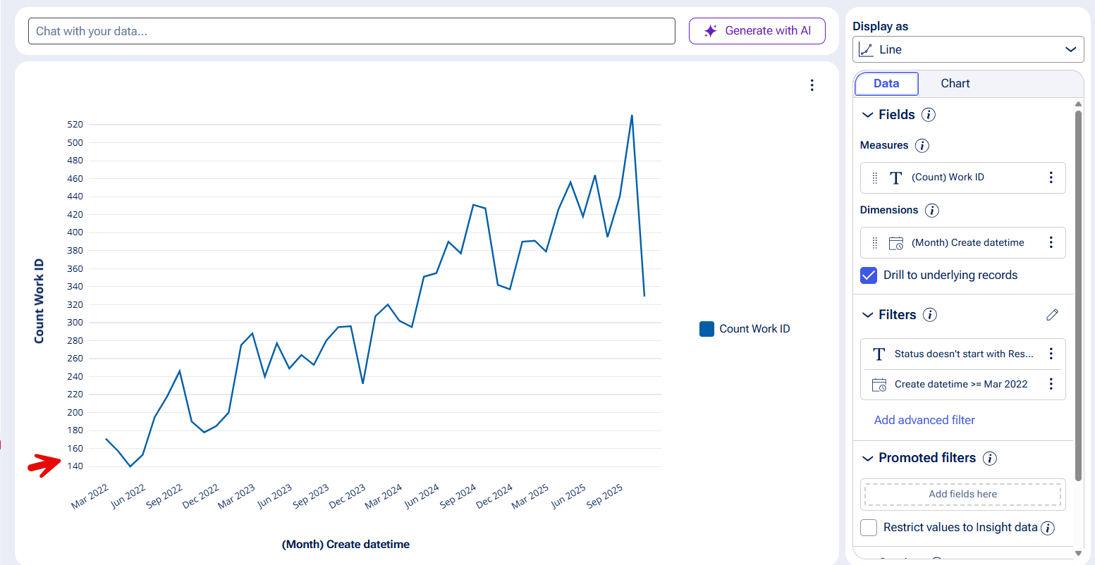
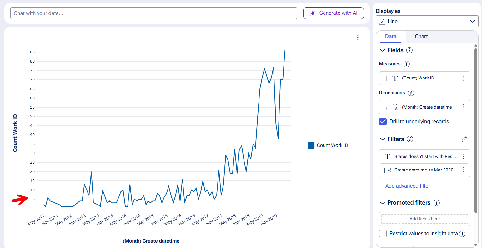
@MarcCheong Hi, Yes it is UI Kit based application. i had attached a sample chart image for reference.
Accenture
IN
@MarcCheong One other best example for this issue attached here. if the Min and max range got adjust more dynamically then it will be good for visuals.
Pegasystems Inc.
GB
@AravinthV I've asked some experts on UI Kit, to help.
I'm so glad this is easier in Insights / Constellation.
Accenture
IN
@MarcCheong we do have similar requirement in Theme cosmos based applications also.
Pegasystems Inc.
GB
@AravinthV both UI Kit and Theme Cosmos do have the ability to run both Insights (Explore Data) and Dashboards for them. If you're having trouble with report definitions and charts it might be worth exploring Insights? I have done this in both UI Kit '24 (Customer Service) and Theme Cosmos '8.8 (Platform) and it was a great way to start incrementally adopting Constellation.
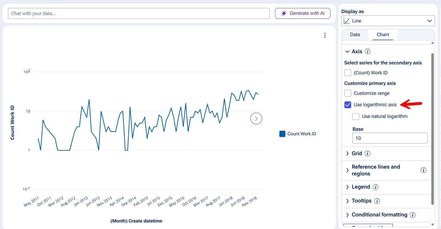
Insights does have dynamic y ranges built in, no need to configure this - it is based on the dataset.
The configuring of customised y-range is hard coded to values (not based on a calculation like you wish. However, we also have logarithimic control.